#TransformTuesday: 24 December
Here is this week's selection of rebrands from around the world, from Spanish transport companies to Belgian coffee brands. For more from #TransformTuesday, follow @Transformsays
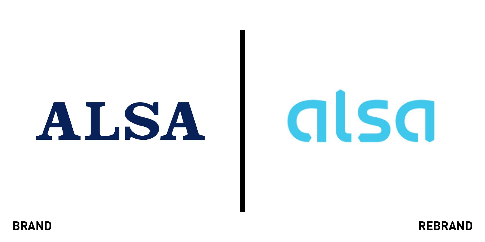
Alsa
Spanish bus and coach operator Alsa has a new visual identity, which is targetting customers in all demographics, but particularly younger people. Brand consultancy Interbrand created the new design based on Alsa’s strategy of connecting people in a safe, sustainable way, guaranteeing simple door-to-door mobility. Moving from a traditional serif upper case font in the old logo, the new version consists of a series of arrows, designed to represent movement without borders and Alsa’s desire to connect in a more friendly way with its customers. The new brand is to be implemented across Alsa’s fleet, with updated livery, and in all forms of communication as well as Alsa’s website and mobile app.
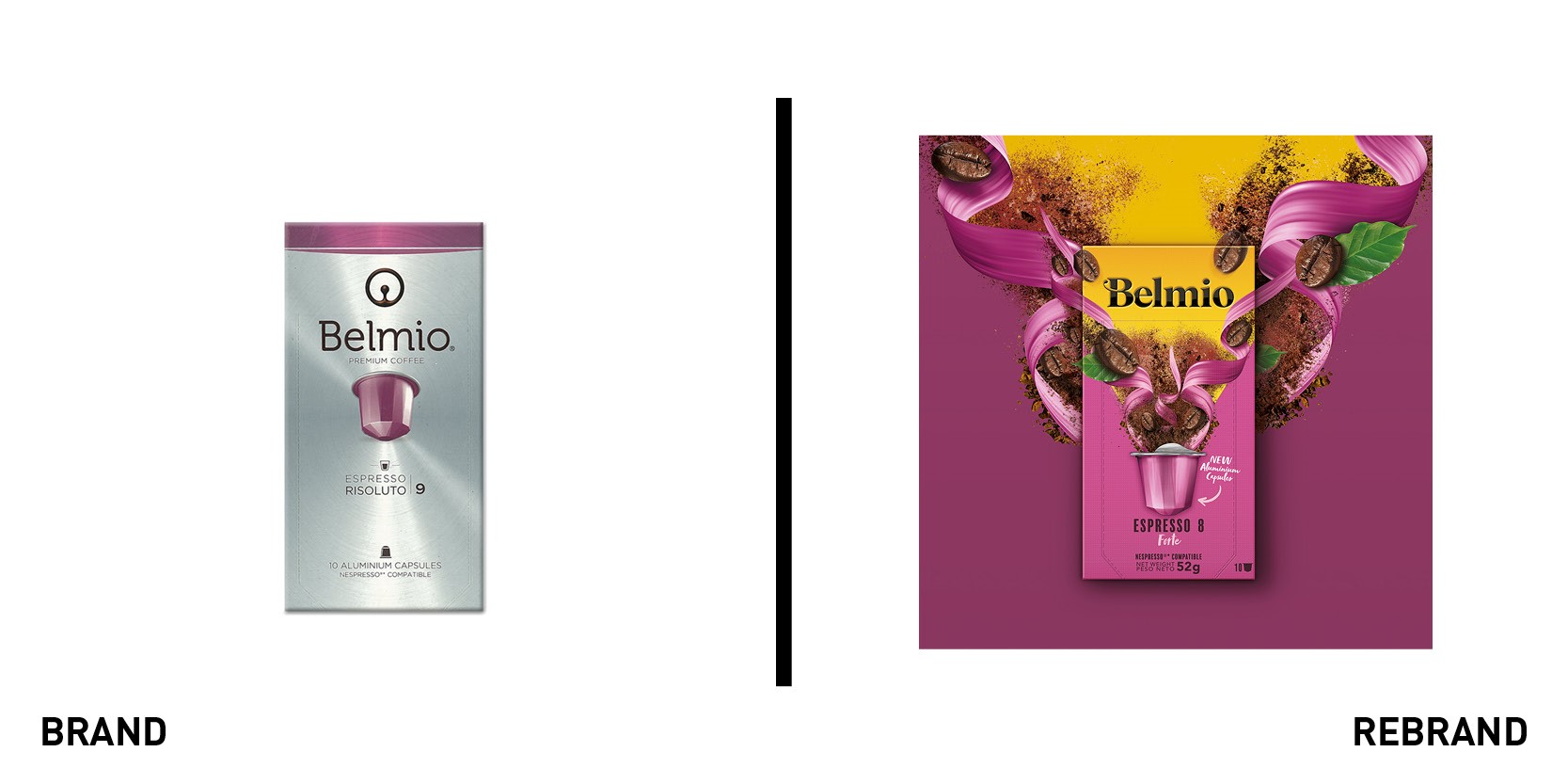
Belmio
Belgian coffee producer Belmoca has relaunched its flagship Belmio capsule brand across Europe with a new identity. It wanted to strengthen its retail presence in an increasingly crowded market, and enlisted branding agency Dragon Rouge to create the renewed brand strategy. The new Belmio brand highlights Belmoca’s aroma guard technology, which protects the freshness of the coffee beans at every stage of the production process, and ensures the aroma is sealed into an airtight, recyclable aluminium capsule. The new positioning refers to 'unleashing extraordinary' coffee experiences, and the packaging uses high contrast black on yellow, with a reworked Belmio brandmark. The new brand identity was launched this month in Albert Heijn department stores in the Netherlands and Belgium, and will be rolled out to Benelux and other key markets in early 2020. Belmoca’s general manager Luk Van Gelder says, “We are thrilled by the new Belmio brand story and visuals, as are our consumers. We worked on a very tight time schedule, and we found Dragon Rouge to be very responsive to our inputs, working together in partnership. From all we have seen, we are convinced that the new Belmio is going to bring innovation and value to the market.”
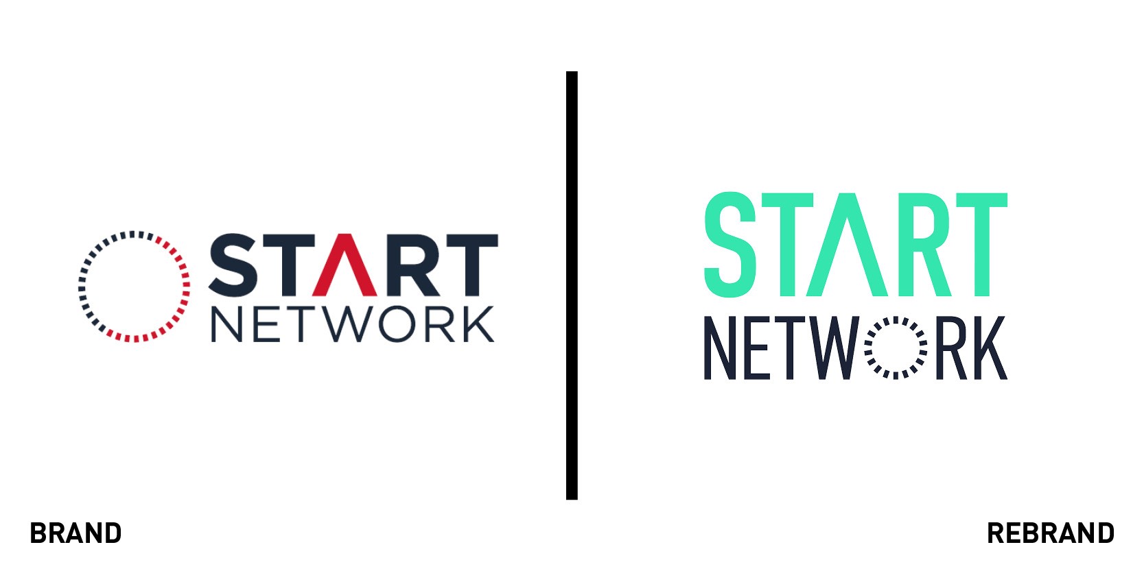
Start Network
Humanitarian charity Start Network has refreshed its brand in a bid to make it more engaging and accessible. Social impact-focused comms agency Nice and Serious has updated Start Network’s logo, imagery and branding guidelines, which the charity says are designed to better reflect its positive and optimistic identity. The new branding will be rolled out across digital and physical platforms. Start Network is a group of non-profit organisations that aims to find new ways of financing humanitarian aid and sharing expertise. Members include Oxfam, MercyCorps, Cafod and founding organisation Save the Children.
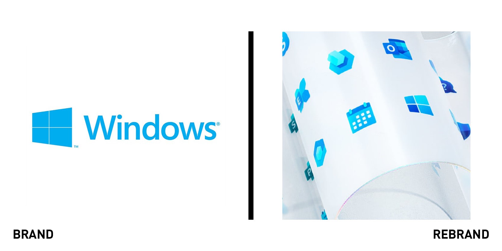
Microsoft Windows
Microsoft has redesigned its Windows logo and more than 100 of its app icons as part of a push to modernise its software and services. In a tweak rather than a radical overhaul, the new Windows logo has softer, rounded corners and various shades of blue, compared with the current logo, which has sharp corners and a single shade. The redesigned app icons have received similar treatment, with colour gradients and rounded edges. There is an emphasis on making the icons appear three-dimensional as well. The logos have been redesigned in-house under Microsoft’s 'fluent design' principles, which the company says “bring the fundamentals of principled design, innovation in technology, and customer needs together,” while “creating simplicity and coherence.” In a blog post, head of Microsoft Office design Jon Friedman says, “From mild to wild, we explored a multitude of design directions and listened to customers around the world. We learned what didn’t resonate with people (flat design and muted colours) and what did (depth, gradations, vibrant colours, and motion), all of which drove our decisions."


