New White Sox logo goes the distance

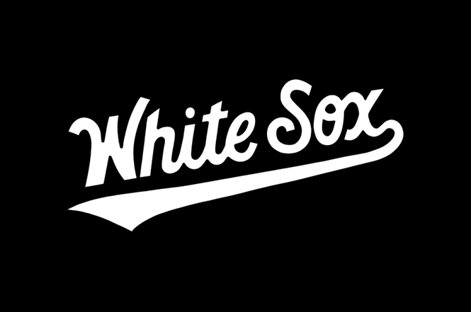
NY-based Contino Studio has designed an alternate wordmark for the Chicago White Sox. Operating within a massive design system, it’s the first ‘White Sox’ wordmark update since 1990 and is a sharp change for the charter MLB club. While continuing to honour the visual identity of the team, its new logo is cleaner and bolder than past iterations, balancing confidence and grace.
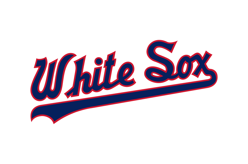
Former White Sox Logo, 1987-1990
There are ten primary White Sox logos, 20 for headgear and 67 for jerseys, all perceived as necessary variations for different products, players and locations. On uniforms, the team wears its ‘Old English Sox’ script reading as ‘Sox’ for home games and one reading ‘Chicago’ for away games but they haven’t had a ‘White Sox’ jersey for decades.
Its new logo will be used as an alternate jersey logo for home games. In both direction and style, its new logo feels akin to the ‘Chicago’ logo but brings in a new typeface with a higher x-height and forgoes the outlines of its previous incarnations. Character elements pivot and curl around multiple directions, mirroring the ups and downs of the franchise, all in black and white. Also accompanying the new logo is the new custom South Side Script to use alongside the new logo on print, online and in all other media.
This new logo sits more smoothly than its predecessor alongside its ‘Sox’ and ‘Chicago’ jerseys. It enforces the brand and could help expand the White Sox into other sectors like fashion, entertainment and lifestyle.
The alternate logo was revealed at a high point for the AL baseball team, on special edition uniforms for Players Weekend 2019 where they won a series against the Texas Rangers.
With keen brand positioning like this, the White Sox has proved once again that if you build it, legacy brands can come into the 21st Century.


