London City Airport acquires modern look with rebrand

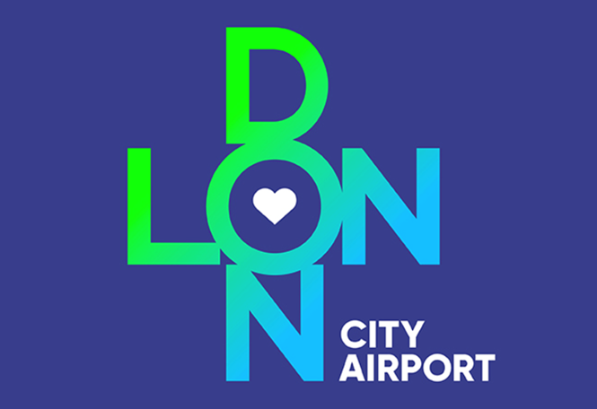
London City airport has introduced a modern and dynamic look, after rebranding with the support of London-based agency the Allotment. Using vivid colours and an iconic logo the company has altered its positioning to capture London’s creative energy and reflect the metropolitan nature of the capital.
Neil Dillon, marketing director at London City Airport, says: “The new design is much more fitting for our 21st century airport in the world’s greatest city and this sentiment has resonated in our research with long-standing and new customers. From a design perspective, the new branding is agile and has huge creative potential for interaction with different mediums and spaces, both now and in our future terminal building.”
The energetic and fresh colours added personality and uniqueness to the brand and allowed it to move away from its previous flat and mundane look. This rebrand, positions the airport as a worthy competitor in the market, with a refreshed look and new marketing strategy.
Renewing the brand as a way of staying relevant in this competitive market is not new for other airports. Other London-based airports, like Luton Airport have recently rebranded. Luton’s simplified and colourful logo, replaced a plain and ordinary visual identity. Gatwick Airport also rebranded when it was sold in 2009. The rebrand contained a colourful and simple identity as well.