Danish consultancy builds bridges with new brand
Denmark is a country of islands. With 443 islands, possession of Greenland and the Faroe Islands and the mainland region of Jutland, the country is connected by bridges. For one of Scandinavia’s biggest comms consultancies, this would provide all the inspiration needed to reexamine its brand.
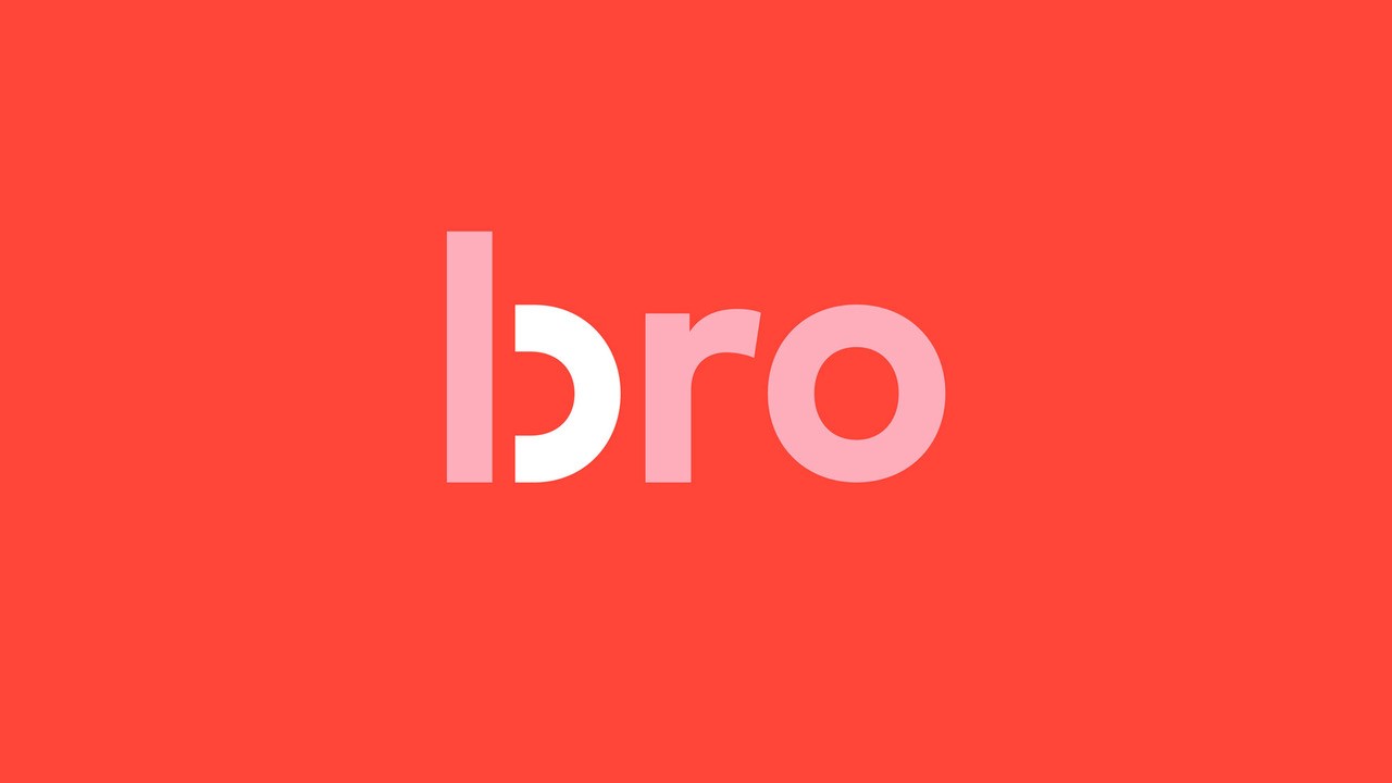
The consultancy, founded 20 years ago by Helle Bro, worked with London-based brand agency Greenspace on a brand transformation to increase the use of the bridge symbolism in the company’s brand. Bro itself means ‘bridge’ in Danish, offering a creative link to the use of bridge iconography in the consultancy’s visual identity.
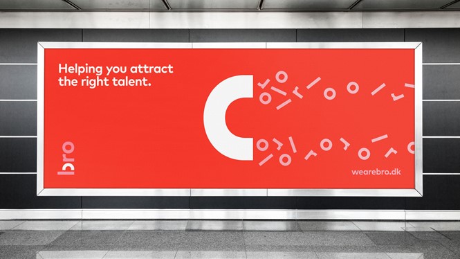
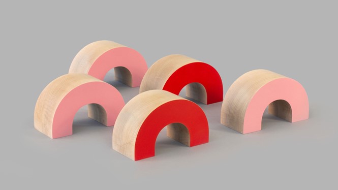
Bro focused on its brand after merging three sub-brands – behavioural company TNC, comms podcast bro FM and the comms consultancy itself. The primary visual device of an arched bridge is effectively a visual indicator of the company's unification and of the areas of communciations in which the consultancy operates.
Lene Nielsen, MD & strategy director of Greenspace says, ”The bro brand transformation has been a really rewarding project for Greenspace, collaborating with bro directly on their purpose and brand strategy to future-proof their business as it enters a new phase, that is backed by strong and coherent design.”
The new design uses a red and pink colour palette to differentiate the brand and deploys an arc shape – representing the eponymous bridge – effectively across the new visual identity. Helle Bro says, “The new identity is warm, friendly and approachable but has the ability to disrupt a marketplace that has generally become quite safe, as we aim to challenge the status quo and continue to deliver our forward-thinking services.”
Greenspace also crafted a system of icons and marketing collateral to be used across the company’s various touchpoints.