#TransformTuesday: 9 January

Every week, Transform examines recent rebrands and updated visual identities. This week's picks are below. For more from #TransformTuesday, follow @Transformsays.
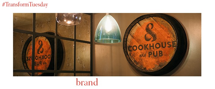
Cookhouse & Pub
Multinational restaurant, coffee shop and hotel company Whitbread plc has launched new brand, Cookhouse & Pub. Lending a more casual air to the sometimes overly-formal gastropub experience, its locations offer a welcome environment which encourages social interaction. Bedfordshire-based creative consultancy Bonfire Creative Intelligence is behind Cookhouse & Pub’s identity, including its signage, wayfinding and digital offering. The reference to ‘togetherness’ reflects Cookhouse & Pub’s unique positioning while integrating it under the Whitbread brand. Stephen Judge, founder of Bonfire Creative Intelligence, says, “Developing a brand for a restaurant chain is a unique challenge. It has to communicate a distinctive and inviting feel to customers from the outside and translate across numerous touchpoints both in the restaurant and digitally.”

Énergir
Canadian marketing communications firm Cossette has delivered a new brand identity, including logo, name, marketing and brand applications, to Canada, Quebec-based energy company Energir. Previously known as GazMetro, the name change signals the utility firm’s attempt to cement itself as the main provider of natural gas in the French-speaking Quebec energy market. Florence Girod, chief strategy officer at Cossette, says, “We imagined a verb, born out of the melding of energize and pioneer. This new name expresses Énergir’s desire to see energy differently and to be part of a progressive movement.”
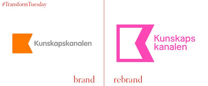
Kunskapskanalen
A Swedish TV channel centred on delivering knowledge, Kunskapskanalen (the Knowledge Channel) began its 2018 progamming by unveiling its latest brand identity. Embedded in the tropes of discovery and functionality, the new design for Kunskapskanlen – developed and implemented by Stockholm, Sweden-based Dallas Motion Agency – takes the concept of the unknown and renders it part of the channel’s brand design. The agency says, “Our new identity for the Knowledge Channel has its roots in the grid of possible knowledge living out there - where a point of contact leads to a host of new ones. Our visual interpretation of this is the classic holeboard. A place where content ordering and clearing guides you through the user experience.”
Lovely Sofas
Yorkshire, UK-based branding agency 10 Associates has updated the visual identity for furniture company Lovely Sofas, a division of Sofas By Saxon. Described as being ‘in hibernation,’ the Lovely Sofas brand faced stiff competition from larger retailers with a strong and established media presence. Focusing largely on the customer experience, Lovely Sofa’s new campaign #LifeOfLovely connects to the impetus behind customers purchasing its products. Matt Deighton, MD of Saxon Furniture Ltd, says, “[10 Associates] totally nailed our brand proposition by redefining what ‘lovely’ meant. The big idea ‘Life of Lovely’ builds a compelling and engaging brand story with a distinct tone of voice. The launch of the brand correlates with a fantastic new portfolio of sofa styles and fabric ranges. We are proud and excited to relaunch the Lovely Sofas brand which now truly delivers on its name.”
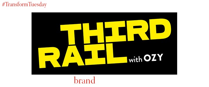
Third Rail With OZY
Responding to the increasingly stark differences in opinion across the US, Third Rail With OZY is a controversial debate show where usually opposing factions meet to discuss topical issues. Based in the US, the format was developed through the merging of digital news site OZY and US broadcaster PBS. Its identity was developed by international brand agency Pentagram, with the bold yellow and black colour palette integrating the existing OZY logo while reflecting the show’s bold and unconventional approach to current affairs. On the Third Rail project page, Pentagram says, “The branding plays off the subway reference of the title, with “Third” and “Rail” crossing in the wordmark to share the common shape – and middle ground – of the ‘H’ and the ‘I.’ The logotype is set in the powerful typeface Ferry, with the conversational Brandon Text as the secondary font.”
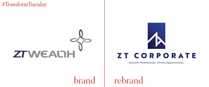
ZT Corporate
US-based full-service wealth management firm ZT Wealth, now known as ZT Corporate, has announced a corporate rebrand across its multiple outposts to better reflect its eye for future growth. Based, and with two offices, in Houston, Texas, ZT Corporate also has offices in Dubai, New York and Pearland. The name change, new logo and brand redesign underpin the company’s continual global expansion while ensuring to pay homage to the relationships ZT Corporate has forged through its Texan heritage.
For more from Transform magazine, follow us on Twitter @Transformsays


