#TransformTuesday: 11 September

Every week, Transform examines recent rebrands and updated visual identities. This week's picks are below. For more from #TransformTuesday, follow @Transformsays
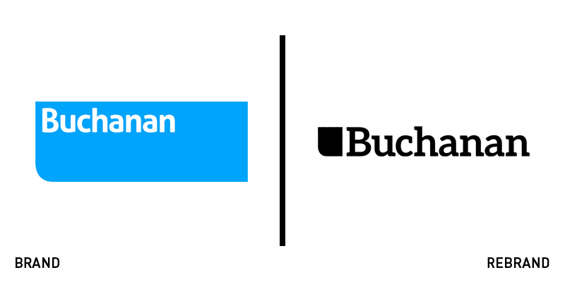
Buchanan
Buchanan, a UK business communications consultancy, has revealed a new brand identity with the introduction of its new corporate website. The rebrand marks a new era for the company, concluding its expansion that included the addition of an in-house design and branding team. The new logo is simple yet strong, achieving an optimum on-screen translation while looking sharp and modern. Bobby Morse, senior partner at Buchanan, says, “The Buchanan brand has a strong legacy which has built up over the years – our brand today reflects the strength of this legacy and couples it with a vibrant look and feel which is representative of our progressive direction of travel.”
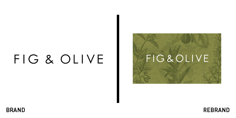
Fig&Olive
US-based restaurant group, Fig & Olive, has decided to refresh its brand and visual identity. While the main elements remain, the brand has enhanced and evolved its brand identity by adding element such as the olive branch and the colour pallet of fresh but muted colours to unify the brand across all platforms and collateral material. Olya Volkova, the designer behind Fig & Olive’s rebrand, says, “The colour palette for interiors is based on traditional colours that you see in the south of France, Italy, Spain – whitewash walls, natural hues of terracotta, green of olive tree leaves.”
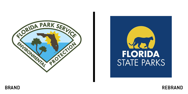
Florida State Parks
The Florida State Parks’ website has been redesigned, promoting the Florida Park Service and giving essential information to visitors about all 175 state parks, trails and historic sites. The new refurbished website has focused on improving its user experience, providing an easy navigation on mobile devises and a robust site search tool. The website also offers a TripTuner, helping visitors plan their trips to state parks. Furthermore, on the website, the new marketing logo can be found, which features the Florida panther, a symbol that reflects the Florida Park Service’s promise for protection and conservation, while highlighting the wild element of the parks.
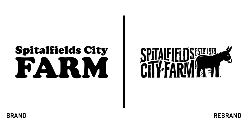
Spitalfields City Farm
In an effort to bring awareness to the east London landmark that is nearing its fourth decade in existence, Spitalfields City Farm has revealed a new brand identity in collaboration with branding agency Living Group. The logo features an illustration of a donkey, the farm’s mascot, in a woodcut style, with iconic building’s, such as the Gherkin, Walkie Talkie and Shard, being discretely seen in the negative space between the donkey’s legs. The woodcut style is consistent across the brand and can be found in a variety of illustrations within the farm, portraying animals, plants, tools and buildings. The illustrations are accompanied by funny, pun-based messaging that makes the brand seem friendly and approachable.
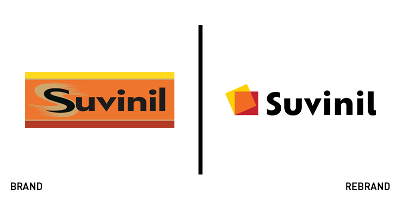
Suvinil
Brazilian paint manufacturer Suvinil has rolled out a rebrand, led by Interbrand São Paulo. Suvinil’s new brand identity has been designed with the goal of making the brand more personable, taking into consideration the fact that customers consider painting their walls a personal experience, as well as a way to express themselves. For that reason, the brand’s packaging copy has been turned into a platform for storytelling. The new logo has kept the brand's core colours, achieving recognisability. However, the identifying colours have been put in a layered symbol, representative of ‘the connection and transparency of Suvinil with the stories of its costumers.’
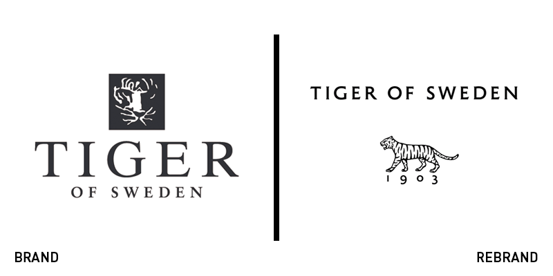
Tiger of Sweden
Swedish fashion house based in Stockholm, Tiger of Sweden, has revealed a new brand identity, designed by Belgian design studio based in Antwerp, A New Archive. The new logo features a modernised version of the symbol used on the original range of ‘Tiger’ suits, back in 1926. Keeping the same theme of honouring the brand’s 115 year-old heritage, the new font is was inspired by a 1960’s marquee, which explains the prominent Roman feature that was common on official Swedish buildings, papers and coins. The new brand for Tiger of Sweden is simple and modern, without losing its classy aesthetic.


