Refreshing rebrand for Oxford University Press
The Oxford University Press (OUP) Education UK division is a department of one of the great universities in the world, the University of Oxford. But the company was struggling to communicate a wider and more diverse offering to its audiences – learners, teachers and parents.
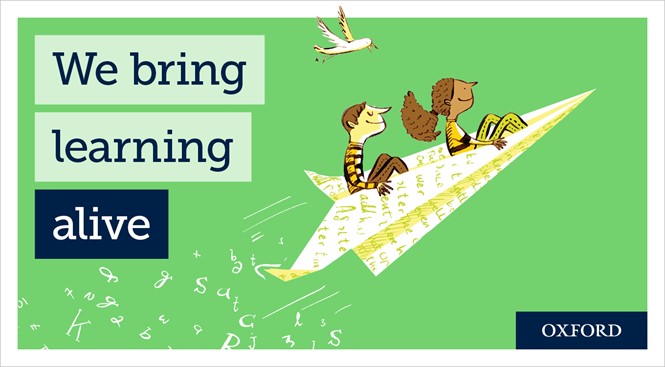
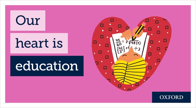
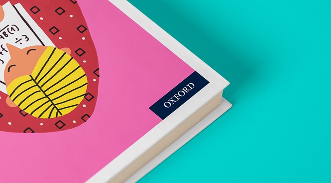
Thus, Oxford University Press has revealed a new identity, partnering with the Brighton, UK-based brand design studio, Baxter and Bailey. Imposing a new lively style of brand and illustration has therefore freshened up the historic OUP image.
The new illustrations have a pure and vibrant sense with equally warm colour covered on each design. Baxter and Bailey also had a creative approach utilising books and letters on the illustrations that could easily catch OUP’s audience’s attention. Additionally, each of the meaningful terms on the design have been developed to promote sincere feelings in them. Heather Atkinson, marketing director of OUP Ed-UK, says, “We’re a diverse and multifaceted brand with a rich story to tell. The team at Baxter and Bailey helped us to articulate that story brilliantly, delivering a suite of versatile, meaningful and heartfelt messages. We can now tell our story to all of our audiences in a genuine engaging way.”
On this rebranding project, Baxter and Bailey had worked on brand strategy, identity, voice, communications and creative direction. The agency also collaborated with designers, including Lindsay Camp, Josh Harrison and Cachetejack. From the freshened image, it is expected that OUP will be able to achieve its objective of excellence in research, scholarship, and education by publishing worldwide. Most of all, along with the rebrand, the OUP could help learning-lovers to have a more energetic participation in learning activities and construct lively imagination in children.
Design director at OUP Ed-UK, Kate Kuncac-Tabinor, says, “Baxter and Bailey is that rare combination of clear strategic thinkers and hugely creative doers. It’s a combination that ensured our visual identity project was built on rock solid strategic foundations but was beautiful and vibrant too. The design team here at OUP Ed-UK are delighted with the result.”
For more from Transform magazine, follow us on Twitter @Transformsays


