Purple sphere inspires safety and flexibility in insurance company rebrand
“We saw this brand review as a significant opportunity to reaffirm and align to our purpose by telling the IAG story more clearly, and to develop a simple, flexible visual identity,” says Brent Smart, CMO of Insurance Australia Group (IAG) about its recent rebrand.
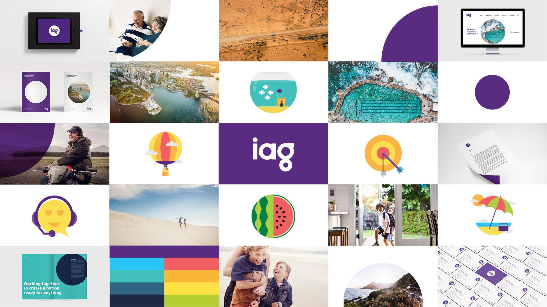
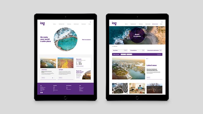
Clearer, simpler and more flexible it most definitely is. Working with Australian brand consultancy Hulsbosch, IAG has unveiled a cheerful, purple and personable new visual identity. The company’s purpose, ‘We make your world a safer place,’ was at the heart of the brand strategy.
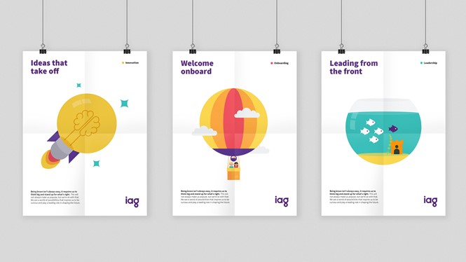
Using a round shape in the main wordmark, and circle devices throughout the visual identity, helps reinforce the idea of safety. But, a new sense of friendliness has also come out of the work. Hulsbosch shifted IAG’s branding from a staid, navy blue, corporate feeling wordmark, to one with a bubbly sans serif typeface, cute illustrations and interesting landscape and portrait photography. A colour palette comprised of bright tones and a rich, velvety purple speaks to the safety message, while also infusing the brand with a new vibrancy that breathes life into its communications.
The resulting brand is more digitally enabled and will help IAG grow and leverage its existing strength as one of the Australian Securities Exchange’s top 50 companies.
For more from Transform magazine, follow us on Twitter @Transformsays