Oreo and Cadbury tempt consumers with sugar-induced joy
Snacks may not bring happiness, but they can definitely help. The perfect companion to a hot cup of tea on a rainy afternoon, Oreo and Cadbury haven't become two of the most well-known snack brands for no reason.
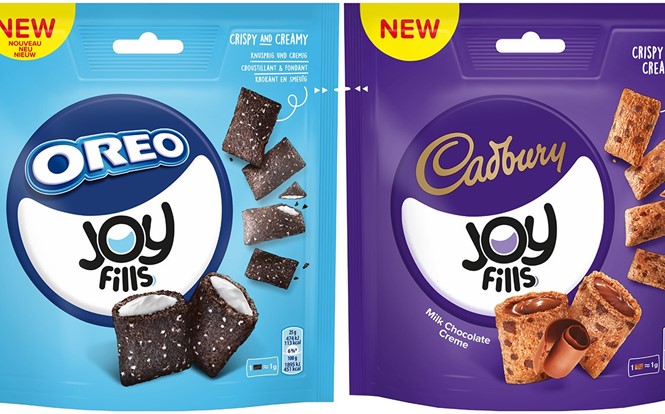
Now, American multinational confectionery, food and beverage company Mondelēz International has introduced a new biscuit snack to the UK market. In collaboration with independent global branding consultancy Dragon Rouge, Mondelēz has created unique packaging to go along with the temptation Oreo offers to every consumer cursed with a sweet tooth.
The brand identity for the new snack, called Joy Fills, combines two of the most popular and loved brands, Oreo and Cadbury, while creating a distinctive new product. The new product is the result of the first collaboration between international power brands, coming together for a single brand.
Steven Saenen, global senior innovation manager at Mondelēz, says, “The launch of Joy Fills in the UK and other European markets marks a big moment for us. We have not spared any effort to craft a product that delivers the great taste consumers expect from our power brands in an uplifting treat that won’t weigh them down, and is easy to snack anytime, anywhere.”
When considering the name of its new offering, the brand’s goal was to find something that could reflect the practicality of the bite side product as well as the emotional effect it has on people. ‘Joy Fills’ manages to do just that, referencing both the cream filling of the chocolate wafers and the jolly feeling it evokes with its consumption.
Dragon Rouge New York’s creative director, Craig Hench, says, “The challenge was to create a distinctive look and feel for Joy Fills that respects the signature elements of the global power brands. We achieved this by leveraging a universal emotion ‘Joy’ and implementing this sentiment across the name and packaging architecture. Our design is simplistic in nature but executed to standout in a crowded shelf environment by deploying familiar category codes and power brand equities.”
The word ‘joy’ was kept as the core value of the new product and was used by Dragon Rouge as inspiration for the design of the product’s packaging. The handcrafted ‘Joy Fills’ wordmark brings emphasis to the word ‘Joy,’ putting it in bigger and bolder fonts, while the letter ‘o’ form Joy contains the iconic Joy Fills smile. The typeface is rounded at the corners, giving it a less sharp and friendlier look. Lastly, the thick, bold letters manage to catch the consumers’ attention, differentiating the product from the rest on the shelf.
For more from Transform magazine, folow us on Twitter @Transformsays


