Kermit the Frog leaps into the world of typeface design

The muppets are an integral part of most people’s childhoods. Whether they were born in the 1960s or 2000s, the figures of Kermit the Frog, Miss Piggy, Gonzo and Statler and Waldorf, offer a nostalgic trip down memory lane.
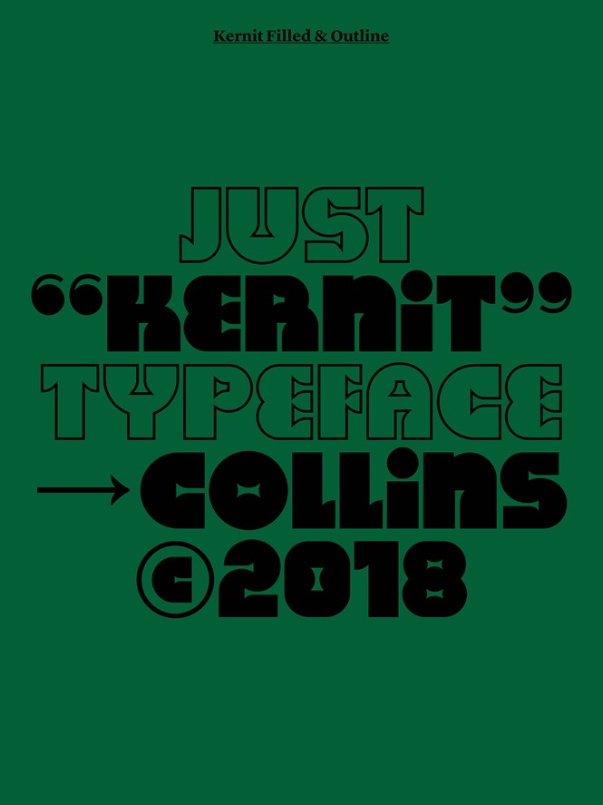
New York-based brand experience agency Collins has designed a new typeface, named Kernit, having drawn inspiration from American artist Jim Henson and his most famous work. The typeface was created in the context of Collins’ design exploration for the Jim Henson Exhibition at the Museum of the Moving Image in New York City.
While trying to build the museum’s exhibitions, Collins was enticed by Henson’s work, creations and characters. The name of the typeface is a graphic designing wordplay referencing the words ‘Kermit,’ the famous puppet frog, and ‘kerning,’ the space between the letters.
Inspired by both Henson’s vibrant and animated world and the late seventies aesthetic, Kernit is fun, quirky, bold and rounded, reflecting most of Henson’s work and paying homage to its brilliance.
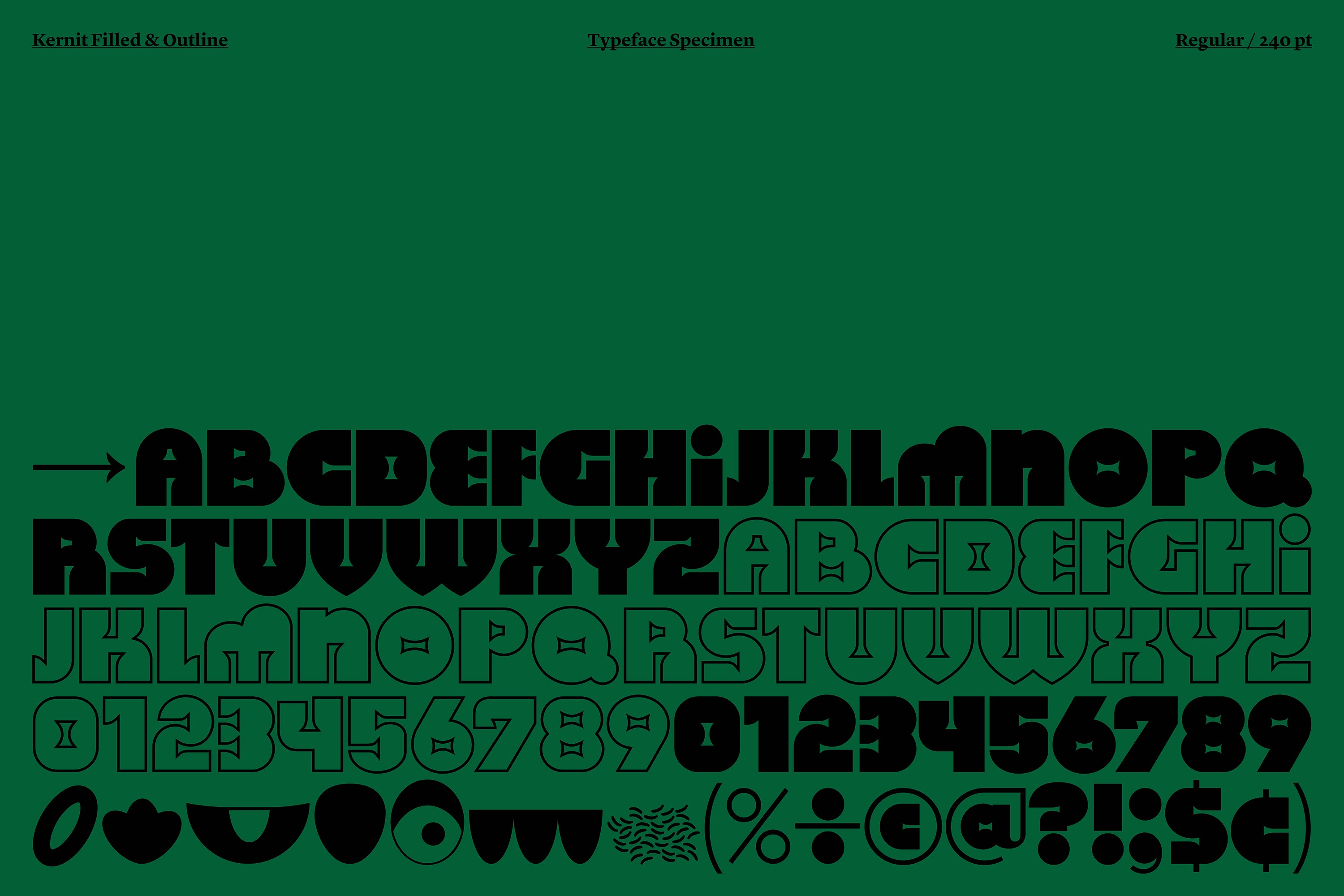
The font has two display weights: Kernit Bold and Kernit Outline. Following the logic of Sesame Street’s ‘Anything Muppets’ the ‘empty’ Muppet heads where facial features, bodies and clothes could be added to create any kind of character, the display weights are designed in a way that allows them to be used interchangeably, bringing visual variety to the designs, or what graphic designers call, alternating rhythm.
You can download Kernit for free here: https://justkernit.com
For more from Transform magazine, follow us on Twitter @Transformsays