Controversial crest redesign for Leeds United
Located in the county of West Yorkshire, the city of Leeds is the UK’s fourth biggest urban economy. The city is the largest financial and legal centre after London, and its dense urban population means, among other things, that Leeds is historically represented across all the UK’s major sports. Its football club, one of the best-known in the English league, dates to 1919. Yet Leeds United is currently embroiled at the heart of one of English football’s biggest design-based controversies.
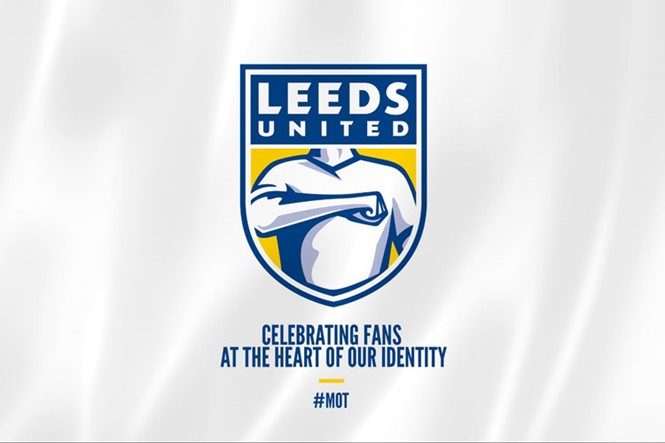
Following a six-month period where 10,000 people were consulted digitally and via focus groups and interviews, the club retains its famous blue and yellow colour palette while updating its imagery for the contemporary football era. Forgoing the previous white rose of Leeds and ‘LUFC’ abbreviation, the new badge now sees a Leeds United wordmark in white, set atop a blue background. As the club’s 11th badge, it was also designed to celebrate 100 years of Leeds United. And for Angus Kinnear, managing director of Leeds United, the redesign marks a new era of positive change for a club which has not always enjoyed the most savoury of reputations.
“Once we heard that there was a desire for change to help herald a new era for club, it became of primary importance that the new crest clearly reflected who we are,” says Kinnear. “Everybody knows how proud and passionate the Leeds United fans are, but since I arrived at the club, I have been in awe at the unique connection between the fans and the team.”
Yet, with some commentators comparing Leeds United’s new badge design to well-known British brands, such as indigestion relief Gaviscon, the design team’s depiction of the famous ‘Leeds salute’ seemingly fails to reflect the club’s underlying sentiment. Commenting on the decision to include this as the lead motif, Leeds United says, “Over the decades, the salute has been an expression of the passion that connects players and fans, on and off the pitch. It is used extensively, notably on match days during the club’s famous song ‘Marching on Together’, and it is a symbol that instantly connects fans all over the world.”
Kinnear continues, “Updating the crest is not a decision we have taken lightly, but we are proud to have a new crest that is authentic to Leeds United and honours the quality and loyalty of our fans. It is a symbol of ‘strength in unity’ and a proud expression of the club’s identity and history."
However, despite its quest to address the club’s authenticity, many football fans remain unhappy. A petition to withdraw the proposed redesign in favour of a fresh identity has reached almost 70,000 signatures at the time of writing; Leeds United has confirmed it will reopen consultation on the design, indicating just how volatile branding in a football environment can be.
Given the broadly well-received rebrand of Juventus, a top-league club located in the Italian city of Turin, delivering a smart, modern design to a football club steeped in history is not an impossible feat. For Leeds United, however, the problem lies not only in the execution; it is the design and implementation of a club badge which at least 70,000 people feel simply does not reflect the true meaning of being a Leeds United supporter.
Picture courtesy of Leeds United
For more from Transform magazine, follow us on Twitter @Transformsays
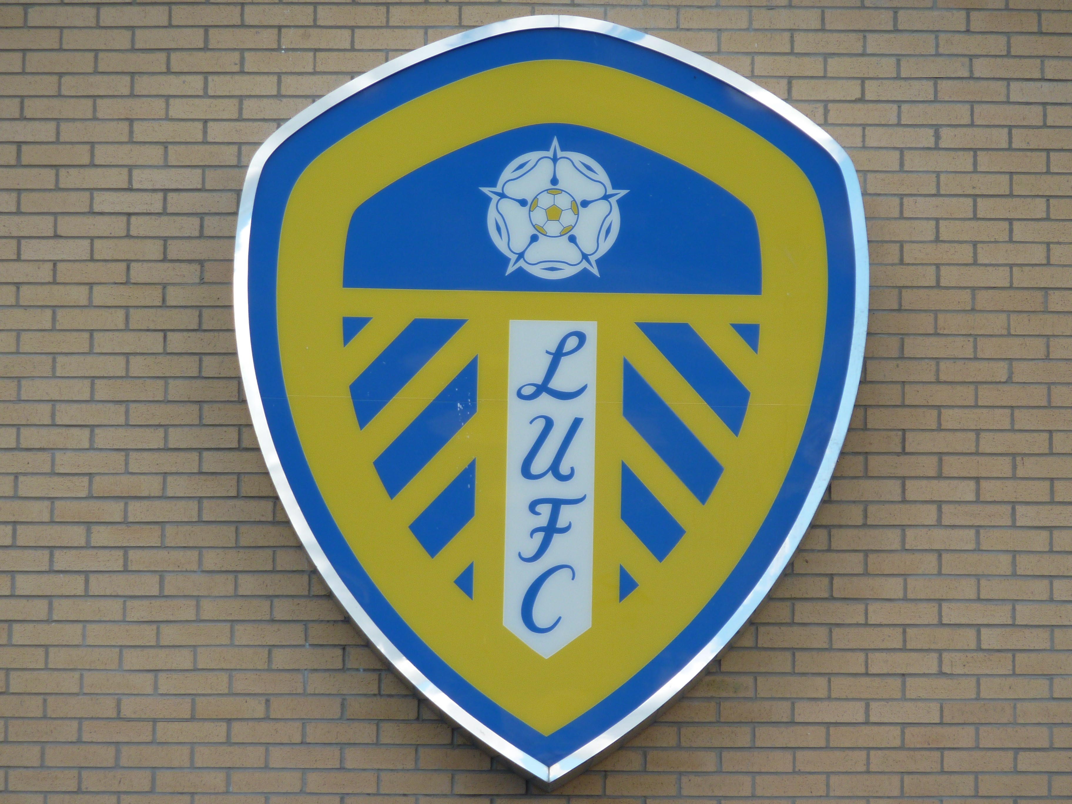
Previous Leeds United logo at the Elland Road ground
Update: Leeds United has now reopened its consultation process regarding the new crest, allowing fans a deeper involvement in the process. The new crest has been put on hold, with any references to it on the Leeds United website since deleted.


