#TransformTuesday: 9 May
Every week, Transform examines recent rebrands and updated visual identities. This week's picks are below. For more from #TransformTuesday, follow @Transformsays
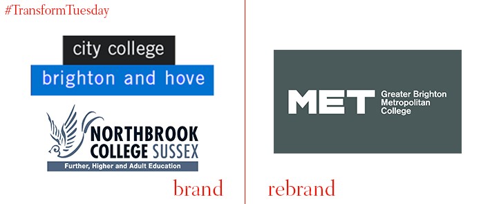
Met
Brighton-based vocational colleges City College Brighton and Hove, and Northbrook College Sussex, have merged to create one new institution and brand. Brand design agency Baxter & Bailey, also based in Brighton, developed the unique identity formed from its name ‘Met’ – the college’s in-house design team carried out the brand implementation. Short for Brighton Metropolitan College, the ‘Met’ moniker suggests a wider urban world outside of Brighton to which its almost 13,000 students can aspire. Its bold, sans serif font has three letterforms for use across Met’s five campuses. Speaking to Design Week, creative director at Bailey & Baxter, Matt Baxter, says, “The emphasis with Met is on providing a more direct route into the world of work... The exuberance and joyfulness of the expressions are an attempt to convey the college as a creative alternative to traditional academic routes.”
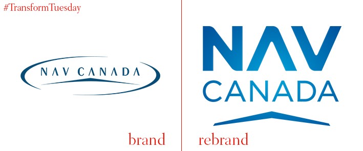
Nav Canada
Privately owned, not-for-profit company Nav Canada, which provides civil air navigation services across Canada, has completed a new in-house corporate rebrand, with logo. The company has evolved its visual identity after 20 years, updating its previous signature with a more modern and vibrant blue to reflect blues hues of the sky. Neil Wilson, president and CEO at Nav Canada, says, “With two decades of exceptional service behind us, we have matured as a company. It’s an exciting time to be an employee of Nav Canada as we are among the leaders of some of the most revolutionary advancements in air navigation. Our new branding and logo reflects our passion to be best in class.”
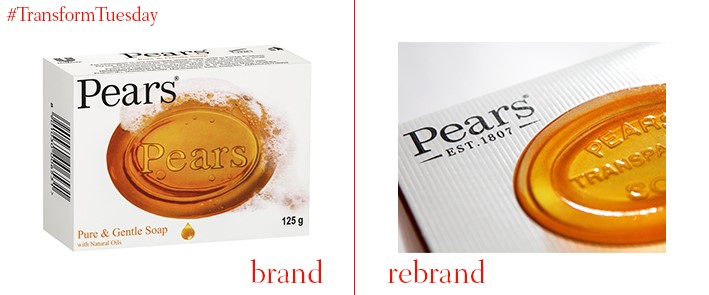
Pears
Premium soap brand Pears has been rebranded by global design and branding agency Hornall Anderson, in a bid to reinvigorate its audience base. Playing on Pears’ historical credentials, the new packaging design reflects classic features of the soap – for example, contoured packaging for a tangible, textured feel. Hornall Anderson also updated Pears’ logo, with features including its 1807 founding date in bold lettering. Kim Van Elkan, managing director at Hornall Anderson, says, “The packaging we have created for Pears dials up its brand heritage, authenticity and the natural quality of the ingredients, creating a more premium feel. This will help the product appeal to its target consumers, who value brands which stand the test of time and who value authenticity.”
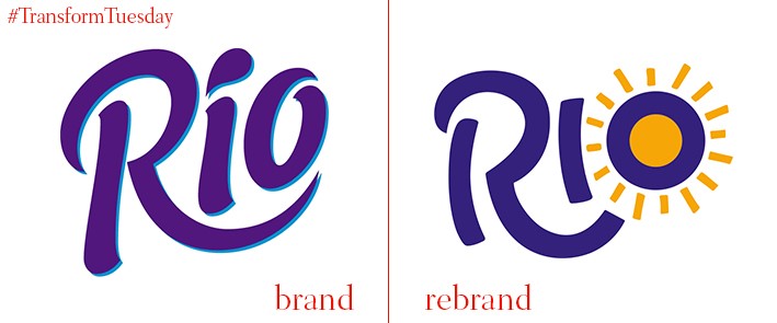
Rio
Fruit-based fizzy drink Rio was launched in the mid-1980s to provide an alternative to the non-fruit fizzy drinks which dominated the soft drinks market. Over 30 years later, international branding agency Pearlfisher has developed a contemporary, illustration-led design for the next generation of Rio branding. Rio’s new design taps into happy and colourful nature of Brazilian culture and its new visual identity moves away from the kitsch aesthetic of old. Yael Alaton, strategy director at Pearlfisher, says, “In considering the role that Rio plays in the life of its consumer – a younger, down-to-earth demographic with a balanced approach to health – we identified an opportunity for Rio to own a ‘feel-good moment’ in a day and defined a set of brand principles inspired by a central strategic vision ‘Celebrating the sunny.’”
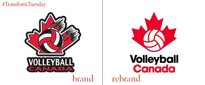
Volleyball Canada
Vancouver-based branding agency Hulse & Durrell has evolved the logo for 64-year old sporting organisation, Volleyball Canada. The organisation represents around 80,000 players at every level, from amateur to professional, and is also responsible for the sport’s countrywide growth and development. Hulse & Durrell has created a bold new identity which aims to reinforce the popularity of volleyball since the Rio 2016 Olympic Games – the corresponding #defygravity hashtag reinforces the sport’s powerful credentials. On its project page, the Volleyball Canada page says, “The new emblem sheds the complexity of previous incarnations. An evolved icon to represent a new generation of athletes.”
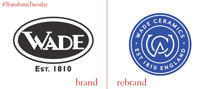
Wade
Historic Stoke, UK-based ceramics company, Wade, has recently released its updated brand identity. Developed by Chester-based brand design agency Armstrong, the revamped design reflects Wade Ceramics’ business heritage and identity – a ‘W’ and ‘C’ form the entwined logo centrepiece and an animated 3D design highlights the company’s heritage. The rebrand comes after Wade restructured its product sectors. The company’s renewed focus on spirits, fragrance, home and food is reflected in the professional and high-quality aesthetic of Wade’s new marketing collateral.


