#TransformTuesday: 8 August
Every week, Transform examines recent rebrands and updated visual identities. This week's picks are below. For more from #TransformTuesday, follow @Transformsays
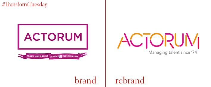
Actorum
At once a talent agency and workers co-operative, London-based Actorum was established in 1974. The uniquely personal approach the company takes is reflected in a renewed brand identity, tone of voice and brand guidelines, all developed by London-based graphic design agency Lloyd Northover. Actorum’s previously pixelated and somewhat bland logo is modernised, with a lilac and orange colour palette providing the excitement with imbues the talent agency industry. Amy Loughton, lead agent at Actorum, says, “We’re delighted at Actorum to refresh our brand & reveal our current energy and focus, without forgetting our unique history. Actorum is forever changing to reflect the individuals that make us and as lead agent, I’m excited to update the industry and move us forward into our next chapter.” For Actorum, Lloyd Northover also developed a new narrative and proposition summary, redesigned stationery and merchandise and a new website design.
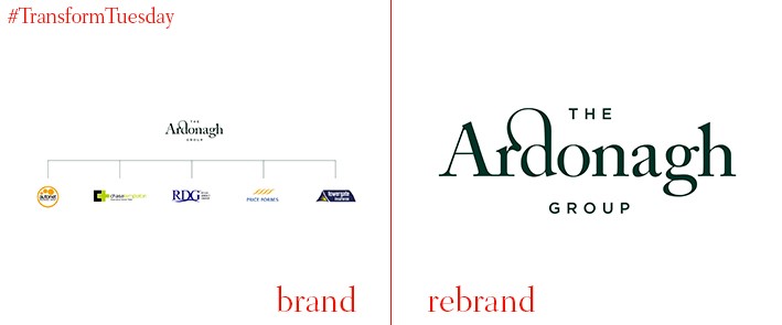
The Ardonagh Group
An exercise in streamlining brand architecture sees the Ardonagh Group release its updated brand offering, negating use for its five separate sub-brands in its visual identity. Implemented by independent London-based creative agency Rufus Leonard, the Ardonagh Group is officially the holding company brand for insurance firms Autonet, Chase Templeton, Direct Group, Price Forbes and Towergate. With most of the Ardonagh Group companies British in origin, Rufus Leonard ensured this heritage reflects in the group’s new visual identity through design topes such as a leading racing green colour palette and a classic typography style. Sharon Hough, director of strategy and proposition at Ardonagh, says, “Finding a unique company name and creating a strong identity for a new holding company is no mean feat, so we’re delighted with the look and feel of the Ardonagh Group. We’ve [brought] to life not only the British heritage aspect, but also the elements of strength, resilience, insight and the power of the group coming together.”
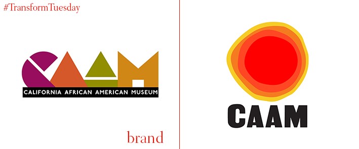
California African American Museum
The California African American Museum (CAAM), was established in 1977 under a charter from the state of California. LA-based brand design agency Julia Luke Design has undertaken a drastic brand overhaul for the museum, considering everything from its logo to the website design and staff t-shirt branding. While CAAM’s previous logo reflected traditionally African tropes in its shapes and shades, it was perhaps looking a little tired – Julia Luke Design’s work now creates a sense of optimism and forward-thinking. However, adherence to the iconic ‘I AM A MAN’ poster from the 1968 Memphis sanitation strike in the new CAAM font maintains the museum’s ties to its troubled past, and what it strives to achieve. The end result is at once bright and compelling, while reflecting the very reason for the museum’s existence.
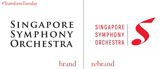
Singapore Symphony Orchestra
Developing a distinctive logo for the Singapore Symphony Orchestra, Singapore’s flagship orchestra, was a top priority in its brand development project. Carried out by Singapore-based brand design agency Vantage, the redesign was much needed for an organisation which has existed since 1979. Based on a musical note, as well as the leading ‘S’ of the organisation’s name, the image created by Vantage reflects the purpose and ambition of the orchestra. The agency also developed three brand pillars from which to work – ‘artistic excellence,’ ‘community engagement’ and ‘the diversity of the Singaporean spirit.’ Vantage says, “We created a brand identity system that placed diversity at the heart of communications. Without alienating classical music aficionados, we created a structure for headlines to engage newer audiences in a more inspiring way. In addition, we introduced a spectrum of colour to convey diverse performances with a distinctive system of photographic and illustration style working seamlessly together.”
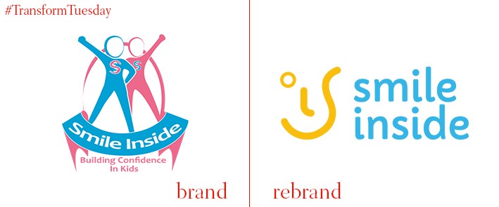
Smile Inside
Hampshire, UK-based design agency Faculty has unveiled a refreshed identity and website for Smile Inside. A provider of indoor and outdoor learning workshops for children, Smile Inside aims to deliver confidence-building, character-enhancing and fun days out for children who may struggle for fulfil these needs either at home or at school. Simplifying the brand, Faculty has streamlined Smile Inside’s logotype, visual identity and colour palette; it no longer conforms to what might be considered a gendered colour approach. Instead, bright blues and oranges reflects the happiness with which Smile Inside operates – and what it aims to bring out in its children.
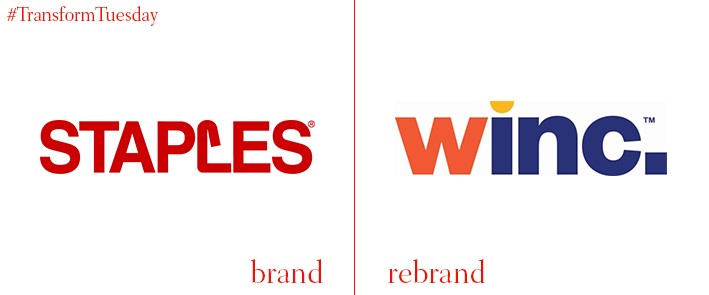
Winc
Australasian branches of iconic stationery and hardware brand Staples have rebranded, following an acquisition by leading US M&A firm, Platinum Equity. Previously known as Staples Australia and New Zealand, the retailer will henceforth be known as Winc – derived from the phrase ‘work incorporated.’ International brand agency FutureBrand is behind the brand strategy and design rollout, which sees a lowercase block font adopted in a total departure from the bright red design of Staples’ previous offering. FutureBrand is also careful to reflect Winc’s new solution-led approach and updated digital offering, which should cement it firmly as a challenger brand in a competitive market. Winc chief executive, Darren Fullerton, says, “This brand is designed to bring a breath of fresh air to an industry that has been historically quite traditional and predictable. By its nature, it also gives us the ability to flex and add adjacent solutions and offerings to meet our customers’ needs, both now and into the future.”


