#TransformTuesday: 4 July

Every week, Transform examines recent rebrands and updated visual identities. This week's picks are below. For more from #TransformTuesday, follow @Transformsays
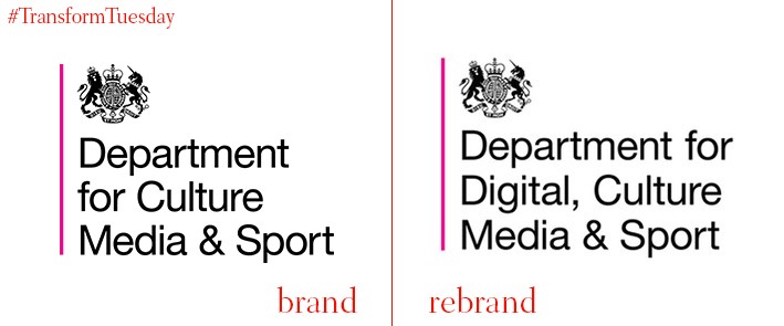
Department for Digital, Culture, Media & Sport
In the UK, the governmental department responsible for societal enrichment has updated its name to better reflect the changing needs of a society increasingly reliant on digital. In a change effective from today, the department often jokingly referred to as ‘the Department of Fun’ - Department for Culture, Media & Sport - now has 'Digital' in its name. However, the department remains abbreviated to DCMS in all communications. Secretary of state for the DMCS, Karen Bradley, says, “DCMS celebrates its 25th anniversary this year, and it is fitting now to include ‘digital’ in the name. The department has taken on significant new responsibilities in recent years, so that half of its policy and delivery work now covers the digital sectors.”
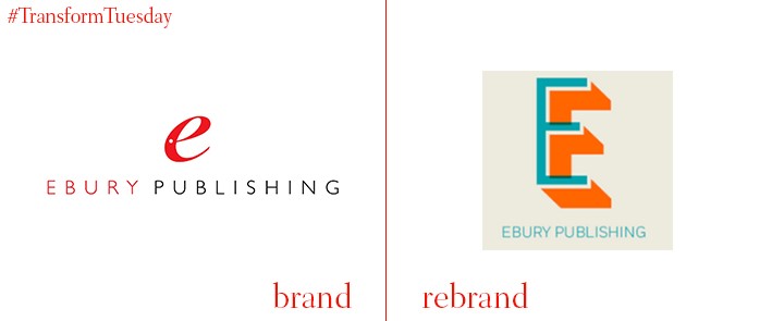
Ebury Publishing
Ebury Publishing, the non-fiction specialist and B2B arm of renowned publisher Penguin Random House, has launched its updated visual identity. Created in conjunction with London-based design and branding studio Form, Ebury Publishing uses a bright orange as its lead colour to highlight its connection to the parent brand. Speaking to the Bookseller, publisher and deputy managing director of Ebury Publishing, Jake Lingwood, says, “Ebury Publishing is a B2B brand and we wanted a logo that gave agents, authors and booksellers a feel for the qualities that make us a stand-out company – we are creative, commercial and great people to work with. We wanted something that reflected that but that doesn’t look ‘corporate.’ We are first and foremost a creative publishing house."
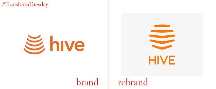
Hive
Smart home brand Hive, owned by UK-based energy provider British Gas, was a market pioneer in the remote home environment controls sector. Following a design update and visual identity overhaul by global design agency, Wolff Olins, Hive announced an expansion into seven North American markets – Houston, Dallas, Washington D.C., Atlanta, Denver, Seattle and Vancouver. Rosie Isbell, design director at Wolff Olins, says, “We needed to help the Hive brand be human in a tech-heavy and confusing market. All while creating a design system that could be stretched across their entire experience. We worked closely together to help them implement the new identity at speed and get it out to consumers as quickly as possible.”
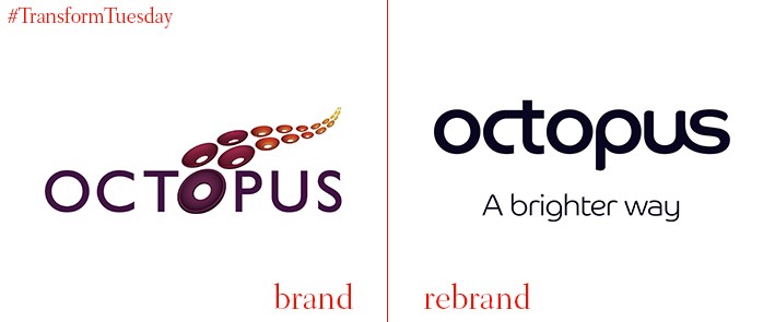
Octopus Group
In late June 2017, UK-based investment management company, Octopus Group, announced the consolidation of its six existing businesses under one umbrella brand. In a streamlining of the company’s brand architecture, Octopus Investments, Octopus Healthcare, Octopus Ventures, Octopus Energy, Octopus Property and Octopus Labs are collectively now known as Octopus Group. The rebrand is reinforced with the launch of a television advertising campaign, built on the Octopus Group ethos of the best improvements only possible through questioning. The advertisement, produced by MPC Creative and Julian Borra from the Thin Air Factory, sees question marks taking the form of flying birds which together reflect unity and strength. Seb Dreyfus, chief marketing officer at Octopus Group, says, “We wanted a compelling piece of creative to demonstrate the distinctiveness of our new group brand and to underline that there is a brighter way to do business. Our businesses have a shared mission to work with our customers to make tomorrow better than today.”

Pepsi Twist
After a rebrand exercise led by AlmapBBDO creative director, Marcus Sulzbacher, the São Paulo, Brazil-based creative agency has released the latest design for global lemon flavoured drink, Pepsi Twist. AlmapBBDO recommissioned the previous lemon-shaped figure which formed the basis for Pepsi Twist adverts in Brazil and beyond; its hand-drawn style and dynamic movements lead the overall brand message. A subtle green and blue colour palette breaks from the luminous oranges, reds, yellows and metallic blues generally designated to soft drink can design. The result is contemporary, forward-thinking and provides contrast in both a crowded marketplace, and with the usual black Pepsi designs.
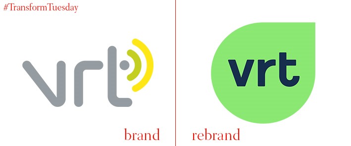
Vlaamse Radio - en Televisieomroeporganisatie (VLT)
Launched in 1930, Vlaamse Radio- en Televisieomroeporganisatie, or VLT, is the public radio station which broadcasts across Belgium’s north-eastern region, Flanders. Despite the station’s longevity, its VLT name was consolidated in 1998 and the station has just announced the launch of its new corporate brand, developed in conjunction with independent global design consultancy, Pentagram. VRT has matured its previous visual identity, with its somewhat generic and internet provider-esque logo, to a listener-centred design befitting of the digital age.


