#TransformTuesday: 4 April
Every week, Transform examines recent rebrands and updated visual identities. This week's picks are below. For more from #TransformTuesday, follow @Transformsays
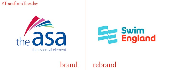
Swim England
The governing body for swimming in the UK, previously known as the Amateur Swimming Association, has rebranded as Swim England. With a history spanning almost 150 years, the organisation decided it required an identity refresh to better suit its aims and achievements. This included unifying its brand architecture, such as its water polo arm, under the same visual identity to ensure the Swim England parent brand is easily identifiable. Swim England’s strategy consists of six key targets: to provide strong leadership, to substantially increase the number of people able to swim, to grow the number and diversity of people regularly swimming, to create a ‘world-leading’ talent system, to improve the workforce and strengthen ‘organisational sustainability.’
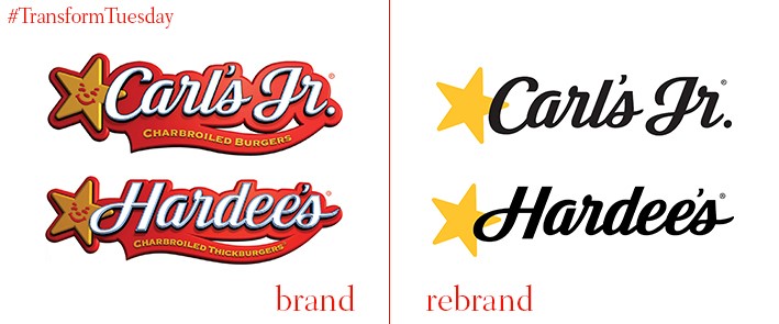
Carl's Jr and Hardee's
Despite sharing identical logos and colour palettes, US-based food chains – Carl’s Jr and Hardee’s – have existed as separate fast food restaurants since the second half of the 21st century. While their parent company, CKE Restaurants Holdings, Inc, employed a marketing strategy featuring scantily-clad models for many years, the corporation decided on the need for a mature visual update. This involves a toned-down visual identity and a foregoing of both chains’ iconic red in favour of black font and a simplified yellow star. Mike Murphy, president and chief legal officer for CKE Restaurants, says, “[Our] extensive history of pioneering innovation is at the heart of this new campaign, and we couldn’t be more excited to not only continue evolving our brand, but also to share our story with a whole new generation of restaurant goers.”
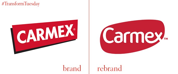
Carmex
Developed by Milwaukee-based Carma Laboratories Inc. since 1937, the Carmex brand produces treatment for chapped lips, dry skin creams and cold sore treatment. The New York-office of global branding agency, Anthem, has updated the Carmex brand identity, simplifying its visual offering and optimising the brand for digital. Its rounder edge adds a modern aesthetic to the historic brand; retaining the iconic white/red colour scheme and yellow packaging ensures brand equity is uncompromised. In a statement, Anthem says, “Through design-focused consumer research, Anthem developed brand positioning, a scale-able brand & product architecture, and beautiful packaging designed to modernize the brand and increase shelf-impact and navigability.”
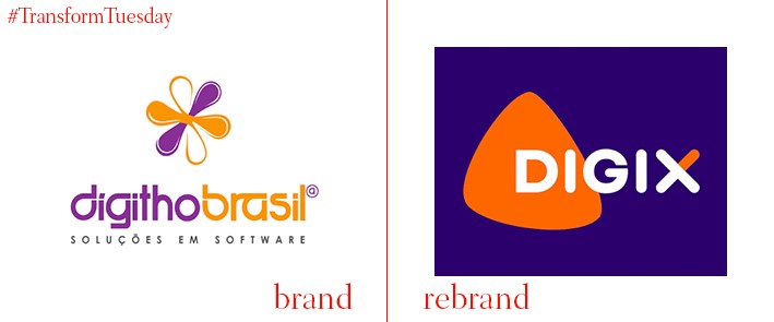
Digix
Digix is a Brazil-based IT solution provider working in the public management sector. Developed in-house, Digix was previously known as DígithoBrasil – the name-change was part of the year-long internal rebranding project. The company has been in operation for around 15 years and retained its identity for much of the previous decade. While its striking purple and orange company colours remain, Digix’s overall identity is much simpler, with the brand concentrating on three main aspects: ‘Focus on people,’ ‘Doing different,’ ‘Collaborate always,’ and ‘Plan, deliver, learn.’
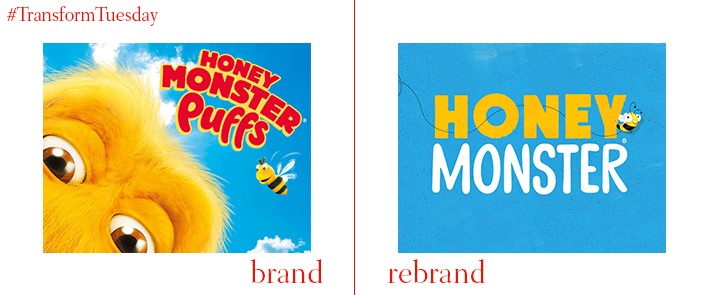
Honey Monster
Leeds, UK-based creative agency, Robot Food, has given the iconic Honey Monster a makeover in order to communicate the balance of nutrients and reduced sugar levels of the product previously known as Sugar Puffs. Robot Food lends the renamed Honey Monster Puffs a more natural aesthetic, complemented through packaging illustrations which encourage consumer engagement with the cereal’s target audience – children. Mike Johns, senior designer at Robot Food, says “We’ve got rid of the nasties from the design and made it purer and more natural, with less CGI….The main thing was to modernise the dated design.” Consultancy Peepshow has also created an animation to be released alongside the new branding.
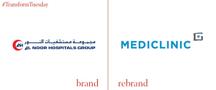
Mediclinic
After South Africa-based Mediclinic merged with Abu Dhabi-based Al Noor Hospitals Group in February 2016, all Al Noor Hospitals facilities in Abu Dhabi, Al Ain and the Western region have rebranded as Mediclinic. In a statement, the company says, “…the complete rebranding of all units will take approximately one year to complete. However, the necessary procedures for renaming all Al Noor hospitals is complete and they will be rebranded as Mediclinic from April 3, 2017.” Online magazine Gulf Business reports that the merged company has 73 hospitals, 35 clinics and over 10,000 beds in South Africa, the UAE and Switzerland.


