#TransformTuesday: 29 August
Every week, Transform examines recent rebrands and updated visual identities. This week's picks are below. For more from #TransformTuesday, follow @Transformsays
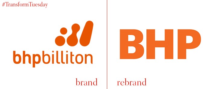
BHP
Global resources corporation BHP began life as BHP. When, in 2001, the company merged with the South African mining corporation Billiton, it became known as BHP Billiton. However, 16 years later, the company returns to its original brand name; the rebrand aims to consolidate the mining company’s global identity. Despite the addition of ‘Billiton’ in 2001, research indicated that on a familial level the company was still known as BHP – the moniker ‘BHP Billiton’ felt too cold and corporate for a company which wants to connect with people on a household level. Geoff Healy, chief external affairs officer at BHP, says, "We fundamentally believe that, as society changes, it is up to us to make the case more confidently and effectively for the positive role that well-run and responsible companies play in society."
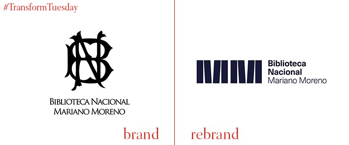
Biblioteca Nacional Mariano Moreno
The Biblioteca Nacional Mariano Moreno (in English, the National Library of the Argentine Republic), located in the Argentine neighbourhood of Recoleta, is the largest library in Argentina and considered one of its most important social and historical institutions. Its latest structure, open since 1992, recently revealed a new visual identity, the result of a logo contest held by the institution earlier in 2017. From 750 entrants, its winner was a design created by a firm called B. Estudio/Taller, which itself is made up of students from the University of Buenos Aires. On its portfolio page, B. Estudio/Taller explains how library’s importance and relevance to Argentine culture lead the studio to base its winning design on three key pillars. “[First] the identity of the library, its history and singularities, what makes it stand out compared to similar institutions. [Second] its function: organising, storing and compiling information to help us understand the world around us. [Third] The object around which the library revolves. The volumes where the data lives: books,” says B. Estudio/Taller.
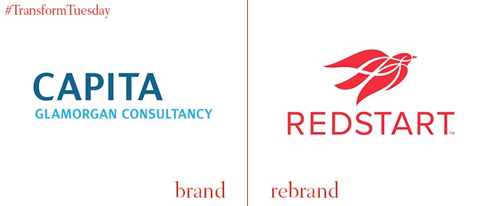
Redstart
The South Wales county of Glamorgan is home to three of the largest local authorities in the country – Bridgend, Merthyr Tydfil and Rhondda Cynon Taf. In a joint venture between them and the organisation previously known as Capita Glamorgan Consultancy, now Redstart, vital infrastructure is provided while sidestepping long tender processes. However, the joint venture lacked any sense of localisation, with its corporate identity too closely associated with the Capita group brand. To reinforce the organisation’s credentials for the area, Cardiff, Wales-based brand consultancy Clout Branding created an identity based on the local Redstart bird, highlighting the venture’s importance to the local area and the vital part it plays in everyday life. Clout Branding says, “The new brand has reinvigorated the joint venture and instilled a new sense of pride and purpose. It has allowed the organisation to have conversations beyond the joint venture area and Wales itself, creating new opportunities.”
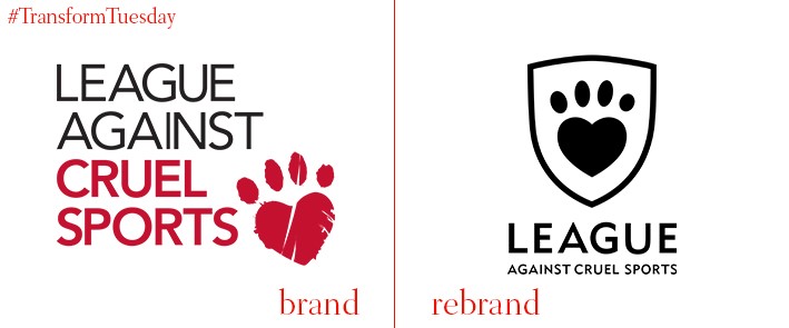
League Against Cruel Sports
Founded in 1924, the League Against Cruel Sports is an animal welfare charity aiming to prevent animal cruelty towards foxes, dogs, stags, otters, hares and others across the UK. Almost a century since it began, however, and the league is still campaigning against many of the injustices being carried out against animals. To put the animals for which it is concerned at the centre of its historic brand, the league has launched a new visual identity and logo. Designed by UK-based brand and marketing agency ArthurSteenHorneAdamson (ASHA), the League Against Cruel Sports’ renewed branding aims to move away from the notion of animals as helpless and tortured. Its use of realistic and confident imagery, alongside a predominantly black and white colour palette with orange highlights, instead empowers the animals and emphasises their existence as sentient beings.
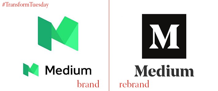
Medium
Online publishing platform Medium has released a new logo, after only updating its previous brand identity back in 2015. Replacing a 3D, bright green M which symbolised the website and its associated digital and social media platforms, Medium’s new design sees the company evolve from the simpler, monochrome offering it used in 2012. The new design is tasteful, aligning the publisher more closely with the type of quality digital content for which it has become known. It has also been critically well-received in contrast to the previous 2015 design, which was met with confusion by some sections of brand design community.
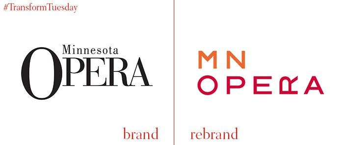
Minnesota Opera
Founded in 1963 by the Walker Art Centre, the Minnesota Opera is based in Minneapolis in the state of Minnesota. The Minnesota Opera has a reputation for producing performances which deviate from the standard operatic repertoire, reflect in a recent rebrand by the Minnesota Opera’s inhouse design team. The organisation aims to challenge norms and, according to the Minnesota Opera Twitter feed, the new design ‘captures our passion for innovation in opera.’ This is exemplified through the placement of the ‘R’ of ‘OPERA’ in a non-standard, sideways format and an accompanying palette of visual elements, whose patterns are based on soundwaves and become more complex according to the complexity of the opera.


