#TransformTuesday: 21 November

Every week, Transform examines recent rebrands and updated visual identities. This week's picks are below. For more from #TransformTuesday, follow @Transformsays.
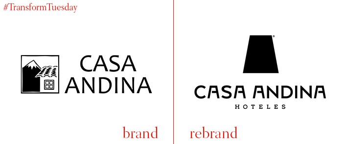
Casa Andina
The Lima office of international branding studio IS Creative Studio has launched a new logo and associated graphic identity for Peruvian hotel chain, Casa Andina. Founded in 2003, the brand currently has 27 hotels under the three sub brands – premium, select and standard. IS Creative Studio developed an identity based on the Casa Andina ethos, which aims to provide travellers with an authentic travelling experience as possible based on the local attractions. A trapezoid shape leads the rebranded logo, reminiscent of the classic Inca polygon found across Peruvian architecture, infrastructure and the environment.
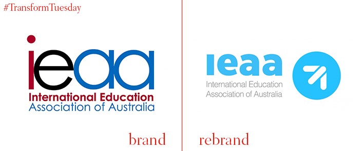
IEAA
October’s Australian International Education Conference (AIEC) saw the International Education Association of Australia (IEAA) launch its new brand, which includes a logo, website and the inclusion of a positive tone of voice. The change, implemented following a year-long process, aims to differentiate the IEAA from its affiliate organisations and change the IEAA’s agenda to one of advocacy and lobbying. The chief executive of the IEAA, Phil Honeywood says, “One of the key objectives of our current strategy is to position IEAA as the ‘top of mind’ organisation for Australia’s international education sector. Our new brand positions IEAA as a modern, progressive organisation and really strengthens our value proposition to members, stakeholders and government.”

Kickstarter
Kickstarter has launched a revamped brand identity, including a new logo, updated website and accompanying digital identity. A leading brand in the crowd-funding platform space, Kickstarter in collaboration with New York, US-based design studio Order, has embraced a monochrome, minimalist identity not unlike something offered by an online design magazine. This is at odds with the bright colours and quirky visuals recently embraced by many online-led brands such as eBay and Dropbox. Yet, by embracing two new fonts in Cooper Light and Maison Neue, Kickstarter provides a clear contrast with the expanded logo and ensures the platform remains easy to navigate for those looking to fund innovative projects.
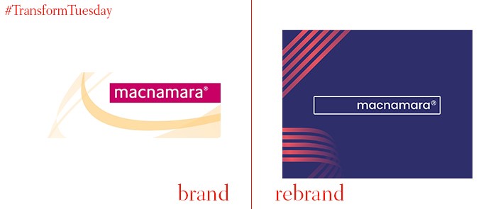
Macnamara
London-based IT and telecommunications support group Macnamara has launched a new visual identity, following a rebrand project led by London-based brand design agency, Nalla. Macnamara, which shares free insights and information with clients to enable them to feel more in control of their own IT systems, required Nalla to develop a fresh brand to demonstrate the firm’s commitment to providing ‘human first’ IT services. Kirsty Tavendale, designer at Nalla, says, “Macnamara has such a unique proposition within the IT world that it was vital for us that it didn’t just look like ‘any other IT company.’ We wanted to ensure its clients see it as a company that is a true partner, and a support, who’ll be honest and professional.”
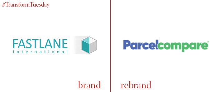
ParcelCompare
The parcel delivery comparison website previously known as FastLane International has undergone an in-house rebrand, including an updated website, logo and name. Henceforth known as ParcelCompare, the site enables customers to compare prices for parcel couriering to 220 countries. Head of consumer research at ParcelCompare, David Jinks, says, “‘ParcelCompare’ describes exactly what we now do. Customers can compare prices and shipping times for all the leading quality couriers such as UPS, DHL and TNT and book in minutes. Make no mistake, ParcelCompare will be just as fast as Fastlane International, and now serves over 220 countries around the world, giving an unbeatable range of choice on international shipments as well as a matchless UK service.”
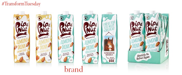
Pip & Nut almond drink
UK-based brand Pip & Nut, known for its various nut and nut-based butters, has launched into the cows’ milk alternatives category with its Pip & Nut almond milk. London-based B&B Studio, which has worked with Pip & Nut founder Pippa Murray since the branch launched in 2014, led the design work. It sees the cartons retain the unique Pip & Nut design while using brand language and illustration-led packaging to create a unique position in a competitive category. Shaun Bowen, founder and creative partner at B&B studio, says, “With complexities around whether dairy alternatives can be branded as milk, we translated the white background of the Pip & Nut butters packaging into a representation of the product, embracing the existing style so that the branding remained recognisable to the core customer base but subtly reflected the product inside.”
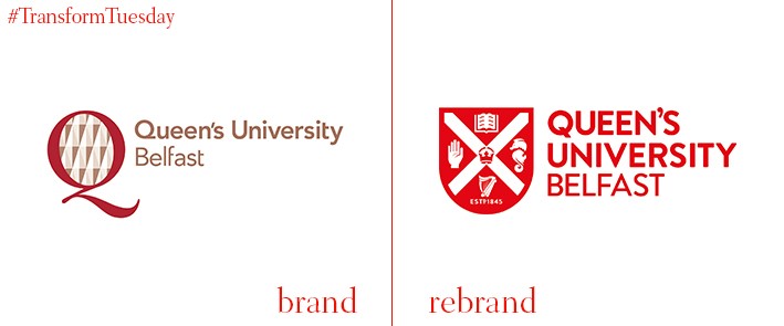
Queen’s University Belfast
Established in 1845, Queen’s University Belfast is a public research-oriented university based in Belfast, Northern Ireland. The university has recently launched a new visual identity and accompanying logo to better reflect its five core values – integrity, connected, ambition, respect, excellence. This is as well as suite of marketing collateral, refreshed brand guidelines and a ‘brackets system’ derived from the queen’s crest outline. The university says, “Our core themes are the foundation stone for all our marketing communications and borne out of the attributes developed collectively across the university with feedback given through surveys, focus groups, research and drop in sessions. They will enable us to build a consistent voice across all university outputs, building a higher awareness and perception of what makes us distinctly Queen’s.”
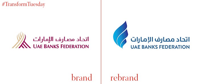
UAE Banks Federation
Abu Dhabi, UAE-based UAE Banks Federation is a representative body comprising 48 banks in the UAE. The federation has unveiled a new brand identity which marries the current economic prowess of the UAE with its rich Arabic heritage, demonstrated through its calligraphy-based logo. “In parallel with the UAE’s growth and transformation into becoming a leading financial destination, our role in the country’s banking sector has also evolved immensely over the years,” says Abdul Aziz Al Ghurair, chairman of UAE Banks Federation. “Designed under the slogan, ‘Empowering progress through unity,’ our new brand identity illustrates our commitment to being the collective voice of the industry and our firm resolve to continuously highlight the contribution of the banking sector in the economic growth of the nation.”


