#TransformTuesday: 17 October
Every week, Transform examines recent rebrands and updated visual identities. This week's picks are below. For more from #TransformTuesday, follow @Transformsays.
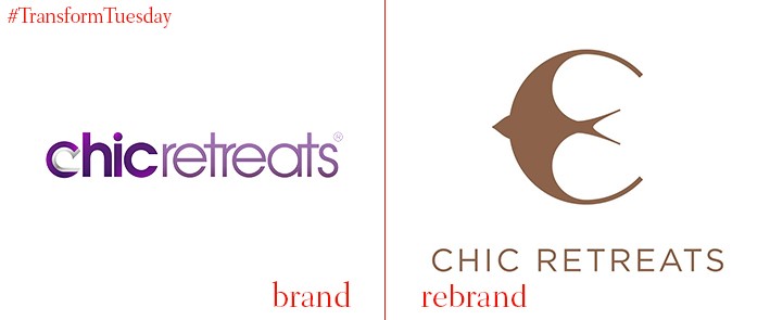
Chic Retreats
Based in London, Chic Retreats is a travel lifestyle brand dedicated to providing its customers with the best in luxury boutique resorts across the world. To comply with its enduring sense of luxury and promote the unique locations central to the brand, London-based graphic design company Powell Allen has updated Chic Retreat’s digital offering, marketing collateral and visual identity. Perhaps most strikingly, the Chic Retreats logo has seen a significant overhaul – using a swallow as the main motif, Powell Allen ensures a flighty sense of travel and adventure is threaded through the Chic Retreats brand.

Digicel
Headquartered in Hamilton, Bermuda, Digicel is mobile phone network operator providing its services across 32 countries in the Caribbean, Central America and Oceania regions. Its television and entertainment subsidiary, DigicelPlay, is headquartered in Jamaica; the company recently rebranded as Digicel to more closely align it with the parent brand and consolidate its market reach. Director of marketing for Digicel Caribbean Limited, Peter Lloyd, says, “This is all about simplifying our business to deliver the best and most amazing experiences and innovation to our customers as one single unified brand. Digicel has built up a 17-year legacy of success, so we’re excited to be streamlining all our products and services under one powerful brand as a total communications and entertainment provider.”
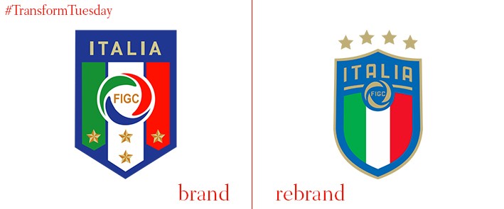
Federazione Italiana Giuoco Calcio
Federazione Italiana Giuoco Calcio (FIGC), or the Italian Football Federation, is Italy’s main football governing body and a founding member of global football organisation UEFA. In its first logo update for a decade, the FIGC has looked back at its varied logo history to combine graphic elements of its past 119 years with a forwar-facing identity which embraces design tropes common to contemporary football. Federal president Carlo Tavecchio, says, "The new visual identity of the FIGC completes a renewal path that began three years ago, we look to the future by enhancing our history. In the new logo we have made the four stars of world triumphs more visible because they represent the pride of the whole country.”
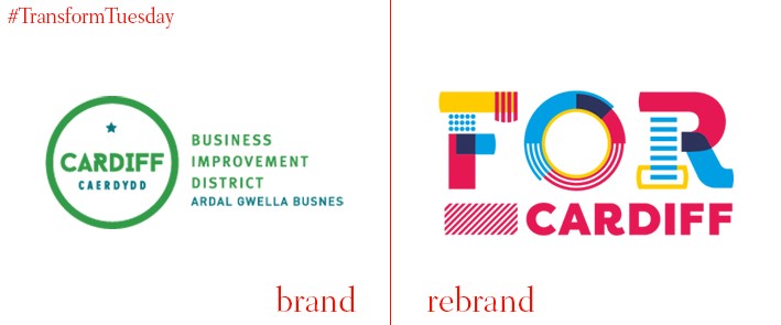
FOR Cardiff
Just over a year after the launch of a Business Improvement District (BID) for Cardiff, Wales, the organisation has rebranded with a name to truly reflects its purpose. Developed to unite Cardiff’s businesses under the common aim of cementing the city as a prime visitor and investor location, the organisation will now be known as FOR Cardiff. Running until 2021, the initiative aims to drive investment in city centre business and ensure the Welsh capital’s voice is heard among the melee of UK cities currently competing for global attention. Executive director of FOR Cardiff Adrian Field, says, “Our new brand and name allows us to highlight each and every one of these things and show how they fit into the wider picture. From the team of ambassadors for peace of mind, to street entertainment for enjoyment, from joint procurement schemes for saving money, to clever marketing campaigns for attracting visitors – ultimately, everything is ‘For Cardiff’.”
Science Museum Group
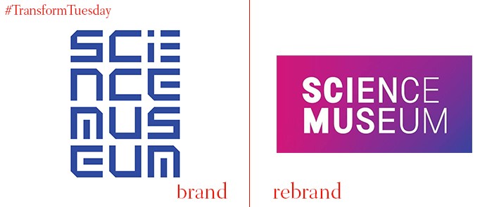
Although most commonly associated with the Science Museum situated in South Kensington, London, the Science Museum Group comprises multiple museums in Manchester, York, County Durham, Bradford and Swindon. To consolidate its brand architecture and better reflect the diversity of its UK-wide collections, London-based brand agency North has led a rebrand project fpr the Science Museum Group. A new visual language is the main focus of its new visual brand. This, along with a new brand mission ‘Inspire futures,’ is reflected in tropes of light and illumination which thread throughout the Science Museum Group’s new identity. Sean Perkins, founding partner of North, says, “In developing the new identity, we drew on the innovation and inspiration that personifies the work both of the Science Museum and the wider group. Just as the museums explore the ingenuity behind scientific advance, so we set out to create a brand that was both beautiful and innovative.” The rollout will be complete by October 2018.

Sexwise
Birmingham, UK-based brand experience agency IE Brand has created an identity for Sexwise, a new campaign developed in association with Public Health England and as part of existing charity, the FPA. The new Sexwise brand aims to promote inclusivity in talking about sex and sexual health matters. IE Brand says, “[We] created the Sexwise logo and a visual identity that uses vibrant colours, collages and background effects that can be dialled up to portray a feeling of euphoria, energy and ecstasy, or dialled down when addressing the more serious side of sex. Sexwise was brought to life online with a mobile-friendly website, featuring a user-friendly contraception tool, to help people make informed decisions about fun, safe sex.”
Tapestry
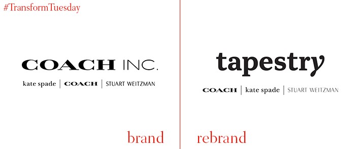
Luxury, US-based brand Coach Inc. has announced it is rebranding, and will be known under the new name Tapestry as of 31 October. The parent company, which owns high-end brands Coach, Kate Spade and Stuart Weitzman, decided to instil a new moniker to more closely align the parent brand with its portfolio, rather than just Coach. Chief executive of Coach Inc, Victor Luis, says, “We are now at a defining moment in our corporate reinvention, having evolved from a mono-brand speciality retailer to a true house of emotional, desirable brands, all leveraging our strong operational foundation… we are establishing a strong and distinct corporate identity, which enables our brands to express their individual personalities and unique language to consumers.”


