#TransformTuesday: 13 June
Every week, Transform examines recent rebrands and updated visual identities. This week's picks are below. For more from #TransformTuesday, follow @Transformsays
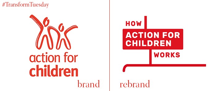
Action for Children
London-based brand design consultancy Johnson Banks has updated the visual identity for UK-wide children’s charity Action for Children, based on the concept of flowcharts and the notion of ‘breaking the cycle.’ Due to constraints on public sector funding and bigger reliance on voluntary donations, UK charities are adapting to the competitive landscape. This means bolder brands which stand out among a melee of competing institutions. Action for Children’s rebrand is supported with a digital campaign, as well as increased visibility in public places such as London Underground stations. On its website, Johnson Banks says, “…we kept returning to the observation that [Action for Children was] breaking cycles and re-routing lives, for the better. This inspired a new brand approach based on the flow of their work, always beginning or ending with the words ‘How Action for Children works’.”
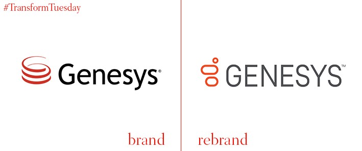
Genesys
Global customer experience software provider Genesys revamped its previously rather dated visual identity following its acquisition of telecommunications company, Interactive Intelligence. Its brand refresh, carried out by global design firm Landor, utilises a bright, vibrant orange to signal the rejuvenation of the Genesys brand. Landor replaces the previous red logotype, a generic design inherent to late 20th century tech, with an abstract G. This, along with its new tagline ‘Moments connected’ refines Genesys’ unique position in the software market. Mark Frankel, Landor San Francisco’s executive creative director, says, “Genesys […] new identity needed to be iconic, digital and expressive, while bringing Genesys and Interactive Intelligence together into a unified brand.”
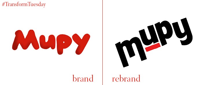
Mupy
Mupy, the first Brazilian milk drink to use soy, is produced by multinational company Agronippo which specialises in bringing fusion Asian and western foods to the Brazilian market. Rebranded by the Sao Paulo office of global brand agency Futurebrand, the Mupy packaging and visual identity has been update to coincide with the beverage’s 40th birthday. Drawing on the famous bag-style packaging in which Mupy is sold, Futurebrand also relied on the drink’s Japanese heritage to inform its renewed design style. Futurebrand says, “The refreshed identity can reach new audiences while putting nostalgia in the spotlight. Mupy is now a brand that delivers a connected experience, present in relaxed, laid-back moments.”
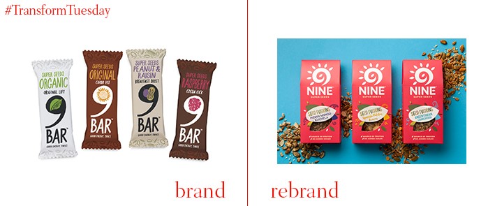
9Nine
London-based brand design agency BrandOpus has released its latest design for health food and nutritional bar, 9Nine, previously known as 9Bar. A new colour palette is led by a bright yet welcoming red, with a window on the new multipack option highlighting 9Nine’s nutritious content. The rebrand moves away from the relatively obscure design of the previous 9Bar identity, which had difficulty standing out as an everyday healthy snack in a highly competitive sector. A bespoke ‘9,’ the lead brand icon, reflects the brand’s new positioning. Paul Taylor, chief creative officer at BrandOpus, says, “The brand needed to shift from its niche proposition to become relevant for the more mainstream healthy consumer. The rebrand is distinctive and vibrant with a single mindedness that gives it significant presence at fixture.”
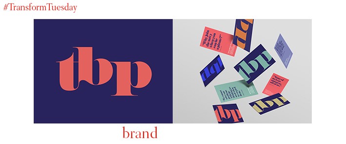
The Blueprint Partnership
While goods offered by the travel retail sector has long been present in transport hubs, the brands behind them are less visible. A group of travel retail experts have come together to form the Blueprint Partnership, with the intention of disrupting a generally staid sector and injecting vitality into travel retail’s future. The new Blueprint Partnership brand, developed by London-based branding studio Designhouse, is a future-facing vision of how the travel retail space might yet look; an example is how the studio takes a classic Italian typeface and distorts it in application. Lavinia Culverhouse, managing director of Designhouse, says, “We worked closely with the Blueprint Partnership to develop a strong, compelling identity that helps differentiate them from competitors and brings to life their core proposition, which is anchored around challenging how retailers view the travel sector.”
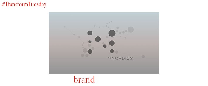
Nordic region: place brand
Denmark, Finland, Iceland, Norway, Sweden, Greenland, the Faroe Islands and the Åland Islands comprise the Nordic region. To effectively demonstrate the region’s unity and strength in a turbulent time to the rest of the world, the intergovernmental body known as the Nordic Council of Ministers selected Danish designer Ole Lund – part of a team comprising Danish architectural and design firm Bjarke Ingels Group (BIG), Danish advertising agency Mensch and tech company Area9 – after a crowd-funding campaign. The regional identity, based on the concept ‘Traces of the North,’ has been developed by Lund and his team with a dot-based design to reflects the letter ‘N.’ Blue, grey, white, black and pink is the colour palette on which the design is based.


