#TransformTuesday: 10 October
Every week, Transform examines recent rebrands and updated visual identities. This week's picks are below. For more from #TransformTuesday, follow @Transformsays.
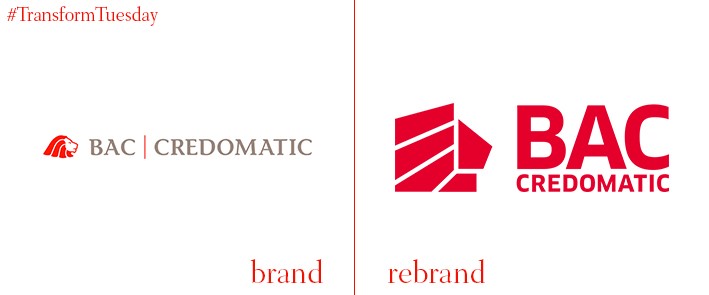
BAC Credomatic
Headquartered in San Jose, Costa Rica, BAC Credomatic has over two million customers in the Central America region. In a project led by global design agency Lippincott, BAC Credomatic has undergone a rebrand which aims to reach a new generation of digital-first customers who are experiencing banking in different ways. Lippincott’s BAC Credomatic project page says, “On paper, BAC Credomatic got a simpler, more modern brand expression. But in reality, it got more. It learned about its customers. It captured the energy of its employees and region. It prepared to help a new generation of customers turn their aspirations to accomplishments. And, in doing so, it put itself in position for what looks to be a very bright future.”
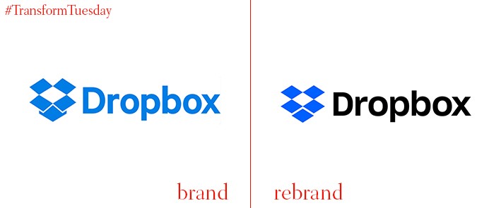
Dropbox
Founded in 2007, file sharing platform Dropbox enjoys a loyal following among the world’s creative and entrepreneurial communities. However, recent competition from other sources including WeTransfer and Google Drive led to the need for Dropbox to update its visual identity and rejuvenate its brand offering, with the inclusion of imagery sourced from Dropbox user footage and a new typeface. Sharp Grotesk, which includes 259 fonts, is a bold step towards establishing a fresh, bold and confident new identity for Dropbox. VP design at Dropbox, Nicholas Jitkoff, says, “Extraordinary things happen when diverse minds come together. We communicate this visually by pairing contrasting colours, type and imagery to show what’s possible when we bring ideas together in unexpected ways.”
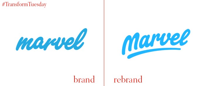
Marvel
Marvel is a London, UK-based app which allows users to create interactive app prototypes. Earlier in 2017, its founder Murat Mutlu approached Netherlands-based logotype and lettering designer, Paul von Excite, to design a new logo for Marvel. Modelled closely on its previous iteration, von Excite says, “The goal was pretty clear, the new type needed to resemble a friendly, fun yet professional character with lots of personality and energy. The Marvel type also needed a stand-alone “M” character for smaller display usage.” The angled version resemble the app’s energetic character, something which von Excite says stood out to Mutlu.
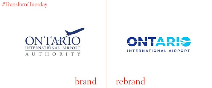
Ontario International Airport
In a project led by LA-based full-service communications agency Fraser Communications and brand and marketing agency Guge Marketing, southern California’s Ontario International Airport has launched its new brand. Its new design negates the previous navy corporate branding in favour of a more dynamic design which displays the connections and fluidity present in the aviation industry while highlighting the airport’s personality. Commissioner Curt Hagman says, “I think this is overdue. We need to get the logo on our vehicles and in the airport and get people to start to recognise us after nine months. To recognise that this airport has changed.”
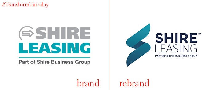
Shire Leasing
UK-based creative agency Catalyst has unveiled the new branding for business funding solutions company, Shire Leasing. The year 2017 has been a milestone for Shire Leasing, with the company reaching £100 million in Own Book lending value. Catalyst was therefore charged with developing a new brand to reflect its eminence. Catalyst says, “We created a brand that communicated Shire’s rich history in a modern context. We wanted to create an identifiable and flexible logo that scales well across an array of online and offline collateral, therefore, we created an ‘S’ device. Through our research we understood we needed to soften the approach, deliver a lighter more approachable brand that communicates the two-way relationship (helping fund the growth of SMEs) the company is known for.”
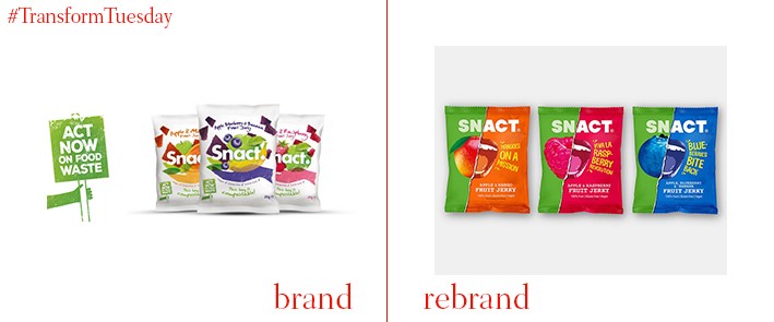
Snact
Combining personality with proactiveness, Snact has led the way in tackling UK food waste through its innovative fruit products since 2013. Made from ‘rescued’ apples, bananas and other fruits which would otherwise go to landfill, Snact products comprise of interesting takes on normal snacks such as fruit jerky. Its packaging, newly designed by London-based design agency B&B studio, is also fully recyclable and implores its customers to act on food waste. Shaun Bowen, creative partner at B&B studio, says, “Snact is a brand on a mission. They are hungry for change and this social purpose should come through in everything that they do. For us, it was important that the vibrancy and enthusiasm within the company was visible at every touchpoint of the brand, so we both visualised and verbalised their playful, progressive tone, helping raise awareness for this worthy cause.”
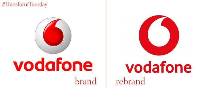
Vodafone
Global telecommunications firm Vodafone has updates its logo, positioning and associated advertising materials following the biggest rebrand in the company’s 33-year history. With a new brand strategy centred on the theme of ‘future optimism,’ the idea is to cement Vodafone as a leader in both technological innovation and how corporations can have a positive impact on the world. The iconic Vodafone speech mark logo has been updated by global agency Brand Union, with the wider advertising work carried out by a cross-functional team in global advertising agency, WPP: Team Red. Vodafone’s new strapline is confirmed as ‘The future is exciting. Ready?’ with the first part of the strapline presented in a local language, while retaining ‘Ready?’ in English.


