Packaging, disrupted
The FMCG sector is facing a massive digital disruption. How are brands responding to changes in online retail, targetting strategies and packaging design? Brittany Golob investigates
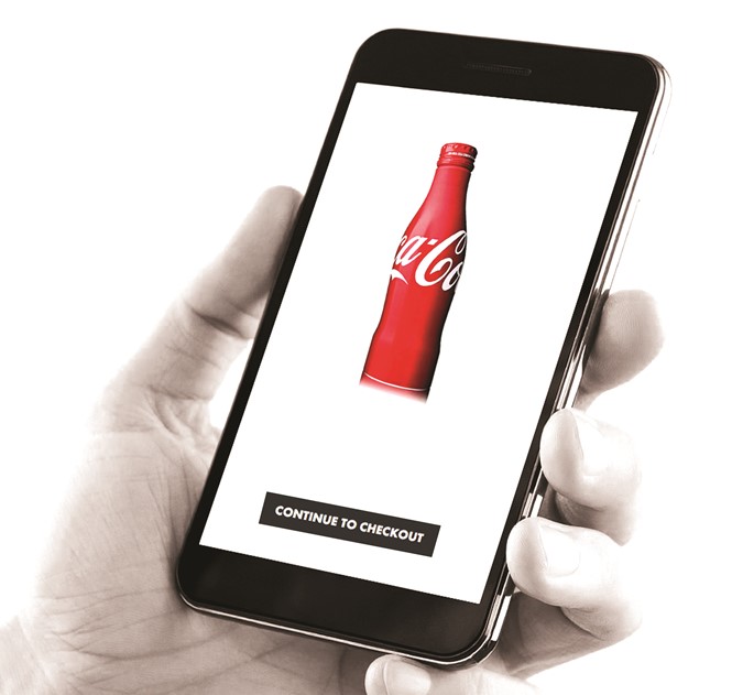
The Coca-Cola bottle is repeatedly heralded as the most recognisable design in the world. The company has won, in addition to countless other awards, golds in the Effies for effectiveness in marketing communications in 2015 and 2016. The Coke bottle itself has just turned 100, an anniversary around which the Coca-Cola Company created a campaign to celebrate the iconic design and its history.
The bottle was designed to be distinctive; to be undoubtedly Coca-Cola’s. Its shape has also been somewhat uid over the years. “One of the interesting notes about the shape is that while it is almost universally recognised, the form has evolved over the years,” Ted Ryan, director of heritage communications at the Coca- Cola Company, writes. Yet, the iconic ‘contour’ is always present. However, when shopping for Coca-Cola online, the packaging that represents the product is anything but consistent, and on the whole, doesn’t reflect the iconic design offered by one of the world’s strongest brands. If Coca-Cola’s iconic bottle doesn’t prevail across online supermarkets, other brands will also struggle to communicate their brand personalities.
The way that packaging is presented online presents a new challenge for FMCG brands. FMCG shopping in store has a certain psychological grounding; supermarkets are organised according to this format. National Geographic calls it “a cunningly orchestrated process.” It’s designed to subtly force shoppers to walk by most of the 44,000 or so products on the shelves. The more they see, the more they buy, the theory goes. But online shoppers don’t walk down virtual aisles. They can’t be subliminally pushed from one section to the next. They aren’t persuaded to pick up shiny yellow bananas on a whim. This is a problem retailers are trying to solve through a variety of means such as banner ads, featured products, nudge notfications and the like. But for brands, the traditional method for packaging, which revolves around a product standing out on the shelf and communicating the brand’s personality is being disrupted.
“You’re not just designing for the side of the box,” Dave Roberts, executive brand director at the Partners says of online packaging. “Your assets have to work hard in other areas. People have to think differently about the assets that they’re creating.”
Even a cursory glance at most grocery stores’ digital ‘shelves’ will show a 5 cm x 7 cm box, or thereabouts, with a tiny image of the product’s packaging within. From Amazon Fresh to the Netherlands’ ah.nl to the US’ Target to the UK’s Waitrose, Sainsbury’s or Tesco to Dubai’s supermarket. ae, and beyond, this trend pervades. This format shrinks packaging so small that it becomes difficult to read, let alone to understand. Brands and agencies focus heavily on getting packaging right, but they are falling short when it comes to digital shelves.
Roberts says simplicity is key, “A lot of packaging is probably fussy and complicated and doesn’t help the consumer or the buyer. Immediacy and clarity are needed.” Packaging should communicate something about the brand, but the size issue online diminishes the delivery of those messages.
“You’re not just designing for the side of the box. Your assets have to work hard in other areas. People have to think differently about the assets that they’re creating”
For Target, a rebrand in 2009 focused on creating a better brand architecture for the thousands of products and numerous sub-brands owned by the retailer. Last year, Sam Wilson of Wolff Olins, who carried out the rebrand, said, “What was great about the packaging solutions that we came up with was they were so bold and iconic you could see them across the room, even if you were looking at them in tiny pictures online.”
Target’s e-commerce site is little different from its peers in the grocery sector, but its own brands – notably Up & Up and Market Pantry – use graphic devices to communicate the brand which are visible at a small size, or indeed at the far end of a physical store aisle.
2009, though, was early days for online grocery shopping. Now, with the influence of giants like Amazon entering the sector, the problems may become compounded.
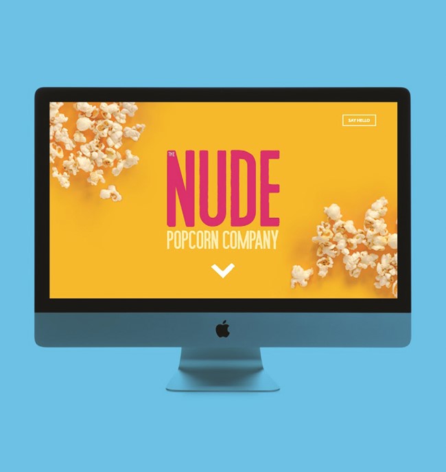
That’s why a new popcorn brand launched by Tyrrell’s, Nude Popcorn, focused on digital when designing its brand. Fluid Ideas, a brand agency in Derbyshire, says the bespoke typeface, bold colours and simple packaging allows the products “a striking identity that stands out on supermarket shelves and online.” The copy on the packages is in an all caps, sans serif type in large print. There are no more than 12 words on the front of each pack. Competitors like Metcalfe’s or Butterkist are difficult to read on Sainsbury’s online site – where Nude Popcorn is being sold initially – to the point where only the brand name is clearly visible.
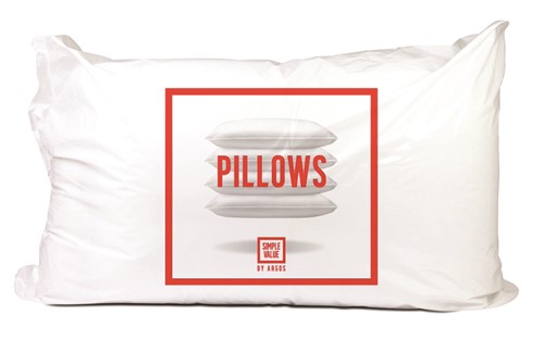
Argos and the Partners took that strategy one step further and made copy style the primary design focus on the rebranded Simple Value range packaging. Argos, as a catalogue retailer, doesn’t rely on packaging in the same way as other FMCG retailers might. But, it put its own brand to use in post-purchase advertising, online marketing and mid-shop engagement, both online and in-store. “We wanted the package to be like mini adverts,” Roberts says. “That’s why we’ve made them as ownable and distinctive as possible.”
For that reason, Roberts and his team put the tone of voice directly on the side of the packaging. They supported that with animation, banner ads and social media content as well. On its e-commerce site, physical packaging that may read ‘SHEEP SHEEP SHEEP SLEEP’
in white type set within a red square, translates to simply ‘PILLOWS’ in a red box, overlaying an image of the product. “When, like [with] Argos you have no shelves, there’s an opportunity for the packaging to work harder online,” It simply gets the message across, it’s visible in a small image and it communicates the brand’s personality effectively. Argos’ marketing controller, Rob Quartermain, said when the brand launched, “Simple Value is so much more than a new name. The new ‘red box’ branding has been designed to give customers an easy way to identify the simplest versions of our most popular items.”
This range sits within a wider rebrand that allowed Argos to make the transition to a digitally-integrated retailer. Roberts says the rebrand was intended to shift perceptions of Argos from being simply a catalogue retailer. “If you look at the new stores, they not only adopt a refreshed, no-nonsense approach to getting what you want, but also incorporate digital ordering and interfaces to help bring the personality to life,” Roberts adds.
This may be the route other retailers take in the future. Paul Taylor, executive creative director at BrandOpus, a London-based agency that works with national and global food and FMCG brands says packaging is what defines the brand in the FMCG sector, but that goes beyond the 2D design. “Consumers don’t decode the brand itself from the packaging that it adorns, so we become familiar with the Heinz ketchup bottle itself. It is as intrinsic as the Heinz logo is.”
Stuart Galvin, director at marketing agency smp agrees, adding that the package is even more important once it is purchased than it is on the shelf. The fact that the product sits in people’s homes means they build an emotional connection with it. That connection can’t be broken by a disrupted shopping experience, he says.
Rather than adapting to the digital experience currently offered by FMCG retailers, Galvin says, what should change is the way online retail functions. Taylor adds, “It’s a real challenge at the moment that when you go online and shop you’re asked to browse these tiny icons and shelves. I’d start there and say, ‘How can we get the online platforms to better re ect the brands and the products to allow the shopping experience to be easier?’”
Galvin and smp may have a solution. Rather than design communications to target specific demographics, brands should consider shoppers of different mindsets. That path is one Argos may have followed in the relaunch of the Simple Value range. Quartermain said, “We know customers from all walks of life buy value products and our new look acknowledges this. The range offers quality products at great value for money, all in one collection of core items.”
Research smp did into the dynamics of FMCG shopping behaviours highlights the need for a different approach to segmentation than by age group or income. The new groups proposed, given names like ‘conscious’ or ‘knowledgeable’ breaks down shopping behaviour by the mindset of those within the group. Galvin says this approach will allow brands to better understand the shopping journey, and thus better communicate with their target audiences along that journey. This shift, he says, is platform agnostic. A ‘secure’ shopper in store will be a ‘secure’ shopper online. But the opportunities to communicate with said shopper will change.
In a survey of over 1,000 individuals, smp found that 38% of respondents said they did not actively seek products with well-designed packaging. That, instead, was a secondary concern when selecting products. But, Galvin adds, packaging is only the last touchpoint in a long consumer journey. By targetting audience groups more effectively, brands can begin to in uence the purchaser long before the till point.
Digital disruption has forced the FMCG sector to change. That change may rely on a combination of better strategies with regards to segmentation, packaging and better e-commerce. Unscrewing a bottle of Coke may complete a design journey of over 100 years, but that journey is now more complex than putting a nickel into a Coca-Cola machine.
Supermarket science
By Vicky Bullen, CEO, Coley Porter Bell
Designers are fascinated as to why packaging design is such a powerful influencer of choice, and we have looked to the world of neuroscience to understand this. We know now that most purchase behaviour in the supermarket – and indeed in life – is driven by our system one brain, the intuitive ‘thinks without knowing it’s thinking’ part of the brain. Those decisions are then justified or rationalised in the conscious-thinking system two brain. If our brains didn’t work like this, we would be in the supermarket for hours thinking about every purchase decision we make. The supermarket shop, is, for the most part, goal-focused and a ‘get what I need’ state of mind; designing brands that appeal to that system one brain, that also aid the autopilot shopper, is critical.
Packaging not only sells from the shelf, it continues to build our perceptions of a brand at home; therefore it is unlikely that packaging design will change fundamentally with the shift to digital. However, what we are seeing is many of our clients considering how their brand should be displayed on the ‘digital shelf.’
One of the neuroscientific principles that we consider when creating packaging design is visual saliency – the idea that we are drawn to things that seem novel, in the sense that they look different and stand out, but that they also mean something to us. But this alone isn’t enough. Brands need to invite people in by putting meaning behind the shapes, symbols and colours that attracted the shopper’s attention in the first place.
That is as true for online as it is in store. In that context we are seeing brands stepping away from the traditional thumbnail picture of the physical pack. Instead, when we create packaging design, we also develop a thumbnail design for online shopping which takes the most distinctive assets of that brand and heroes them. This strips away anything extraneous, making identification of that brand immediate, and making that brand stand out on the digital shelf.
In terms of applying meaning, the same rules apply for online and physical packaging. Neuroscientists call this priming – the idea that we learn by association. Designers give a brand meaning by building in visual cues that people associate with ideas from the broader world. It’s not enough for a brand’s distinctive assets to stand out from the crowd, they have to communicate the right things about the brand, giving it the meaning that will make it relevant to our shoppers’ lives – regardless of where they’re shopping.
Packaging performs many roles. It protects its contents, it’s a form of media, and it is a powerful influencer of consumer choice; not least in the supermarket. The shift to digital doesn’t negate the role of packaging, as brand owners still want to communicate the right things about their brand in the shoppers’ home. However, brand owners should consider how their brand is depicted on the digital shelf. There are better ways to get your brand noticed there than just using a small image of your pack.


