Building a dynamic identity for the Great Exhibition of the North
As the capital city and the country’s financial, media and professional service centre, London is sometimes accused of attracting a disproportionate amount of media coverage. However, where culture is concerned, the city’s northern counterparts continue to display their own unique, multi-faceted heritage- and art-driven programmes, set to inform and entertain. Newcastle and the town of Gateshead, located on the north-east coast of England, is the latest hub to promote its urban credentials through a series of workshops, events and activities known as the Great Exhibition of the North.
The exhibition’s destination marketing agency, NewcastleGateshead Initiative, has also kept the agency charged with the event’s branding fairly local, choosing Leeds-based branding studio, Build.
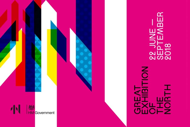
Set to help rebrand Newcastle and Gateshead as the pinnacle of northern cultural intrigue, the Great Exhibition of the North is currently expected to launch on 22 June 2018 and run until September 2018. Launched with a £5m investment by Ed Vaizey, the minister for culture, communications and creative industries from 2010-2016, the exhibition aims to “[…] promote the very best of Northern art, culture and design,” said Vaizey. “Investment in our arts and culture not only benefits these sectors but, as we have seen from Hull being named UK City of Culture 2017, can drive regeneration of whole towns and cities.”
However, at the crux of the any successful place brand – particularly when carried out through the lens of a widescale event – is a visual identity with enough flexibility to capture the imaginations of visitors, investors and residents alike. It must also remain true to its aims – particularly the future-facing direction for which Newcastle is aiming – and ensure it is suitable for widespread application across many mediums.
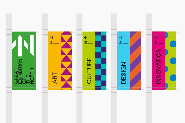
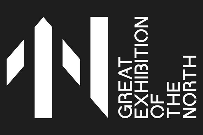
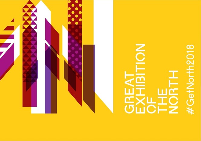
Developing the arrow symbol native to the north of England, Build has created a visual suite based on the notion of exhibition attendees travelling up the country to visit Newcastle and Gateshead. Arrow symbols, designed by Build to also represent an abstract N for Newcastle, are used on road in the region, creating a visceral link between the place, and the event. Its visual identity will also be used alongside a marketing campaign, #GetNorth2018, developed by Northumberland-based brand and design agency, Twentyseven.
Kathie Wilcox, director of marketing and communications at NewcastleGateshead Initiative, says, “The very essence of the Great Exhibition of the North is about collaboration and celebrating the whole north, so to be able to bring in two agencies who represent the talent housed right here is fantastic.”
Yet the branding does not stop at arrows. With art, culture, design and innovation the event’s four main tropes, developed into the exhibition branding by Build, different patterns, such as stripes or squares, are applied to denote different genres. This dynamism and creativity also acts as a metaphor for the north as a whole, which harbours a rich heritage in design, heritage and art.
Michael Place, creative director at Build, says, “The branding for the Great Exhibition of The North has been designed to be as dynamic as possible enabling it to speak in a multitude of voices. Sitting smartly within a corporate environment to being super playful for younger audiences, the identity is able to adapt to a variety of uses and importantly different demographics.”
Place continues, “The three main sectors of the exhibition – art, design and innovation – each have their own sub-identity within the larger brand. These can be used on their own or combined together creating a rich visual language for the exhibition.”