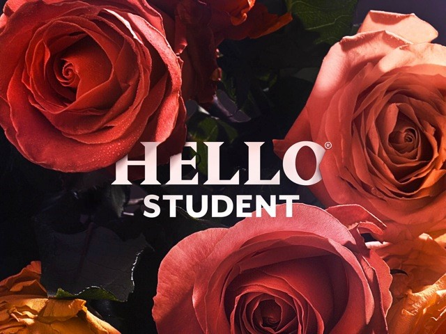
Where students blossom
Student living has had a sophisticated makeover with the branding of student accommodation provider, Hello Student.
The new branding was created by London-based brand agency, SomeOne.
Simon Manchipp, co-founder at SomeOne, says, “This is an adult brand, for students intent on a more mature approach to learning.”
Hello Student aims to be an integral part of the student experience, it wants to help keep its tenants safe and healthy, and to guide them in building a life for themselves. Student brands can often come across as condescending in their effort to be hip and young, but Hello Student aims to talk up to its audience. The classy visual identity reflects this by avoiding the harsh, geometric shapes and bright colours that have become a cliché in the student sector.
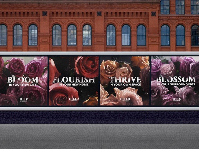
The new visual identity is characterised by bold close-ups of multi-coloured flowers, and the new wordmark includes capitalised, white type with a premium feel. The floral theme extends to the brand language which utilises words such as ‘bloom’, ‘flourish’, ‘thrive’ and ‘blossom’ to refer to the brand’s mission, to provide students with a certain lifestyle, rather than simply a roof over their heads.
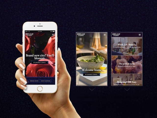
A mobile-first digital strategy is at the heart of the new brand identity. SomeOne developed iconography that would work across mobile, tablet and desktop devices without compromising legibility.
Paul Hadaway, chief executive of Empiric Student Property plc, says, “The new brand is a more attractive and consistent service offering; a brand that better resonates with our current and potential customers as well as further driving re-bookings and referrals.”


