Peer perspectives: AT&T

AT&T’s rebrand by Interbrand is a work in progress, but the first phases have been rolled out, including a new, simplified world icon. Jaid Hulsbosch, director of Australian brand agency Hulsbosch, examines the progress the American company has made thus far in its brand development and analyses what the
future might hold
Project: AT&T rebrand by Interbrand
Reviewer: Jaid Hulsbosch, director of Australian brand consultancy Hulsbosch
Branding in the telecommunications sector: Telecommunications is a dynamic business worldwide that has enormous competition driven by new, innovative technologies.
Corporate rebranding in the category has momentum and is accelerating due to fierce competition that’s impacting on business models and, in some cases, financial restraint.
However there is no compromise on one issue, as businesses remain both wary and diligent of active telecommunication consumers and their fluid brand loyalty.
Leading telecommunications firms in Australia are forever watchful as they attempt to respond to changing conditions and keeping pace with the overly regulated sector and media reform in general.
Generally, there are four challenges in a corporate rebrand: overcoming a disconnect with the core model of the business; stakeholder short sightedness and resistance to change; maintaining an ideology of one company/one voice; creating positioning that is an ‘umbrella’ for multiple identities.
No matter the category, corporate rebrandss are a significant investment by companies,. but remain critical to sustaining competitive advantage in light of changing corporate priorities.

What AT&T achieved: How does the new AT&T logo look? It resonates with me and I love it! The new identity says everything that any brand should pride itself on – simplicity and consistency.
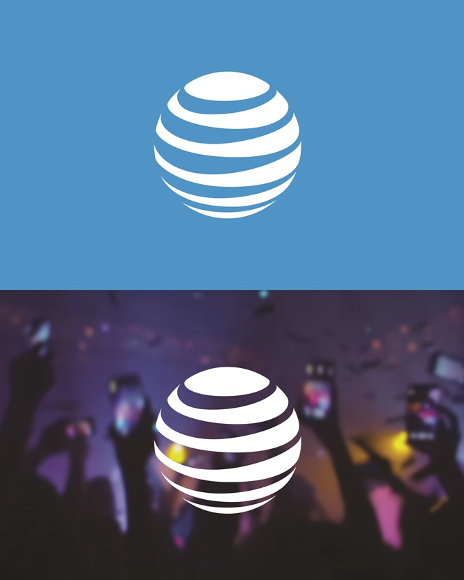
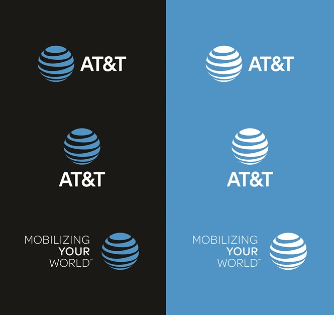
AT&T has evolved and I applaud their efforts to use past insights, which have ultimately informed its new logo. Visually, it remains a warm rendition and amplifies the progressive company values and beliefs.
The identity is much more simple because of the flat design which also makes it easier to reproduce. Its boldness and versatility make it suitable for a consistent rollout across a variety of platforms, and online and mobile applications.
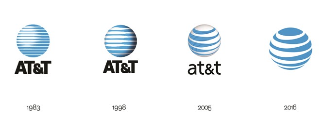
After 33 years, it is the right time to do away with the brand name and just show the globe icon; a more future-driven concept to encapsulate who AT&T is as a business.
It is moving into a creative space that does not require the brand name – as with other global empires such as Apple and Nike, – which mirror the marketing ability for future-driven, brand strategies.
Hulsbosch’s intent is for Australia’s largest supermarket chain, Woolworths to also claim a similar iteration for its visual expression. To be an iconic logo on its own – that is to stand alone – is the ultimate goal for any business’ brand.
More to come: I’m delighted to contribute to the column however my perspective here is not a true representation of the AT&T rebrand – it’s based on an example of the final AT&T logo.
I would have loved to have seen and been able to give an opinion of breadth based on a wider understanding of AT&T’s overall brand identity.
From the brands vision and values, iconography, brand architecture to colour systems, tone of voice and language – all are valuable functions that propel and filter toward the completed brand creative outcome.
AT&T was ranked sixth in the 2015 rankings of the world’s most valuable brands published by Millward Brown Optimor. Its new image should help them gain a top-five ranking in 2016 and is a worthy contender!


