Spotlight on Pizza Hut
Pizza Hut was losing traction with Millennials, so it not only revamped its visual identity, but redefined its approach to pizza, flavour and communications. Brittany Golob talks taste, heritage and the power of now with Pizza Hut's branding team
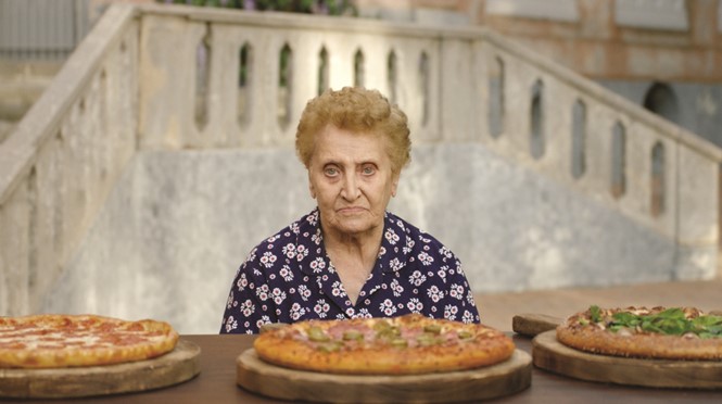
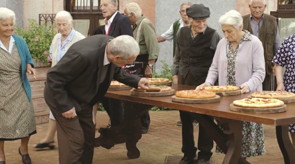
"It’s good!” says an old man in Sorrento, Italy in response to Pizza Hut’s new Flavor of Now menu before his wife slaps his slice out of his hand. “But it’s not pizza,” he adds, gravely. The TV spot, concocted by the folks at Deutsch LA, was to be the centrepiece of the Flavor of Now launch. But there were bigger forces at play than just reluctant Italian grandparents.
When Pizza Hut’s parent company, Yum! Brands, came to Deutsch – which had worked on the communications and broadcast campaigns for sister brand Taco Bell’s repositioning – it was hoping to get its new menu off the ground. Though it hadn’t yet been named, the menu was a break from the traditional pizza options like cheese and pepperoni and also a break from Pizza Hut’s less-successful calorie-stuffed pies like the cheeseburger crust pizza.
Pete Favat, chief creative officer for Deutsch North America says Pizza Hut was looking to capitalise on the shift in food consumption habits that has seen everything from lemongrass to harissa turn up on food trucks, restaurant plates and in cookbooks across Europe and North America. Favat says the name Deutsch derived – the Flavor of Now – reflects that trend and implies an ongoing relevance and sense of innovation connected to the Pizza Hut brand.
Job done then, so it seems.
But in branding the new menu, Deutsch also repositioned Pizza Hut’s North American operation and rebranding its digital platforms, stores and brand assets as well. “The basic strategy was to define what this new menu was about,” Favat says. “The idea that we went in with was the idea that pizza hasn’t really evolved in thousands of years. Adding things like honey sriracha and pretzel crusts and all different ways to look at pizza was very interesting to us.”
The Italy advert derived from that. With Millennials comprising the core audience for the new menu, the broadcast campaign could have featured a bunch of hipsters eating pizza, as Deutsch’s digital executive creative director Jerome Austria says. But, he adds, “Millennials don’t want to see themselves in advertising. They want to see something that’s going to entertain them, that’s going to charm them, that’s going to make them laugh.” Grumpy Italian senior-aged pizza purists turned out to be the perfect foil to the adventurous, modern audience Pizza Hut was attempting to reach.
While markedly American in tone, the advert hits the sweet spot in its message – this is not your grandmother’s pizza brand. It thus paves the way for a thorough, bold rebrand of what had become quite a tired company.
The Yum! Brands share price on the NYSE had been steadily climbing from its second-worst value of the year – $67.23 in October. Yet when the Italians advert launched on Thanksgiving weekend – a busy time in the US as consumers are bombarded with food, football and Black Friday – the stock hit its second-highest price of 2014, ringing in at $78.36 on 2 December.
“I tell clients all the time, there’s no one sitting around waiting for whatever we say or do. With the amount of content that’s going out online, we’re competing with that,” Favat says. “You have to take more risks and you have to take more chances. You have to have that singular focus to say what are we going to do to get people to
A. see that we’re relevant and B. see why [they] should engage with the brand.”
That disruptive attitude imbued not only the broadcast campaign, but the rest of the rebrand.
Pizza Hut, despite having 56 years of heritage behind it, leading its sector and having a presence from Milwaukee to Malaysia, was up for a change. Louisville,
Kentucky-based Yum! Brand CEO David Novak told Deutsch, “This is the campaign that I’ve wanted for my whole career at Pizza Hut.”
The design work took its lead from that disruptive, relevant-to-now perspective. “We wanted to have a graphic package that mimics the bold and confident standpoint that Pizza Hut was taking,” design director and lead on the rebrand at Deutsch Nathan Iverson says. He adds that the rebrand was a logical step forward from the broadcast campaign as it was a clear way to reposition the brand and better communicate Pizza Hut’s refined perspective to the target Millennial audience.
First to go were the gradients and business of the old hat-atop-name logo that had been Pizza Hut’s identifier in some iteration since 1967. Replacing it is a marque that draws on the best of the now-iconic brand while ensuring excellence in design. Essentially, Iverson and his team ditched the gradients, the colours and the outlines in favour of a simpler, white on red wordmark. The mark of distinction, however, lies in the red swirl logo which, upon closer inspection is the spitting image of the second step a pizzaiolo takes when crafting a pie – swirling the tomato sauce atop the freshly-laid out crust.
“[This] keeps it very flat and again very bold and very confident,” says Iverson. “We took away all the gradients. We wanted to get to the very essence of their brand. That’s how we came up with the ladle/swirl logo. It represents the idea of throwing the dough up in the air and the energy to pizza making, which is what we really wanted to celebrate.”
Iverson points out that this was not a one-dimensional change, either. The logo was redeveloped keeping in mind the countless uses it could have online, offline, on storefronts and on social media. The reflection of pizza-making as a craft, spoke too to the shift in Pizza Hut’s positioning. The brand was seeking to counter the perception that it offered a cookie-cutter experience, that it was boring or outdated. “In that swirl, I think that says everything about their new brand in one icon,” Favat says.
“We took away all the gradients. We wanted to get to the very essence of their brand. That’s how we came up with the ladle/swirl logo. It represents the idea of throwing the dough up in the air and the energy to pizza making, which is what we really wanted to celebrate”
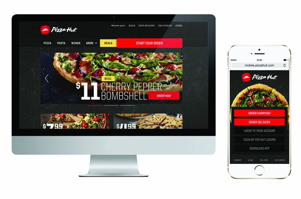
The other major design choice Iverson’s team made was to use the traditional Pizza Hut red alongside a cast iron grey evoking the artisan, craft feel of the new menu and new Pizza Hut. The old website, says Iverson was not communicating those aspects of the brand, “Everything was red on red on red. So we wanted to celebrate that kind of craft of spirit and care that’s put in with the cast iron background.” The photography used alongside brand assets was also reconsidered to highlight the ingredients and quality, evoking, as Iverson says, a sense of craftsmanship.
This palette and new look will be rolled out to Pizza Hut’s locations and across it’s physical assets – pizza boxes will be decked out in blackish-grey and red – but where the brand comes into its own is online.
“We obviously look at the website as being a very important part to Pizza Hut’s reappraisal of the brand because most people experience the brand through the website, through online ordering. We saw the website as an important place to show off that new rebrand,” Austria says. The old website was a red, yellow and green assault on the senses featuring blocky, loud typefaces that effectively hid the pizza – nominally the main event – from the user.
The rebranded site retains a similar format and functionality, but with an enhanced user journey. The biggest change, though, is to the actual look of the site, on mobile and desktop. Austria says this removed distractions to focus on the colours and freshness of the pizzas. The red was dropped in favour of the new grey – a slate-like colour akin to a pizza stone or the platters upon which mezze boards are served on – and a new typeface was implemented.
Typeface is one topic the Deutsch team took on with enthusiasm. Often one of the add-ons to a rebrand, typeface is at times forgotten or can induce a random choice picked off an Apple font menu. Consideration behind type design and choice can make a difference in a rebrand. For Pizza Hut, the logo and Flavor of Now logo excepted, a shift to a readable, bold and modern font was in order. United Sans was thus selected. “We did a really extensive type exploration,” says Iverson. “The design direction that we had, the really expansive approach, has a very revolution kind of rushing constructivist feeling. This is a movement for Pizza Hut. We were looking at typefaces that did that and then we also had some typefaces that could pair up on the craft pizza-making side. So it was kind of a two-fold approach that we had to balance and play with.”
Favat adds, “What I like about the typography is it’s a really thin face, but when you make it big and all-caps, it feels very bold and it feels like a big statement. Yet if you place type over the pizza, it doesn’t obscure it.” This approach allowed for a more modern feel online.
Sparked by the Flavor of Now launch and supported by the design work making a statement about Pizza Hut’s commitment to modernity and innovation and the clever, comedic Italians advert, the repositioning has put Pizza Hut through a thorough rebrand. It was one thing, though, to take a chance on a broadcast campaign and quite another to reposition a sector-leading business. Favat says, “Here is the biggest problem: when you’re a challenger brand, you can take a lot more risks. When you’re the leader of a category...one of the fine lines that we had to walk was how do we talk to new customers, yet not alienate their existing customers, especially seeing that their sales were mostly based on traditional pizza.”
The resulting communications strategy allowed Pizza Hut to talk about its traditional successes and what is one of the most-loved foods in the world while still embracing a trailblazing attitude in terms of food innovation. “The strategy was the idea that we’re taking pizza where it’s never been before,” Favat says.
That enabled the company to communicate simultaneously to the customers that had made it the sector-leader while also engaging people who want to try new things – the pioneers and explorers, as Favat puts it.
The focus will also have to be largely on digital and social channels in the coming months. With most of the brand experience being derived from online channels, the web redesign was important. Yet, Favat is quick to point out that brands must also compete with content-creators like Buzzfeed, Reddit and Vice for people’s attention. The social aspect of Pizza Hut’s communications has to be similarly exciting, interesting and shareable. “What we do here is original and shareable,” he says, “Because the best way to make one dollar work like two dollars or five dollars is to be able to get people to share the work themselves.” Agencies, he says, are in the entertainment industry now. They have to worry about how people perceive and talk about and to the brands they represent more than ever before.
The Italians broadcast campaign was thus complemented by GIFs, social posts, JPGs and other lightweight content that is starting to gain traction on social sites. “They’re a super-retail oriented brand and the balance for us is there’s such a retail component for them, but they needed to do more than just retail. They needed to rebrand themselves. How do you get the cash register ringing but also faze in an immediate reappraisal of the brand? Finding that balance has been tricky but I think we did a really good job with it,” says Deutsch executive creative director Michael Kadin.
The other audience Deutsch tried to reach through the rebrand was the internal one for Pizza Hut. They wanted it to be a rallying cry within the company signalling a shift in the broader business. Time will tell if that proves true, but for the initial change to adopt new, casual, even cool uniforms for frontline employees is a sign of things to come.
“To do a rebrand, that the consumers are going to really celebrate and the company itself is going to celebrate as well and feel like they’re going into new territory with confidence,” says Iverson about favourite aspect of the project. Louisville may not be the birthplace of pizza, yet in decades to come, Pizza Hut’s Millennial audience could too become representatives of pizza making, craft and artisanship.
Peer review
Sarah Cattle, creative director, Pearlfisher
Pizza Hut is one of our most well-known and loved global pizza brands. A brand with expertise and heritage. Presumably, its new identity is looking to reassert its iconic status in a contemporary context and tie in with its new ‘The flavor of now’ strapline.
Any redesign is usually about increasing standout and differentiation and this is an improvement. In an increasingly competitive set, it’s good to be more single-minded. It is a more clean, contemporary mark but the red tomato swirl and typography is generic and uninspiring for a leading brand in this sector. This redesign presented an ideal opportunity to better capture the heart of the brand and the heart of the consumer. Pizza Hut may be mainstream but it is a pioneer and I would expect to see it elevate and embellish its positioning and essentially challenge more strongly through
its identity – an identity which has the job of communicating everything the brand stands for in one small moment.
Today we don’t see brand identities as solid things. They provide consistency but in a more fluid and free way, needing to work across physical and virtual channels. Putting the logo in a circle may be seen as restricting brand expression and can compromise the size of a logo when used in situ, particularly when it comes to restaurant fascia and frontage. The new Pizza Hut brand mark is expected to work across brand communications and collateral as a standalone mark. However, without the Pizza Hut typography, I wonder whether Pizza Hut becomes more of a Pizza Hat.

