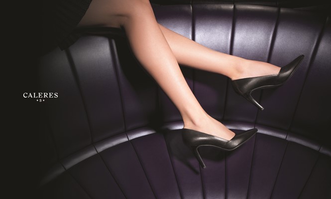
Spotlight on Caleres
Corporate shoe company Caleres looked to its heritage to pave the way into the future. Brittany Golob reports on the shoes, style and photo shoot of the new brand
When the team from New York-based brand agency Collins stepped into the forgotten archive room at the Brown Shoe Company headquarters, it was confronted by reams of papers, old advertisements, crumbling documents and a stagnant air. But there was something there. They knew it and they were going to find it.
Digging into the past was, in the end, what brought the Brown Shoe brand squarely into the future. The company, a 140 year-old St Louis, Missouri institution transformed the shoe manufacturing industry in the 19th century. It was the first to mass produce shoes that were not only designated for left and right feet, but made fit and size a priority. It was the first single- brand shoe retailer. Over the years, the business grew to a massive size through acquisition and became the invisible entity behind such prominent American and international consumer brands as Naturalizer, Via Spiga, Dr Scholls, Diane von Furstenberg and more.
But the name ‘the Brown Shoe Company’ was holding it back and when president and CEO Diane Sullivan rose to the chairmanship in 2014, she put brand at the heart of her business strategy. She sought to rename the company, align the portfolio and create a new logo. Enter Collins and the hunt for history.
“When Diane Sullivan, the CEO of the company, originally approached us, she framed the problem as a ‘logo project.’ The company had already been working with the great firm Lexicon to create a new company name – and she had asked us to turn it into a new visual identity system,” Leland Maschmeyer, co-founder and executive creative director at Collins, says. The name Caleres – based on the latin ‘calere’ for ‘ardent’ or ‘glow’ – was introduced to evoke the passion Caleres has for shoemaking.
But bigger changes were store. “Any time you change the name and/or the logo of a company, it’s a clear signal to your audiences that something bigger has changed or is about to change,” Maschmeyer says.
Sullivan says the rebrand allowed the company’s leaders to recognise the opportunities that lay ahead of them and the new Caleres name and brand system supported their ambitions. “It has energised everyone,” she adds.
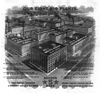
With the decision made to examine the brand – logo, architecture, culture and all – Collins then had to get to work on the creative aspects of the project. Which brings them back to the archive closet. Amid the masses of documents, the Collins researchers found a symbol that kept popping up; a five-pointed star on either side of the number ‘5’ inside a rectangular, dollar bill shape. Digging deeper, they found that the symbol was the emblemfor the company’s ‘Star-5-Star Guarantee.’ The emblem was stamped on the bottom of every shoe made by the Brown Shoe Company with the promise that the company would give the wearer $5 back if his or her shoes became uncomfortable before the star mark wore off.
This was representative of the company’s longtime brand positioning as a purveyor of high quality, comfortable and well-fitting shoes – George Brown, the company’s founder, even said he wanted to make shoes with ‘the perfect fit’ for everyone. It was exactly what Collins was looking for.
“Any time you change the name or the logo of a company, it’s a clear signal to your audiences that something bigger has changed or is about to change”
The star symbol became the basis for the new logo. Though modernised, the same Star-5-Star combination appears in the logo below the striking CALERES wordmark. The typeface is an altered serif font that evokes Roman road signs but features more contemporary bias-cut letterforms. The rebrand was made concrete, literally, when Caleres etched the new logo into the limestone of its head offices earlier this summer.
But the logo was only the start. The entire rebrand was inspired by the brand strategy not matching the business strategy under the old Brown Shoe name. Sullivan’s plans were to take the company’s brands firmly into the premium space while paving the way for future growth. “Diane told us that she needed to grow the company globally, compete authentically in the premium end of the footwear market, recruit more of the world’s top talent and inspire her employees to believe that achieving those goals meant growing beyond what the company had historically been,” says Maschmeyer. The company was holding itself back.
Sullivan adds, “Brown Shoe Company did not conjure up the image of what we are today and who we want to be tomorrow. We needed something that could stand on its own and stand out in a crowded market and we love that Caleres does just that.” It wasn’t just about the external market though. For Brown Shoe, the employees and sub-brands were a primary audience throughout the rebrand. Collins had to ensure that the shared and storied history to which they felt an affinity, as well as the equity inherent in that history, was preserved.
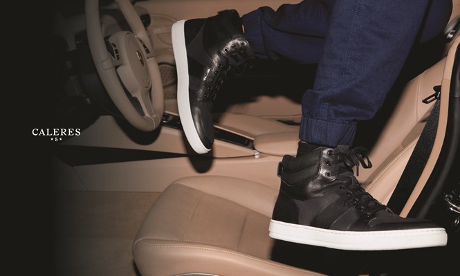
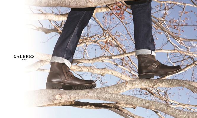
The historically-mired Brown Shoe Company thus became the historically-inspired Caleres. “The company needed a new brand strategy, a new architecture, revitalized company values, internal roll-out campaign, and a new website to effectively drive the change. Most importantly, it needed to do all of this in a way that honored this history of the company while also pointing to a new future,” Maschmeyer says. While the corporate brand has changed, Brown Shoe has been revitalised as a consumer-facing brand offering premium men’s shoes (often brown ones) that will target Millennials.
Sullivan says the rebrand has given Caleres the opportunity to examine its internal culture. “Now we are reinforcing the importance of passion, accountability, curiosity, creativity and caring with our associates – values that will help propel Caleres forward,” she says.
Employee communications included a company- wide announcement, two films made by Collins about the history of the business and about the rebrand and live event for head office employees that was streamed and shared around the world to help explain the rebrand. Shareholders and business and community partners were reached through one-on-one conversations and communications as well as a PR campaign targetting key external audiences.
The new website launched on 28 May and the joy and relief within the Collins offices was palpable. The massive project had finally been given a public face. The new Caleres digital platform is eons ahead of the Brown Shoe Company’s outdated, stock-photo filled and unappealing website. Where once there were brown squares denoting the company’s brands and bland stock photographs of the shoes on the homepage, there is now a stock ticker and a full-screen, rotating lifestyle photo. Where once the consumer brands’ own logos muddled the onscreen message, now they are presented amid a narrative of the style that runs through the entire site.
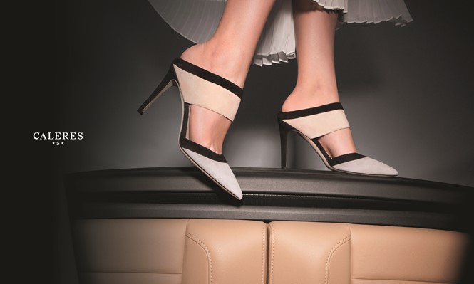
A new photo library was commissioned to evoke a premium feel and a sense of Caleres’ shoes existing in real life. However, with such a variety of brands in its portfolio, the photography had to be versatile enough to range from low cost-point brands like Famous Footwear through to men’s shoes and everyday premium all the way up to premium women’s footwear. As a result, each brand has its own small library that retains the same feel as its sister brands.
Maschmeyer says the new corporate website is only part of the new life of the Caleres brand, “The challenge for Caleres moving forward is managing the new company name as its own brand. Historically, the brands it has managed are the successful consumer- facing ones in its portfolio. The Caleres brand itself needs to be meaningful and inspiring to global talent, partners, industry press, and potential brands that it might acquire.” Sullivan echoes him, “Rebranding our company was essential to best position our brand portfolio for accelerated growth and global expansion. It is an affirmation of our evolving position in the marketplace.
Ultimately, we will create a portfolio of relevant brands that endure.”
Caleres is not the only corporate brand that is seeking a more prominent place in the minds of its stakeholders. In the past year or so, manufacturing and engineering firms, as well as those in the extractives, pharmaceuticals or logistics industries have unveiled rebrands as a means of creating a consumer face to a B2B brand as well as building a better reputation in an age of transparency. Data by Kantar Media shows an increase in corporate brand advertising by 17% as of 2012 compared with a 3% increase in overall ad spending.
It’s not such a leap anymore to travel from the website, Facebook page or Twitter account of Naturalizer shoes to that of Caleres. Relaunching, rebranding or reinforcing a corporate brand is a means by which these companies are managing their reputations in an era of transparency.
But it’s also about consistency, particularly for the internal audience. Sullivan points to the five ambitions behind the rebrand, “More organic growth, the ability to acquire and incubate brands, be a magnet for talent, build global relevance while staying ‘fit’ for the consumer.” Employer brand considerations figure highly in this.
The rebrand, now live, has captivated the media and employees and has changed the perception of the Brown Shoe Company from the inaccurate image of a company that makes brown loafers to a premium fashion brand with a portfolio of high-performance brands. It all comes back to the same brand promise, though, that George Brown made his customers in 1875. His shoes would fit. Perfectly. That drove the company to pioneer new technologies in shoe manufacturing, it prompted a nationwide change in the shoe industry and it inspired a number of brands to unite under the Caleres brand.
“Rebranding any company is not something that a management team can take lightly. And for a company that has been around as long as we have, it becomes critical that you find a relevant and real way use your past to fuel the future. We believe the Star-5-Star mark did just that. It is a modern way to tip our hat to the storied history of our company. What has fueled our history is a 137-year obsession with ‘fit.’ Collins helped us clearly see that our passion around fit evolved throughout our history – from actual fit to feet, to gender, to personality and lifestyle,” Sullivan says.
The Star-5-Star mark may have been unearthed in a dusty archive, but its promise shaped the Brown Shoe Company, and continues to shape the new Caleres brand into the perfect fit.
Peer review
Robert Soar, corporate creative director, Dragon Rouge
London Caleres means to ‘glow’ with passion or intensity in Latin. The use of Latin sounding words like Zeneca, Novartis and Diageo was a trend we endured during the ’90s. Those brands are clearly now all successful but some name changes were not so successful and some were even ridiculed.
We know that a successful business is more than an exotic sounding name, it consistently delivers on its promise, its service quality or product excellence. Is there a difference between a Latin sounding name and a word like ‘Apple’ or even a number like ‘3’?
Looking at the strategic business case for change, Caleres has taken a brave and visionary step forward. Caleres becomes the company name for a portfolio of famous footwear product brands. The brand also intends to leverage the huge equity in its old name by creating a product brand called ‘The Brown Shoe and Boot Company.’ This smart move enables it to take the best of the past into the future.
More than ever, we celebrate and are willing to pay more for history, provenance, craftsmanship and design within our products. With over a century of craftsmanship, Caleres can tell us a great story about all of its product brands; and now it has a story about its clear vision for the future. I’m sure that many other options and scenarios were considered in the branding process, but this solution future-proofs the Caleres brand architecture. It creates a simple and clear structure, which in turn allows the company to acquire or develop product brands, which fit neatly into the three tiers of ‘contemporary fashion, healthy living and family’ – a benefit to employees and key stakeholders.
I personally like the ‘Star-5-Star’ addition to the name. It is associated with a great story, a nod to the past but intriguing to today’s consumer.

