Gumtree branches out
Gumtree has grown to a considerable size on the legs of the brand it first launched with in 2000, but its fussy and out-of-date visual identity is no longer suitable for modern digital applications.
The UK’s largest classifieds website today launched a new identity that prepares it for a future as a popular online destination.
Morten Heuing, general manager at Gumtree, says, “Gumtree is more than just a service – it’s a community. We’ve worked hard to make sure our new look and feel, and better functionality and user experience, help our community get the most out of us. To keep up the momentum, we’ve set ourselves a target of having every adult in the UK who uses the internet using Gumtree.”
The new logo, visual identity and tone of voice by Koto brand agency will be accompanied by improvements to the user experience both on mobile and desktop channels.
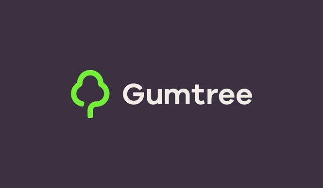
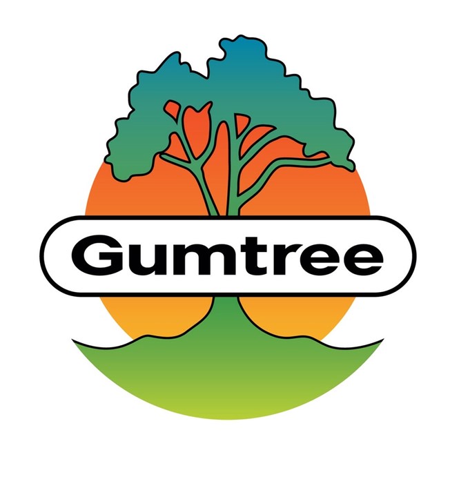
The new logo keeps Gumtree’s signature tree but loses a lot of the detail of the original logo, which makes it far more appropriate for use on mobile devices where the icon will appear very small. The old logo design used two separate colour gradients, which have long appeared outdated.
James Greenfield, co-founder of Koto, says, “We did a lot of research around images of trees and how they had been represented by artists and designers through the ages to really understand how our audience of millions see trees as an icon. The final logo has been informed by this extensive research along with our own rigorous design process.”
Gumtree, the UK’s largest classifieds website, currently connects over 15.3m customers every month. The US equivalent of the site, Craigslist, also appears quite dated in its branding, but its logo is far simpler – a plain, peace symbol that represents its sharing, community ethos and its roots in San Francisco – which may make it better suited to digital applications.


