Defining and designing East London
Interspersing text with quotations laid on colourful insets, the recent publication created to highlight the work of historic printing firm the Baddeley Brothers is a treat for the eyes - as well as the brain.
It is clear the Baddeley Brothers book, like the company, is a design world apart. Illuminating, eye-catching and above all interesting, a formative part of London’s design history is certainly done justice.
First person accounts and a detailed photograph collection lend a human face to the brand which has for so long defined East London typography. The inclusion of archival material has been set alongside contemporary contributions from British artists such as Adam Dant and Lucinda Rogers, lending visuals to the continuation of a family story which began so many years ago.
Indeed the Baddeley Brothers book, and story, is much like London. Although external influences and changes in trends have impacted its operation, inspiration still stems from the unique juxtaposition which can be gained only by combining old with new. Its survival through such formative years has helped form the Baddeley Brothers into its prestigious state; informative commentary and informal interviews by The Gentle Author lend a working-class authenticity to what is perceived as a high-quality brand.
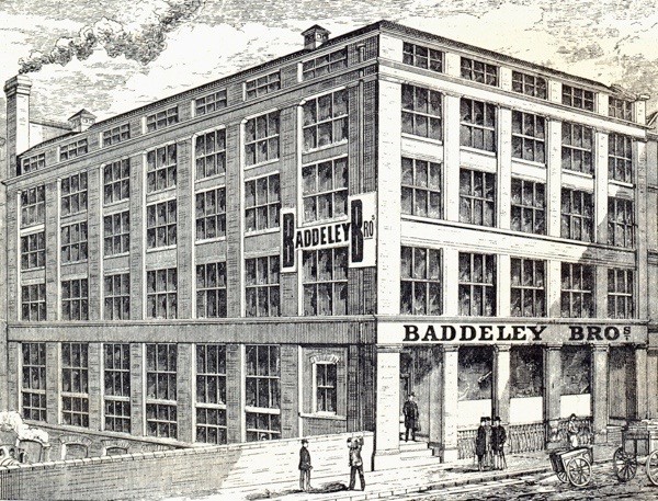
Although there are records of the Baddeley family craftsmen plying their trade in Staffordshire from the mid-seventeenth century, it was not until 1859 that the company began serious trading from its City of London premises. It is from this year onwards that Baddeley Brothers, illustrated by David Pearson, really charts; using typeface and colouring reminiscent of the brothers themselves, a story is crafted.

