What’s your type?
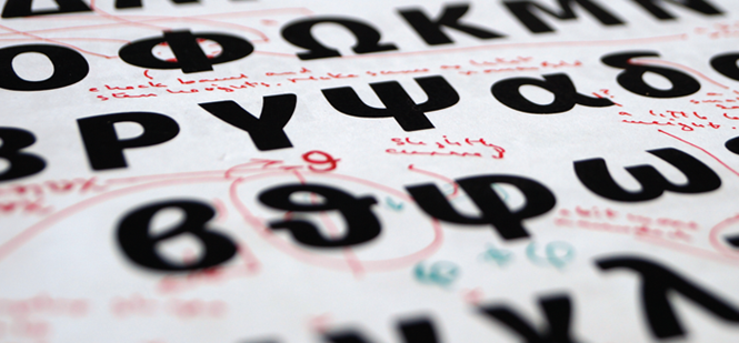
Typography can help define a brand and influence the way in which a company is perceived by its stakeholders. These three typography experts contribute their thoughts and experiences in designing, applying and implementing typefaces. First, Bruno Maag analyses brand and type
An organisation’s visual identity is often the first point of contact for prospective customers. The core elements of a visual identity are logo, colour palette, imagery and the typefaces. While logos, colours and images grab all the attention and are the obvious identifiers, typefaces are those that provide the bedrock upon which all other elements can rest. It is therefore crucial that the choice of typeface for a brand is made with the utmost consideration, not only in regards to its tone of voice, but also how this tone of voice carries across different media and languages.
Naturally, the typeface must reflect the brand’s positioning. The typeface, like colours or images, needs to be chosen according to emotional attributes. Once the emotional values are pinned down and typefaces reflecting these attributes are chosen, the requirements for implementation must be considered: how can the typeface be deployed across media and languages and what are the financial implications?
Large brands like Nokia, HP and Intel have opted to create their own typefaces and tones of voice. This makes sense for many reasons: the visual expression can be controlled to the last detail to correctly reflect the brand’s positioning, and to carry that positioning across media and global languages. Additionally, cost and logistical implications are known from the start and have little opportunity to vary. In all three aforementioned cases, the brands already had an established typeface, either custom designed or a licensed existing design. In all three cases, the existing typefaces no longer fulfilled the brands’ requirements, leading to inconsistent brand asset output and confused emotional messages. In addition, the typefaces were no longer suitable for an increasingly digital world and could not easily be translated to support languages in new and emerging markets.
When we were commissioned to create the typefaces for Nokia, HP and Intel, before even putting pencil to paper, we tried to understand and define the clients’ requirements. All three have deep roots in digital technologies and accordingly, the typefaces must work in screen environments, from laptop to mobile phone, at smaller sizes with only a few pixels available. The typeface also needs to be suitable to for use in print, from larger display sizes to the small sizes present in contracts.
In all our work for corporate clients, we must provide functionality. A typeface has a clear purpose: to convey a message with minimal distraction to the reader. A typeface that is noticed by the reader misses its function. That does not mean it has to be bland; on the contrary, a good designer is able to induce a lot of personality and brand attributes without compromising the typeface’s legibility.
Often strategists and designers forget, or like to ignore, that people around the world speak in different languages and write using different letter shapes. Some writing systems have an intricate complexity that is not present in the Latin script, and accordingly, place heavy demands on display methods on screen, particularly where vertical space is concerned. It is therefore crucial that language support is defined at the earliest stages to ensure that a consistent approach to design and brand expression is achieved.
For Nokia, HP and Intel, a consistent and legible rendering of the typefaces and their emotional expression for use across digital platforms was a high priority requirement. Throughout the development process, from inception to delivery of the final product, we tested and tweaked the letter shapes to achieve the highest quality. A typeface is the voice for a multinational brand. It is important that different languages and media are treated with equal consideration for the tone of the brand’s voice to be consistent. This necessitates a commitment to invest in one of the most powerful assets a brand can have. It is shortsighted of a brand manager, or finance director, to think that they need not invest in a typeface to coherently communicate across all segments of its activities using the argument that a system font will do. It puts the brand’s credibility at risk and treats its customers with disrespect and disdain.
Our clients invested in typefaces, whether commissioned or licensed, and many of them have had an ROI. Sparkasse, a German bank, reported to us that a year after introducing a consolidated visual identity, mainly carried by the typeface we designed, business improved considerably. This is due to the client being able to produce coherent and consistent communication, making its products and services accessible to all segments of society, from five to 85 years old.
I am often told that the average person can’t tell the difference between one font and another. That is true; a non-designer will not be able to explain the details in typefaces, and give professional explanations. But today’s customers are visually and emotionally literate, and they are able to perceive good from bad, engaged from lazy. A brand must always care about the tiniest detail, to create an impressive customer experience, from the greeting in the lobby to its typeface.
HISTORY
Gutenberg to Gates and the history of typography: Steve Matteson looks at the history of typography
Typography 1.0 is the time during which physical pieces of type matter were used to print on a physical substrate. This could be considered a golden age of professional typographers skilled in the art of arranging words on a page. Even the short era of phototype process fits this definition, as film strips held a tangible letterform.
After 500 years, type entered its 2.0 version: it became intangible bits of software. This transformation in the 1980s gave the layperson immediate access to typographic expression on his or her computer, but the message was still transferred and preserved in physical form through either an office laser printer or a printing press.
With the introduction of web typography and mobile reading, type has entered version 3.0: intangible font software drawing to a screen, which refreshes the intangible content after it has been consumed.
Type 3.0 is the most significant change in the evolution of type since its inception. Words are portable and temporary. The process of creating letterforms is democratised. The art of arranging letterforms in a message, or an interface, or an advertisement is open to anyone who interacts with a device. With all this freedom, it is more important than ever for brands to put guidelines in place to direct employees and artists in expressing the brand promise. Typography is central to any brand message because we read everything about every brand even if it is just a passing glance at a logotype. A typeface which causes a visual disconnect between words and their meanings is bad for a brand. Typefaces which reinforce or even help emphasize a brand promise are the holy grails of typographic execution. Type 3.0 offers tens of thousands of unique typefaces to form the best bond of visual and meaning.
Type 3.0 requires all brands with websites to interact with users, and typography is central to this experience. Humans have a low tolerance for misguidance, misunderstanding or mistrust, and Type 3.0 makes it easier to ignore a poorly functioning brand. It aims to seamlessly integrate brand promise at every brand touch point. The future of Type 3.0 holds promise that well executed brands will flourish but requires a Type 1.0 retrospective of typographic skills.
Steve Matteson is creative type director at Monotype.
THE FIVE STEPS
Five steps for evaluating a typeface: Reed Reibstein discusses process and selection
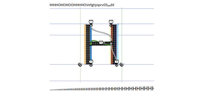
Classification
Look at the strokes that compose each letter. Do most strokes end with a perpendicular ornamental line? These serifs are the oldest of the classifications and are often used for text in books. If the serifs are almost as thick as the main parts of the letter, typically creating a more impactful appearance, the typeface would be considered a slab-serif. If the strokes terminate without a serif, the typeface would be a sans-serif (or simply a sans). Given their clean lines, sans-serifs tend to be viewed as more modern than serifs.
Usage
Is the typeface better suited for display – large, headline sizes – or for comfortable reading in small text? Does it work well both on screen and in print? A typeface optimized for text should have all its attributes in moderation. Among the most critical traits are strong, simple forms that don’t feel particularly narrow or wide.
Family members
What versions are available? Are there heavy weights, such as semibold, bold or black and light weights such as light and thin? Does it have narrower versions, such as condensed or compressed or wider versions, such as expanded? Do any or all of these versions have italics? Does it have complementary versions for other writing systems you may need, such as Greek, Cyrillic or Arabic? A larger type family will be useful when trying to select a workhorse that accommodates many applications.
Tone
What does looking at the typeface evoke? For example, think about the obvious choice of using an elaborate script rather than a streamlined sans-serif for a traditional wedding invitation. Even with a more subdued text typeface, you should seek to choose a tone that complements, rather than contradicts, your message. Try adjectival pairs: Is it more warm or cold? Elegant or rough? Classical or modern?
Licensing
Professional typefaces must be licensed from their creator or distributor. There are three main types of licenses available depending on the application: print or desktop, for use in print or in static graphics; web, for use on a website; and embedding or app, for use in a mobile app or publicly available PDF. A print license typically requires payment of a one-time fee, while a web or app license may have either one-time or ongoing monthly or annual fees.
Reed Reibstein is an art director and project manager with the international media consulting firm García Media.