#TransformTuesday: 9 February

Here is this week's selection of rebrands from around the world. For more from #TransformTuesday, follow @Transformsays on Twitter.
Axe Signature India
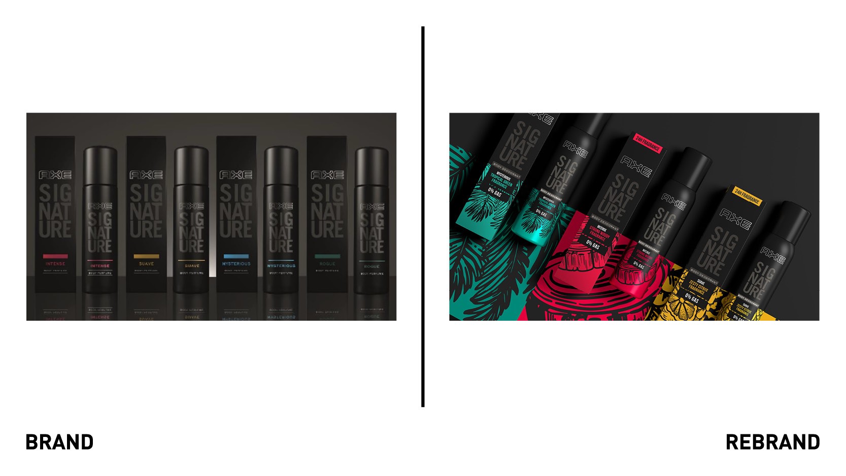
Men's grooming brand Axe has redesigned its personal care range for the Indian market with the help of design agency PB Creative. With a fragmented Axe brand portfolio in India incorporating range designs spanning several years, Axe thought the time was right to furnish the brand with a much more unified and consistent look and feel. Many of India’s personal care product sales come from traditional ‘mom-and-pop’ stores, which have space constraints, poor lighting and no opportunity for consumers to interact with products. The idea was to develop a flexible design system strong enough to work across different categories and formats while incorporating several legacy designs. One of the critical deliverables for the rebrand was to inject bold colour and personality back on the packs to boost standout while retaining the brand’s overall black plus design philosophy. With an older target consumer than in other regions it was also important for the new visual identity to embrace a more mature and premium aesthetic.
“Fragrance is a key driver of sales in India, so we’ve championed the ingredients stories front and centre of this new range design, further differentiating the Axe brand from its competitors,” says Agata Racka, design director PB Creative.
Institute of Grocery Distribution (IGD)
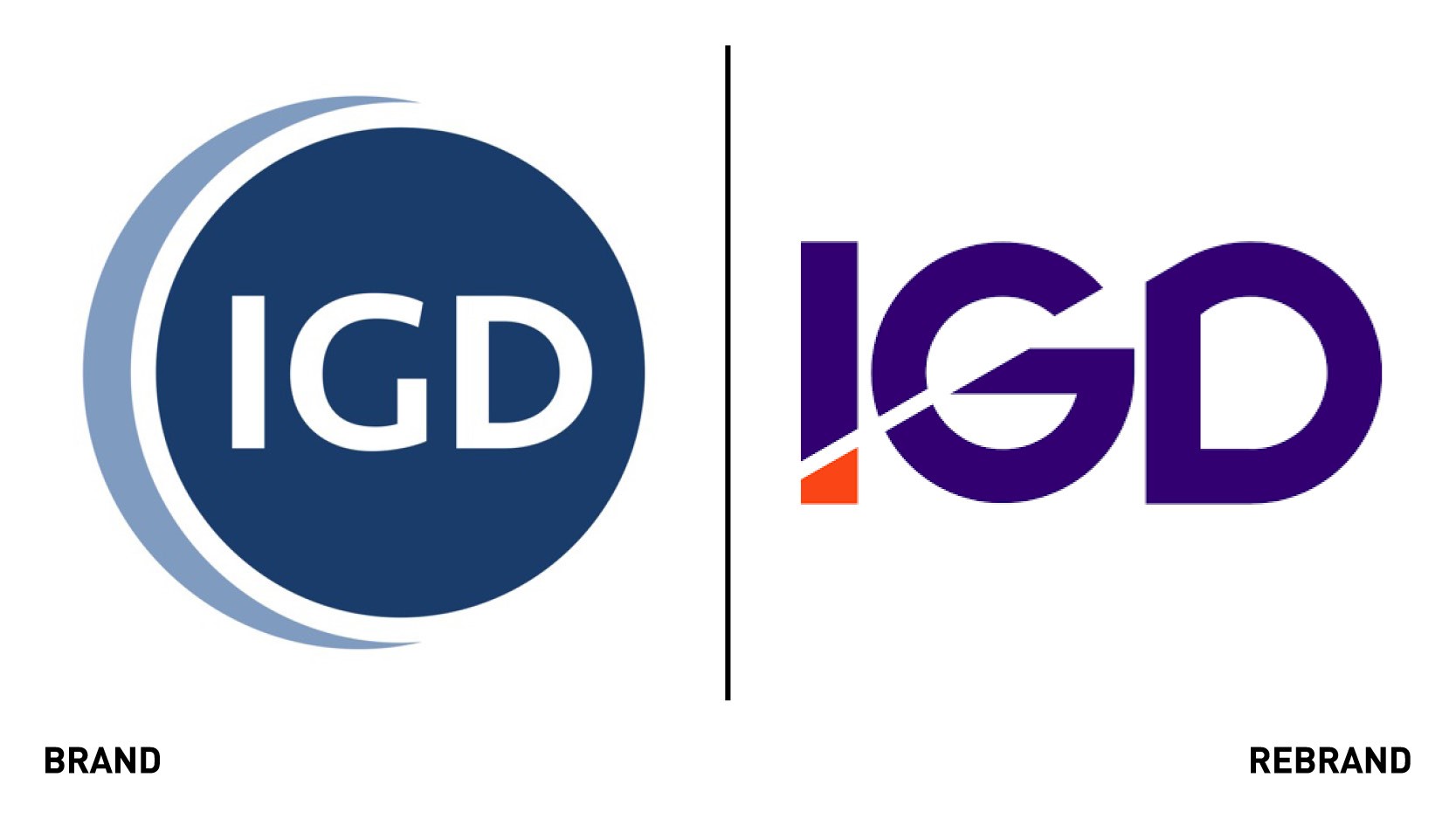
Institute of Grocery Distribution, which provides insight, training and best-practice for the food and grocery industry, worked with global branding and creative agency 1HQ to develop a new brand and purpose, featuring a new visual identity and narratives that tell the story of the organisation as it sets out its vision for the future. The new visual identity reflects the dynamism of the industry that IGD sits at the hearts of and underpins the organisation’s commitment to be a force for good. The new brand has been used to strengthen the identity and understanding of the organisation’s two halves; its trading company has been rebranded to commercial insight, while the charity will now be known for its social impact. Together, IGD will achieve its purpose of working to drive change that makes a tangible difference for society, business and the individual. IGD reinvests the revenue generated through its commercial activities into delivering social impact, addressing crucial social, economic and business issues. It builds initiatives aimed at uniting and mobilising the whole food and consumer goods industry, motivating it to be a force for good.
“The positioning and the visual identity have been designed to be brave, progressive and dynamic, representing the deep and genuine commitment of IGD to inspire the food and consumer goods industry, provoking positive debate and leading the response to ways in which the world is changing; all of which is grounded in long-established expertise and deep knowledgem,” says Rachael Slaney, managing director of 1HQ
KX
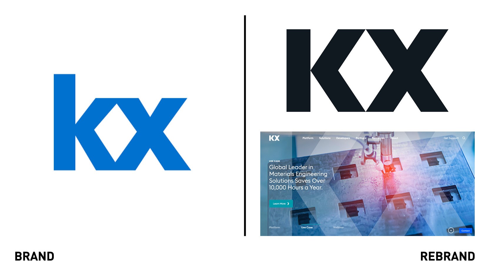
The world’s fastest real-time streaming analytics software, KX, launched a new brand identity that reflects the performance, speed and efficiency of the businesses’ technology. KX has been expanding into other areas where real-time data is being harnessed to operationalise continuous intelligence and drive businesses forward. The new brand identity aims to elevate and distinguish the company in the marketing as it focuses on increasing its growth. The new logo is a refinement of the letters and leverages their geometric design, with the diamond shape formed between the ‘K’ and ‘X’ conveying real-time data analytics being at the heart of the business. The moving imagery on the new website illustrates how data captured anywhere and anytime across various industries can take shape to drive business decisions and outcomes.
“Data analytics and continuous intelligence have always been at the heart of our business and our technology,” says Kathy Schneider, chief marketing officer at KX. “As companies grapple with the enormous volume and variety of data coming in real-time and what is historical, they’re looking for a partner with the technology, expertise and experience to deliver results,” says Kathy Schneider, chief marketing officer at KX.
LCS
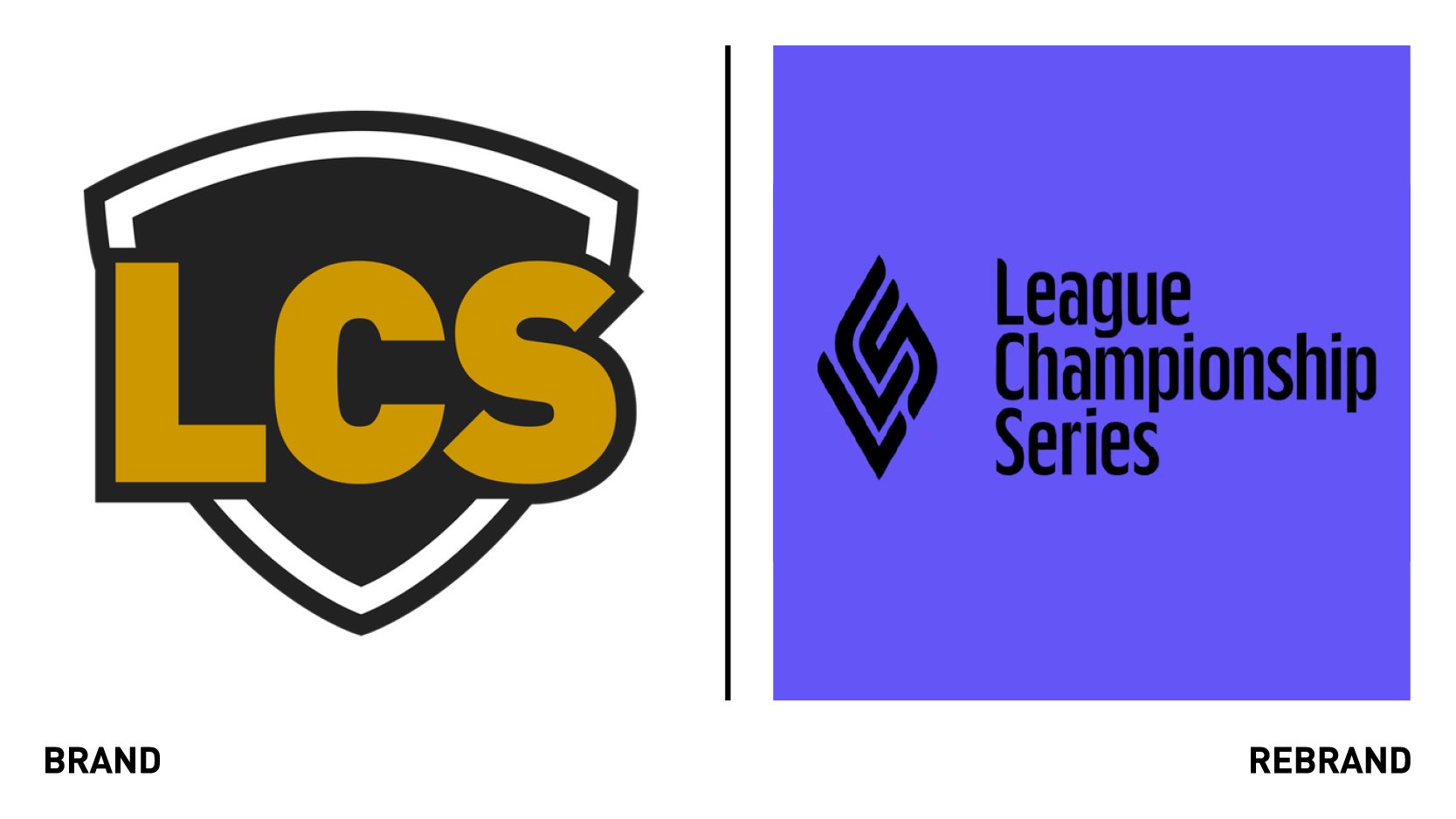
LCS, North America’s premier esports league founded by Riot Games, worked with design agency Stink Studios to develop a rebrand that would authentically honour the community and connect with fans and players alike. The new logo references the Summoner’s Rift map, the league trophy, a fingerprint, a flame and monograms the letters LCS. Building from this, a graphic system was created whereby each piece forms part of the new story for LCS. The lilac and black colour system balances he league and its teams, while a typographic superfamily expressed a broad range of emotions. The graphic patterns infuse a job of the game’s energy, and the refractive visuals reflect the many sides of the multidimensional league. Extensive guidelines were set for a complete overhaul of the league's broadcast package brought to life by Troika & Capacity Studios alongside the Riot creative team. The new visual identity celebrates LCS’s future as a singular and premier esports league in North America and a brand that was ‘made by many.’
Sevilla FC
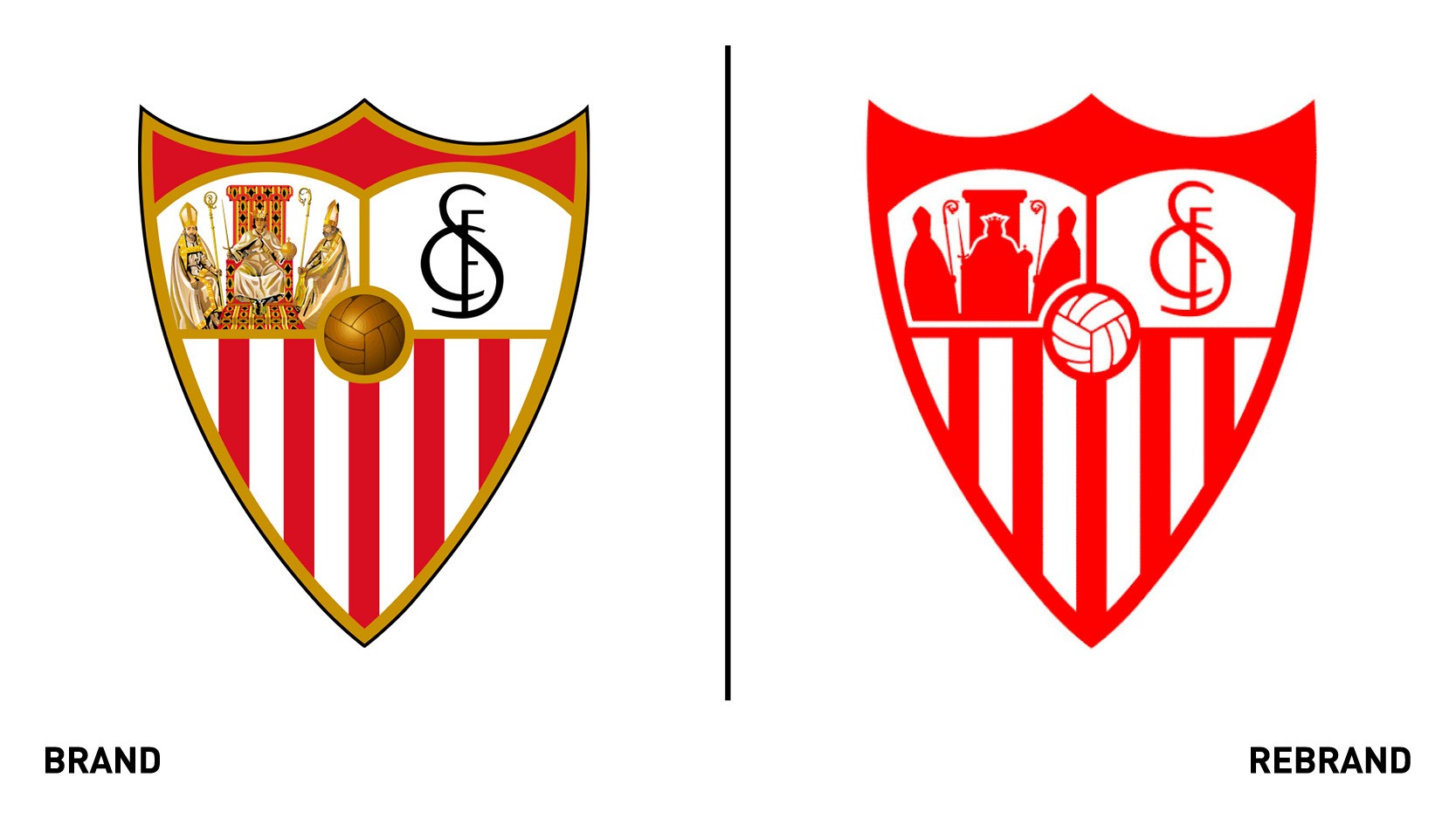
Barcelona-based design agency Summa was commissioned by Spanish professional football club Sevilla FC to carry out a global branding project that would give a new impetus in the achievement of the club’s business and sports objectives, both internationally and nationally. Summa focused on Sevilla FC’s unique traits of ambition, business vision and its fandom. The club’s passion goes beyond the football pitch, connecting with the Sevillian character itself. With this in mind, Summa developed a powerful brand story inspired by the values and purposes that link the club with the city of Seville and its fans, while also modernising the brand and allowing it to connect with new generations of expand its horizons beyond football. The visual identity was inspired by the rich imagery of Seville and its cultural background. The Montecatini typeface acts as a bridge between folklore and football, adding its own language compared to other clubs. The colour palette centres around Seville red and flag red, the city's flag. The icons and illustrations were inspired by the architecture elements of the city, such as the coats of arms on building facades, the tiles in the streets, the Train neighbourhood and the royal Alcazar palace.


