Two lions, a red line and a Lausanne typeface

Unlike Geneva, its Lac Leman counterpart to the south, or Bern, the Swiss capital to the north, Lausanne’s place brand lacked a distinctive identity. However, the city’s character and heritage are rich with classical architecture, contributions to world sport and sites of religious and cultural significance.
Now, having worked with Geneva-based Base Design, the City of Lausanne is building a distinct place brand and visual identity. Typography is deployed as the main design device, alongside a modernised and streamlined version of the city’s coat of arms.
Taking note from Switzerland’s longstanding contribution to typography design – through typefaces like Helvetica, Swiss and Frutiger – Base Design worked with typeface designer Matthieu Cortat on a bespoke typeface for Lausanne. “These fonts have become the symbol of modernity and timelessness. Rather than piggybacking on the success of these particular fonts, we decided to combine the bold use of the colour red with a contemporary return to the inherent Swiss-style to give the municipality of Lausanne an intrepid voice,” says Anthony Franklin, design director and partner at Base Design.
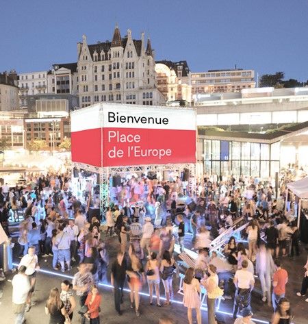
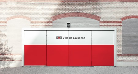
The brand will be deployed across various touchpoints including wayfinding and signage throughout the city, services vehicles and uniforms and official stationery and documentation. The visual system is completed by a simple red, black and white colour palette – in the Swiss tradition – and a solid red stripe device. Those elements, coupled with the typography and the coat of arms make for a simple, distinctive place brand.
David Moret, designer at Base, says, “We began by analysing the city’s coat of arms, from which we drew a font with unusual proportions. The typeface features lowercase letters that are 2/3 the size of the capital letters. The result is a simple, warm, and coherent visual language supported by a typeface with distinct character.”