#TransformTuesday: 7 August
Every week, Transform examines recent rebrands and updated visual identities. For more from #TransformTuesday, follow @Transformsays
Abacus
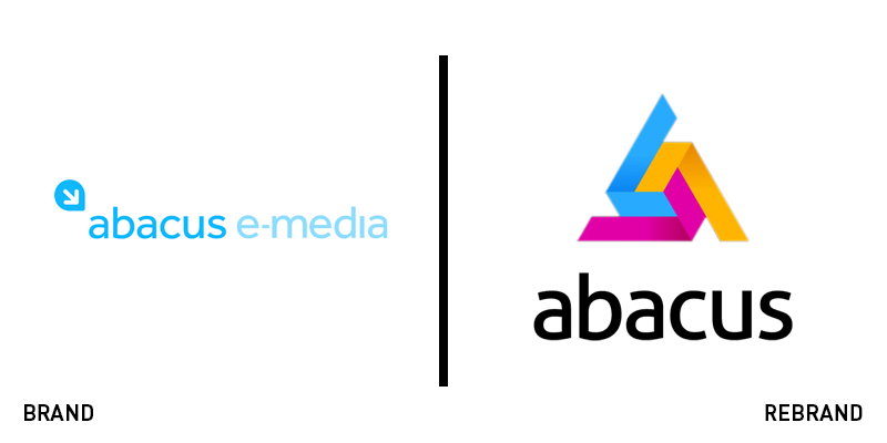
In an effort to evolve and grow, 40 year-old e-media company Abacus, has introduced a new logo and an updated brand identity. Leaving behind ‘e-media’ from its name and simplifying it to just ‘Abacus,’ the refreshing rebrand reflects the modern outlook of the company, as well as its desire to stay relevant. The new brand has eliminated the dominating sky blue colour and replaced it with a colourful design that accompanies the name, displayed in a clean and simple font. The result is a playful, yet simple logo that better suits Abacus’ brand profile, while upgrading the brand’s aesthetic.
Britannia
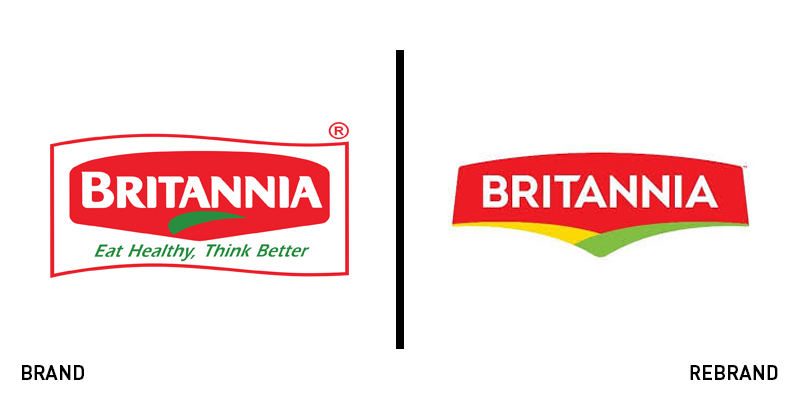
Indian food products corporation Britannia Industries has launched a new logo to support its expansion into new markets. Nusli Wadia, chairman, at Britannia, says the new logo is “not completely different from our old logo.” The updated wordmark is a modernised version of the previous one, carrying its predecessor’s heritage, while remaining recognisable to its loyal. The new design has kept the colour palette of red, green and yellow of the previous logo, however, it no longer features Britannia’s tagline or the red framing device. The chosen typeface is also similar, but without the minor curves the previous one had, offering a result that allows for a better digital adaptation.
Donald Russell
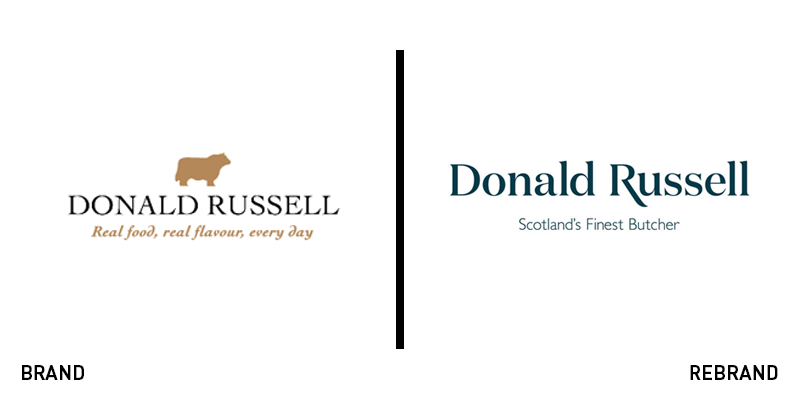
UK online butcher Donald Russell worked with global design agency Conran Design Group to design a new visual identity to reach a wider audience, offering a refreshed look that will attract new customers. Considering that the new visual identity should work across all brand communication channels, Conran Design Group designed a simple logo that no longer has an animal illustration on the top. The typeface has changed, leaving behind the all-caps approach, while the colour palette of black and brown has been replaced by navy blue. Last, the tagline ‘real food, real flavour, every day’ has given it’s place to ‘Scotland’s finest butcher,’ which cuts to the point. Conran Design Group Creative partner Lee Hoddy says, ‘We helped to reenergise a much-loved premium brand and tackle its business challenge with a design solution that is flexible enough to provide consistency across all communication channels.’
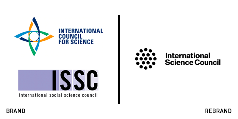
International Science Council
Through the merger between the International Council for Science and the International Social Science Council, the International Science Council, a global, non-governmental organisation, was established in 2018 to represent both natural and social sciences. The organisation has revealed a new visual identity by London-based design agency, Paul Belford. To help with the adaptation of the logo across the new brand’s touchpoints, Paul Belford designed a sharp, bold and simple logo that sports thick letters, swapping the brand's previous colourful look for a strict black colour palette alongside a geometric design that is open to interpretation, as it can be seen as a simple circle, a speaker or even a a collection of people coming together to form a council.
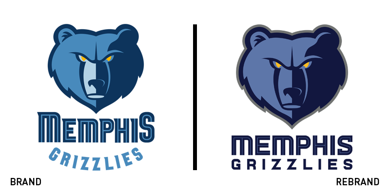
Memphis Grizzlies
American professional basketball team based in Memphis, Tennessee, the Memphis Grizzlies, has revealed a major rebrand consisting of new logos, uniforms, colours and a new court design. The ‘Grizzlies’ wordmark is brand new and its colour matches the blue hue of the city name. The secondary logo consisting of a basketball and claw has also been redeveloped, adopting the same colours of the primary logo. The claw now sits directly on top of the ball, in a position that makes the middle three claws can form the letter ‘M for ‘Memphis.’ Although the changes are very subtle, the team’s overall look has been upgraded in the process.
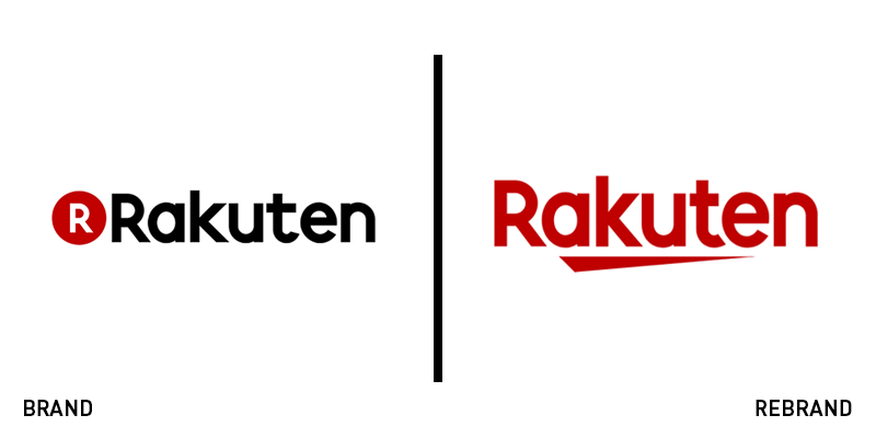
Rakuten
A company that contributes to society by creating value through innovation and entrepreneurship, Rakuten Inc., has announced the redesign of its logo, supporting the brand’s growth and evolution around the world. The new logo features the addition of the Japanese character for ‘one,’ which references the company’s new chapter in its mission to expand and welcome the next challenge. It also symbolises the unity among the organisation, it’s leading quality and its uniqueness. The new logo is bolder, sharper and bigger. The colour choice of vibrant red replacing the previous plain black gives it a dynamic feel, which is further enhanced by the underlined effect. Different colours have been chosen for each of the company’s many services, showcasing the diversity of the Rakuten group.


