#TransformTuesday: 4 September

Every week, Transform examines recent rebrands and updated visual identities. This week's picks are below. For more from #TransformTuesday, follow @Transformsays
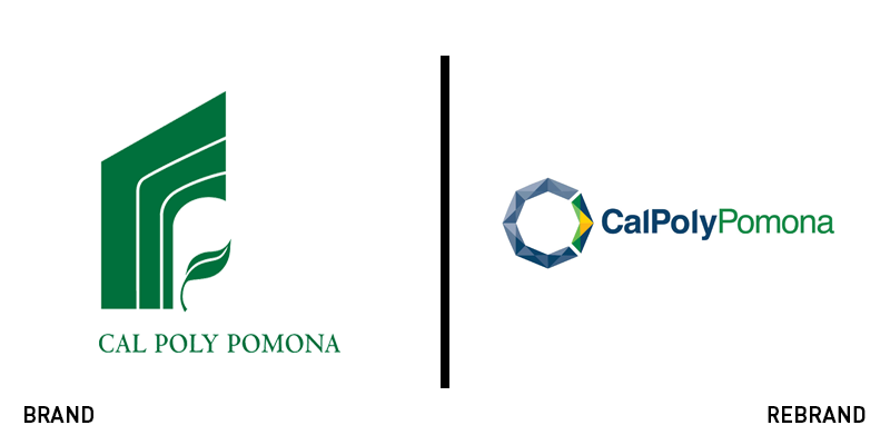
Cal Poly Pomona
California State Polytechnic University, Pomona is a public science and technology focused institution located in southern California. Following the trends of universities such as the University of Warwick and the University of Roehampton, among others, rebranding to cater to the new generation, Cal Poly Pomona has introduced a new brand identity. After gathering information from students, parents and alumni, the university formed eight committees, consisting of people from all parts of the university community, to evaluate the findings. The result is a new logo with an octagon shape that references the eight academic colleges and the eight elements of polytechnic education described in the university’s academic master plan. A bold blue colour was also chosen as the primary colour of the brand, with the previous colours of green and gold appearing in the octagon’s arrow, connecting the brand to its history.
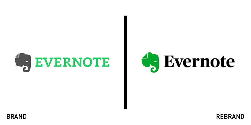
Evernote
Mobile app Evernote has marked its 10th year of operation with an update to its brand. The app, with over 225m users, appointed DesignStudio, which, together with the brand’s in-house team, came up with a visual identity that is based on abstraction. The new logo sports softer, rounded edges, which optimises the white space around the wordmark. Honouring the brand’s heritage, the fold in the iconic elephant’s ear became bigger and more prominent. Furthermore, the trunk has been turned into a spiral, a symbol of progress, and the eyes were softened to give off a friendlier, more approachable look. The combination of grey against a green gradient felt outdated, so the elephant’s colour was also changed to a pure, vibrant green, the signature colour of Evernote that helps the logo remain recognisable to its audience.
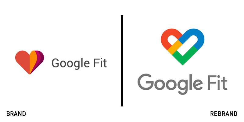
Google Fit
Google is refurbishing its fitness tracking app, Google Fit. The app’s new identity features an all-white look that aligns with Google's new material design guidelines, based on guidelines from the American Heart Association and the World Health Organization. The revamp of the app brings a number of improvements to its features, as well. Google Fit’s logo was also updated, making it fit in with the aesthetic of the master brand much better than it did in the past. The colourful heart illustration of the original logo has been replaced with a more abstract version that sports the iconic colour palette found in the Google logo. The typeface has also been swapped for the one found on the Google logo, achieving consistency within the Google master brand.
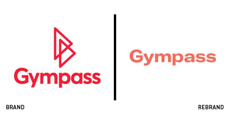
Gympass
One of the biggest US-based corporate fitness platforms with headquarters in New York, Gympass, has unveiled a new brand identity that uses varying sizes and colours to symbolise inclusiveness and diversity. It uses rounded shapes to represent the different people Gympass hopes to attract with polygons used to represent the more than 600 activities Gympass offers. The combinations of shapes are never-ending, just as the fitness potential in each user. For the new logo, Gympass has chosen vibrant and lively primary colours, that evoke a joyous feeling, while also being elegant in their simplicity. The secondary palette appears when the colourful rounded and polygon shapes, which represent both people and activities, overlap.
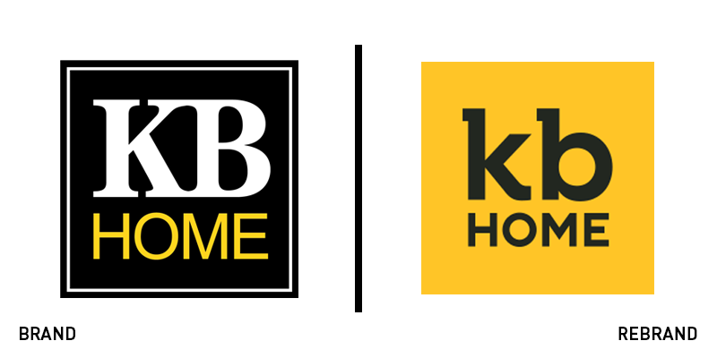
KB Home
Property development company based in the US, KB Home, has revealed a new logo, designed to modernise the brand and attract a wider, younger audience. Along with an updated visual identity, the rebrand includes a new tagline, ‘Built on relationships,’ which describes the differentiating factor between KB Home and other businesses. The rebrand was led by Los Angeles-based creative agency Phenomenon. Phenomenon designed a contemporary brand identity that reflects the brand’s core values of innovation and customer centricity. Jeff Mezger, KB Home’s president, chief executive officer, and chairman of the board, says, “KB Home has always been built on relationships – with customers, suppliers, trade contractors, land sellers, realtors, and municipalities, as well as between colleagues. This evolution of our brand aligns with our heritage of offering an exceptional customer-first experience to more than 600,000 families. It’s a bold and positive new visual identity that captures the essence of who we are for today’s and future homebuyers.”

Thunderbird
Well-known mail client, Thunderbird, has rolled out an updated visual identity, its first in eight years, as a solution to the significant gap in technical and design issues between Firefox and Thunderbird that resulted from Mozilla moving away from the brand. Thunderbird collaborated by digital design studio Ura to revamp its brand. Ura came up with an updated logo and word mark, that is now simpler, cleaner and offers optimal on-screen translation. Furthermore, the colour palette has been swapped with a brighter and more vibrant version of the previous one. The new logo will appear in Thunderbird 60.


