#TransformTuesday: 23 January
Every week, Transform examines recent rebrands and updated visual identities. This week’s picks are below. For more from #TransformTuesday, follow @Transformsays.
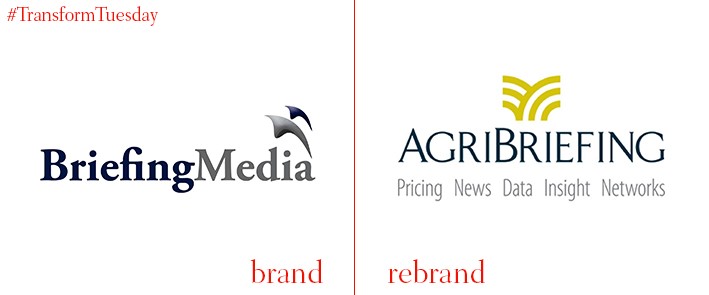
AgriBriefing
Briefing Media, the world’s leading agribusiness media and information company, has rebranded under the new name AgriBriefing. The company's name change better reflects its focus on international agribusiness and will further aid it in expanding its international audience. AgriBriefing currently works with professionals in over 200 countries, and its turnover has tripled over the past five years. In 2015, private equity investor Lyceum Capital backed a management buyout of the company. Daniel Adler, partner at Lyceum Capital, told Farmer’s Guardian, “The brand better reflects this company’s strategic focus and exceptional international growth. We look forward to its continued success through increased customer reach and targeted acquisitions.”
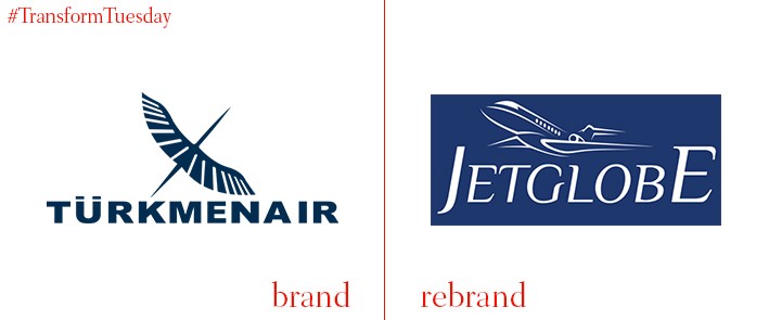
JetGlobe
Türkmenair, an air taxi company and flight services coordinator based out of Instanbul’s Atatürk airport, has recently rebranded as JetGlobe. Since it was acquired by Bilen Air Services in 2015, JetGlobe has reached an increasingly international client base and has expanded its number of aircraft from one to six. The new name reflects the company’s global positioning. “We decided to change our brand due to the significant increase in the presence of our business globally,” says Bilen’s corporate business director Ayca Kocabas. “The name JetGlobe is more dynamic and all of the team is aiming to develop our services for new and existing customers.”
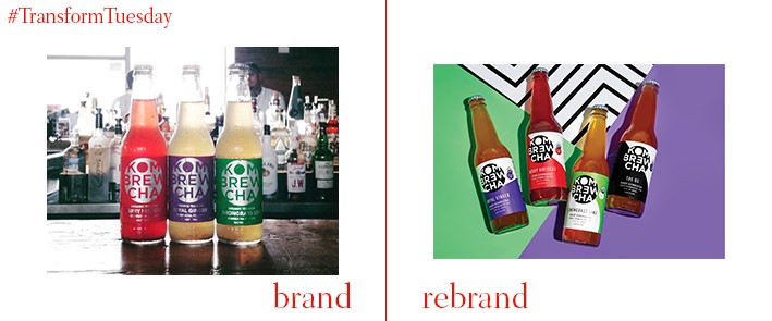
Kombrewcha
Miami-based company Kombrewcha provides the world’s first alcoholic kombucha drink to health-conscious restaurants and select Whole Foods locations. The 3.2% ABV carbonated fermented tea has recently undergone a rebrand courtesy of creative agency The Workshop Collective in order to celebrate the drink’s now-higher alcohol content. The logo features a sans serif typeface cropped within a black circle, contrasted against half-white, half-colourful labels that identify each tea’s flavour. The Workshop explains that it “created a design that is colourful, cheeky, and immediately catches the attention of any consumer passing by.” It adds that the new bold colours and packaging patterns “create Instagramable moments for those who like to socialise without compromise.”
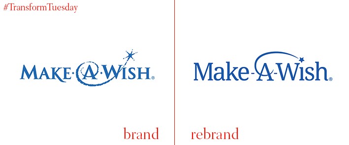
Make-A-Wish
Make-A-Wish is a non-profit organisation that grants the wishes of terminally ill children across the U.S. and 45 other countries. At the start of the year, Make-A-Wish announced it would be replacing its 38-year-old shooting star logo with an updated, more contemporary version designed by creative agency Rule29. The agency maintained a serif typeface in order to signal that Make-A-Wish is “a credible organisation with established longevity.” The most notable difference between the logos is the new shooting star feature, which now curves above the wordmark. This creates a flat baseline that allows chapter and affiliate names to be placed closer to the logo. Rule29 explains, “The new logo aimed to create a strong presence for the brand, while also maintaining the imaginative appeal of the old logo.”
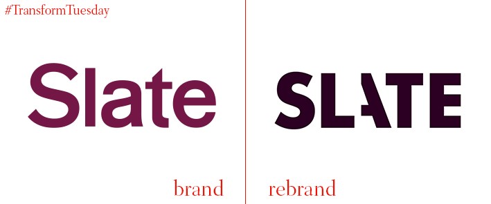
Slate
Online general-interest magazine Slate has a new visual identity to create a “cohesive visual voice” that executives felt was lacking. Slate’s in-house team worked with design firm Gretel to create new logos, colour and type palettes, and a design toolkit that Slate has implemented across its website, podcasts, and social media platforms. A prominent feature of Slate’s new design is the overlapping of visual elements and handwritten details. Slate’s design director, Jason Santa Maria, explains, “We prize curiosity, wit, and chasing those moments of surprise in a story. Our design direction seeks to embody these qualities by visualizing some cues of the story-making process. We want to show how materials and research come together—sometimes literally by allowing elements to overlap and pile on top of one another—and how the editor’s hand is a part of that.”
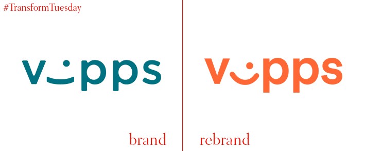
Vipps
Vipps, Norway’s leading cash-free payment system, revealed a new identity in December 2017. This new logo was created by Scandinavian Design Group, which updated Vipps’ existing logo to reflect its new ownership. Originally owned by Den Norske Bank, Vipps’ previous logo featured the same shade of green as its parent company’s. However, last autumn Vipps separated from DNB to become an independent company co-owned by most of the banks in Norway. Scandinavian Design Group changed the new logo to a bright orange to mark the company’s new status. Tonje Foss Kløve, Vipps’ brand director, remarked to Norwegian publication Kampanje, “Now Vipps starts a journey where we go from being a DNB product to becoming a company.”
For more from Transform magazine, follow us on Twitter @Transformsays


