New start for Start-Rite
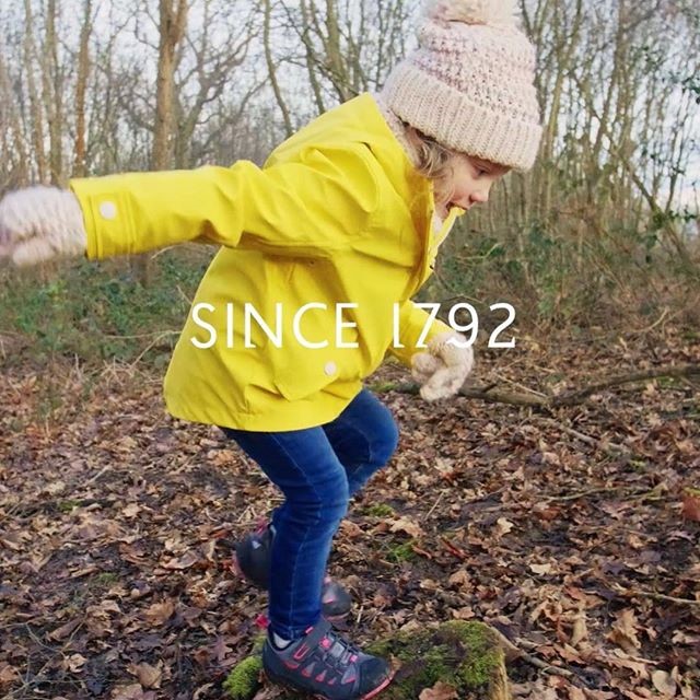
Start-rite, a children’s footwear company that has been in business for the last 225 years, has partnered with Studio Sutherl& in order to launch a new logo in the context of the company’s complete renovation. Studio Sutherl&, which worked alongside brand specialist Jo Graham to bring the brand’s image up-to-date, while being conscious of its desire to honour its legacy.
When Ian Watson joined Start-Rite as the CEO in February 2016, he soon realised that the company had become detached from today’s families and had no connection with its customers and associates. That’s when he decided to invest in research that would reveal what the industry would need. He says, “If you know a thousand consumers are crying out for an element to be built into a product, you’ll minimise the amount of risk you’re taking.”
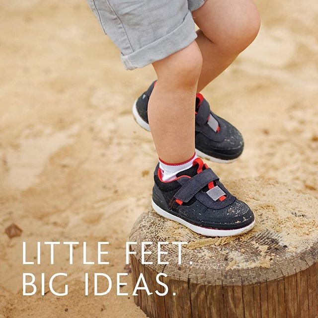
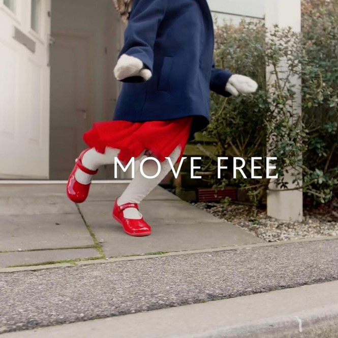
The changes made in both the logo and the whole brand is that Start-Rite was perceived as a conservative brand that felt restricting and outdated to modern families. Consequently, the brand dropped its gender-based categorisation of products for a more lifestyle-centred approach. Watson says, “It’s about making the brand relevant to today’s families. This is driving our product development. Historically, we had very smart shoes for girls, and slightly more casual ones for boys. We’re repositioning the brand to help children move around freely – we’re not defining what they should be, but [rather, saying that] whatever they want to be, we’ve got them.”
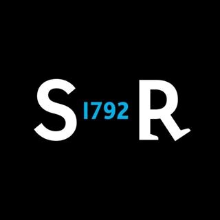
The new logo and branding has been developed by Jim Sutherland, who has a long history of collaborations with big company names like the Formula 1 team and NUA. The Start-Rite twins, who have featured in the brand’s logo since the ‘30s, have been redesigned to resemble children instead of dolls and can now be found not only on the logo but elsewhere across the branding. What’s more, ‘Typefeet’ font has been selected as the main font, ‘Bliss’ has been used as a secondary font and the chosen colour palette consists of black, white and sometimes sky-blue.
In addition to the new logo, a new company website is on the works, as well as digital and print communications and a “keep exploring” campaign, in which “close to £1m” was invested. This campaign includes new systems for enterprise resource planning, trade web orders, accounting and computerised warehouse management, all of which are set to go live at its Norwich distribution centre this month.
For more from Transform magazine, follow us on Twitter @Transformsays