#TransformTuesday: 5 January

Every week, Transform examines recent rebrands and updated visual identities. This week's picks are below. For more from #TransformTuesday, follow @Transformsays
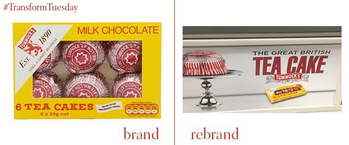
In a controversial move, Tunnock’s, a traditional, Scottish biscuit-making company, is changing its packaging and advertising to position itself as a British brand south of the border. Post-referendum, Tunnock’s is proudly positioning itself as a British, as well as Scottish brand. It also hopes to benefit from the huge success of The Great British Bake-off television programme. The new advertising slogan describes the marshmallow treat as “The Great British Teacake”. Tunnock’s has also dropped the Scottish symbol of a lion rampant from its new teacake advert, which features on the London Underground.

The North Shore-LIJ Health System, the largest health system in the Tri-State area, aims to illustrate its growth beyond Long Island with a new name, Northwell Health. Michael Dowling, president and CEO of Northwell Health, says, “The system was named after two of our hospitals – North Shore and LIJ – and now we have 21 hospitals.” The health system also aims to further its expansion into New England. It will take up to two years to change the entire system’s signage to the new parent brand.

BBC Three, the BBC television channel aimed at young adults, has revealed a new identity ahead of its switch to online-only programming. The new logo consists of two vertical lines and an exclamation mark, and has come under some criticism for both its lack of the number three, and its design more generally. Nicki Carr, BBC Three's head of marketing, says, “If I'm being honest I’m not worried. Some people are resistant to change and we wanted to be bold and create something that looks forward and will be around for years to come."
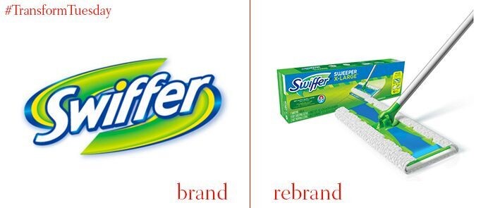
Chase Design Group have created a new identity for cleaning product, Swiffer. The new logo is a straightforward brand evolution that maintains many of the aspects of the previous design. The typeface is less italicised and the green ‘swooshes’ in the background are simplified.

