The type writer: Wayfinding and signage
Bruno Maag analyses the use of iconography and typography in wayfinding and signage
Every day we each navigate through spaces, either physical or digital; we use conventions that allow us to make informed decisions on the direction to take. Typefaces, colour and pictograms help guide us.
Public transport hubs, such as international airports and large railway stations, require a considered and coherent wayfinding system to enable people to reach their desired destinations with ease, and to prevent missed connections and overcrowding of spaces. The design challenge lies in the diversity of its users, with differences in age, cultural background and mobility. Each user must be able to access information quickly and accurately.
Being able to read a road sign when driving at 120 km/h can mean the difference between life and death. As in a transport hub, the information has to be accessible to a broad range of people, some with mild visual impairments, but ambient lighting and the distance/
speed relationship also have to be accounted for. It is paramount that the typographic presentation of the information – through typeface style, size, letter spacing and line distance – is carefully chosen and tested under strenuous conditions.
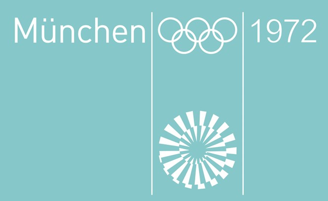
Many wayfinding and signage systems already use pictograms alongside typography. Pictograms are language-independent, but to be correctly interpreted must adhere to established conventions and account for cultural differences. The 1972 Munich Olympics set the precedent of good pictogram design by Otl Aicher, as much as Adrian Frutiger and Margaret Calvert established what good typography in transport design means. Let’s continue the good work.
Bruno Maag is chairman of Dalton Maag

