#TransformTuesday: 5 May

Here's this week's selection of rebrands from around the world, meat snacks to rum manufacturers to mobile platforms. For more from #TransformTuesday, follow @Transformsays on Twitter.
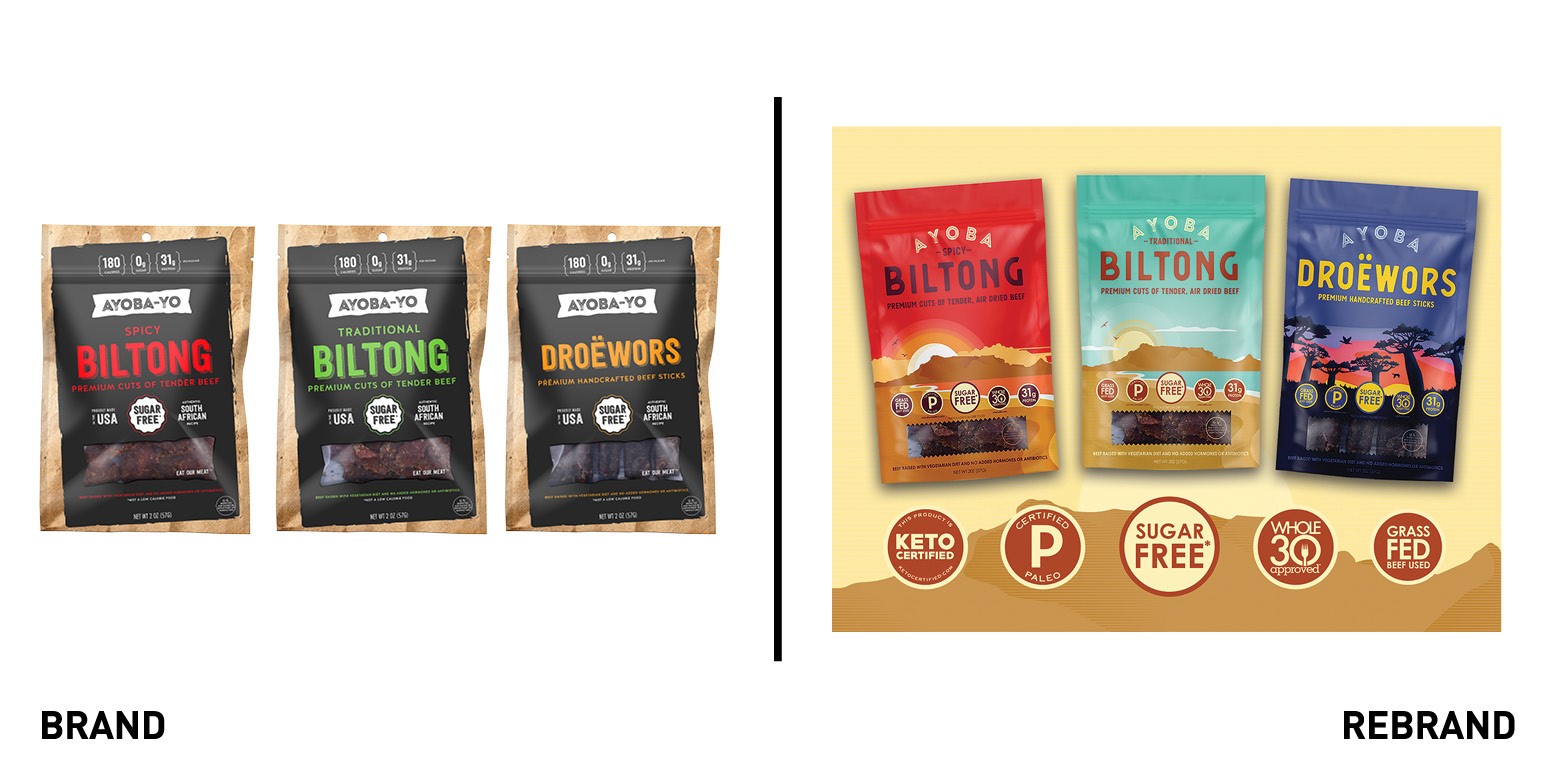
Ayoba
American Biltong beef brand Ayoba launched a new brand identity, including a new name, packaging and logo. Initially known as Ayoba-Yo, a term to express excitement and approval, it became Ayoba because it’s “easier to say with your mouth full,” as co-founder Wian and Emile van Blommestien say. The packaging is centred around a vibrant colour palette of blues, reds and purples, colours which embody South Africa, where the Biltong beef is from, while the graphic elements help tell the brand’s family story. The ‘Big 5’ health callouts on the packaging (sugar free, whole 30, grass fed, 31g protein and paleo certified) reflect Ayoba’s positioning as a premium meat snack brand focused on authenticity and transparency of their natural ingredient sourcing.
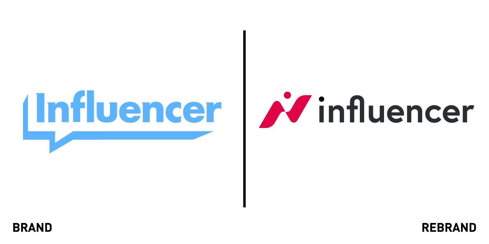
Influencer
London-based Influencer marketing platform, Influencer, launched a new brand identity, including a new logo, device and colour palette, for a more mature brand aesthetic that reflects its increasing growth in the sector and the central role technology plays. The new logo includes a fuchsia wave shape created by the letters ‘i’ and ‘n’ which represent the brand’s overall message, of wanting to generate a ripple effect across the world through ‘waves of influence.’ The company’s role, to provide content that has been informed by deep data from hundreds of campaign, is further emphasised by the new strapline, ‘Make waves. Measure all of them.’ “The new branding encapsulates Influencer as the intersection between extraordinary creativity and exceptional technology, and seeds the idea of creating waves of influence. Creators tell stories that make human connections and start global waves of influence, which ripple across the planet; waves whose impact is measured in unparalleled detail by Influencer,” says Influencer’s CEO Ben Jeffries.
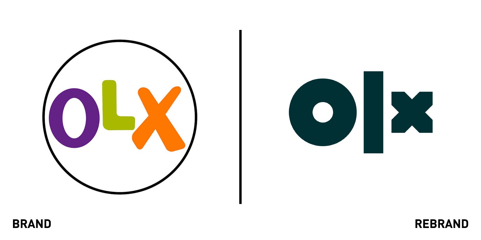
OLX
Amsterdam-based OLX, one of the world’s largest classifieds platforms, teamed with creative agency DesignStudio to launch a new brand and digital experience that would set the company apart globally, unify its markets and go beyond classifieds. Initially, DesignStudio worked on eliminating the stigma surrounding the second-hand sales market, showing that it can be savvy and eco-friendly. The strapline ‘Making second hand the smart choice’ guided all the strategy and design work that created a dynamic and confidence visual identity, one that would express all the optimism that’s true to OLX. Similarly, the new logo, which adapts to different digital platforms, symbolizes the many choices and flexibility people have when shopping in secondhand markets.
“It was an absolute pleasure working with such a brave and ambitious client to shift the perception of buying and selling second hand, positioning it as something smart, exciting and fun — hopefully through OLX and their new digital platform, we start to see a shift in behaviour towards smarter consumption around the world,” says Elise Santangelo, design director at DesignStudio. The rebrand included custom typography, a bright colour palette, photography guidelines and tone of voice principles.
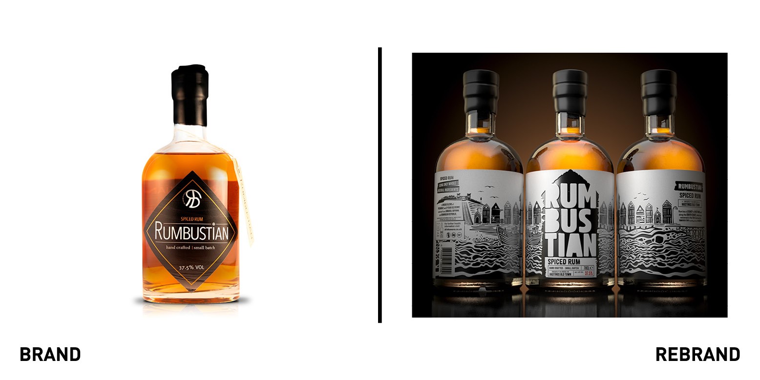
Rumbustian
Rum producer Rumbustian from UK coastal town Hastings partnered with London-based agency PB Creative to launch a new design for their range of small batch of rums to represent the hand-crafted nature and provenance of the product. The founders of Rumbustian, Jamie and Sue Keenan were looking for a new brand identity that would bring to life the natural edge of Hastings, where the rums are crafted. To achieve this, PB Creative centred the new brand aesthetic around some of Hastings’ landmarks, with the black weather-boarded fishermen’s huts which populated the beach front featuring at the front of the label alongside the castle, funicular railway an traditional fishing boats. Lloyd Moffat, creative director, PB Creative says, “Every element of the Rumbustian handcrafted process is overseen by Jamie and we wanted to bring this artisanal nature, the uniqueness of the blends and their provenance to life through the brand on pack. A natural thick paper stock combined with a deep debossed foil stamp creates a very striking and tactile look and feel. Each variant has its own personality while black remains the consistent and unifying element across the whole range.”
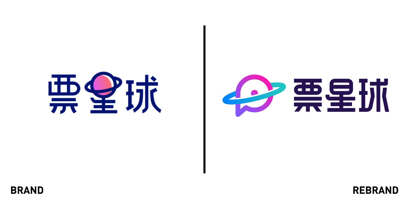
Ticket Planner
Ticket Planet, a Chinese mobile platform that provides tickets for sports, concerts and other live entertainment events, worked with Shanghai-based Chi-Mu design agency to create new more professional, relevant and contemporary brand. Chi-Mu focused on creating a brandmark that would become iconic while including a Chinese font. “We focused on creating a visual solution that had a strong and unique personality,” says Victor Chi Sun, creative director of Chi-Mu. The colour palette, which is based on the colours of the galaxy, from purple to pink to blue, further reflects both the logo symbol, a planet with rings that reminds us of Saturn, and the English name, Ticket Planet.


