#TransformTuesday: 3 March
Here's this week's selection of rebrands from around the world, from New Zealand kiwis to mental health service providers. For more from #TransformTuesday, follow @Transformsays
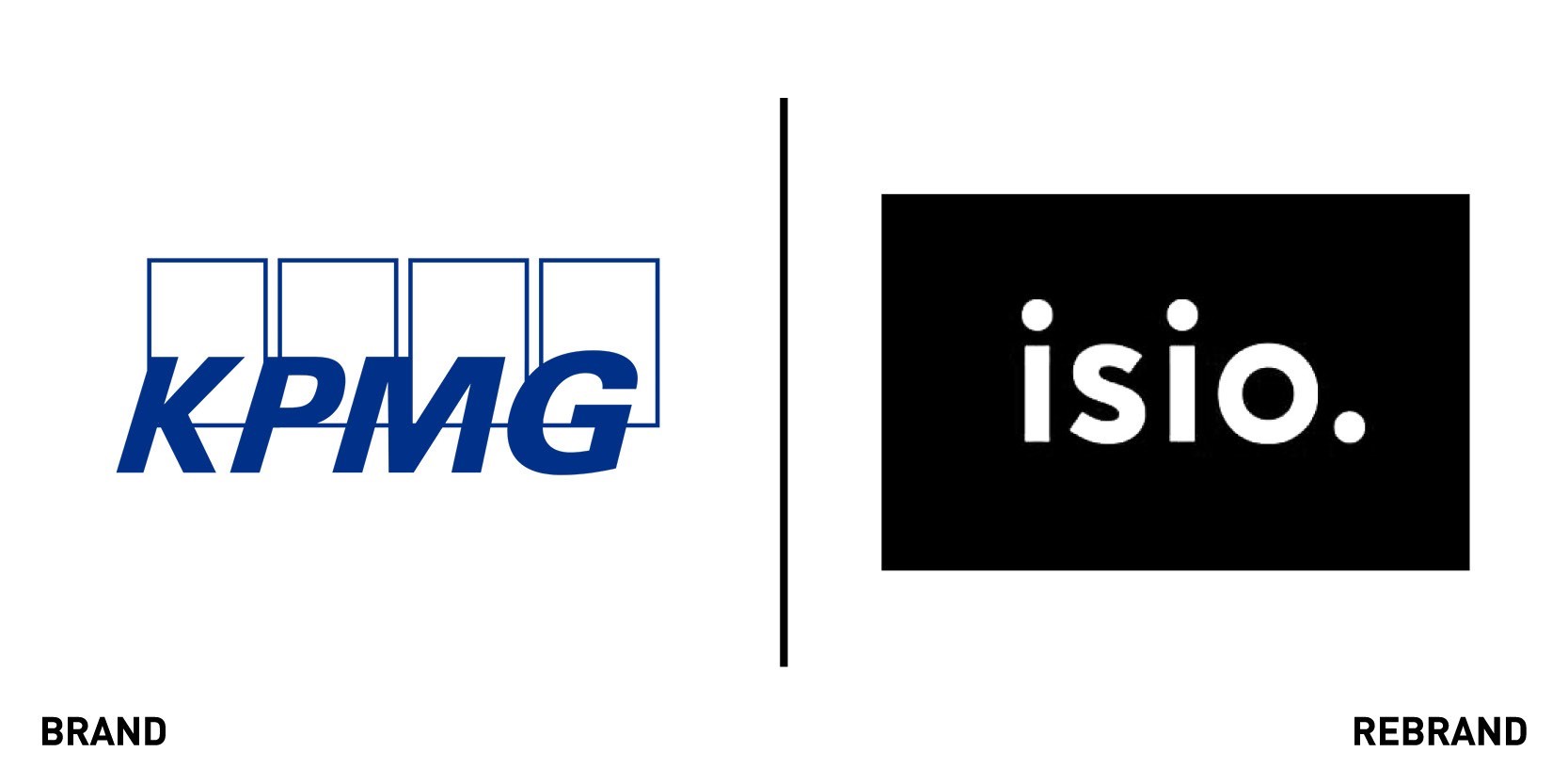
Isio
As part of its national launch in eight different locations, the newly independent entity of former KPMG’s pension consulting unit has rebranded as Isio. The pension practice, which works for some of the UK’s largest pension companies and holds around £50 billion of pension assets under advice, was acquired in late 2019 by investor Exponent Private Equity in an increased demand for independent professional counsel. Isio will build on its pre-existing advisory base and offer clients a combination of actuarial expertise, third party administration, defined contribution specialists and investment consulting. CEO Andrew Coles says, “As an independent practice we can predict and respond to client opportunities and challenges with greater agility. Backed by proprietary technology, our team brings deep technical expertise, and an entrepreneurial culture. The industry is at a turning point and our belief is that pensions advice needs to adapt to the new world, with technology playing a key part in improving the member experience, the quality of data and the modelling of pension outcomes.”
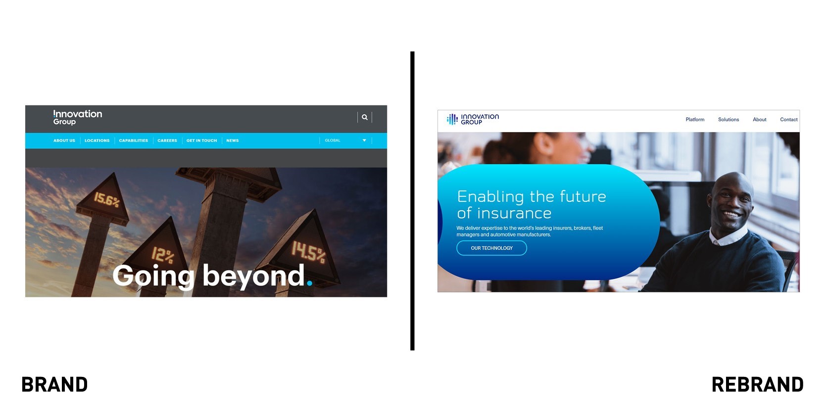
Innovation Group
Innovation Group, which provides operational support and technology platforms to insurers, fleet managers and brokers across the world has undergone a total rebrand, including a new visual identity, employee values and corporate website. The rebrand follows the group’s rollout of strategic technology platform Gateway, designed to revolutionise all aspects of claim management operations. Tim Griffiths, CEO of Innovation Group says, “The new brand reflects our status as a technology platform business supported by a world-class services capability.” Nowhere is this reflected more than in the new corporate website that, although retaining the signature blue colour palette, is clearly built around what they can offer as a company that many others can’t: advanced technology. While the old navigation bar displays the ‘about’ and ‘locations’ options, the new one is all about the platforms and solutions the group will provide for its clients.
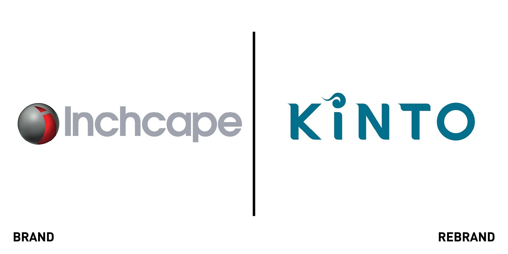
Kinto
The Toyota Fleet Mobility (TFM) is set to rebrand Inchape Fleet Solutions (IFS) under its Kinto mobility brand in the first six months of 2020, reflecting its transition from car company to mobility company. The new name and logo, derived from the Japanese word kintoun or ‘flying nimbus,’ a yellow cloud that transports a character in the famous Dragon Ball series, reflects the company’s global vision of evolving into a mobility company that provides all kinds of transportation services for all people around the world. The decision to rebrand follows TFM’s acquisition of IFS in December 2019, which marked the company’s entrance in the UK’s fleet management and full-service leasing market. By rebranding as Kinto TFM, which was established to develop a European base for future mobility services, aims to appeal to new categories of mobility users, use the power of data to develop and launch services such as car sharing, and integrate future advances in automated driving. “With Kinto, our ambition is to create an equally strong brand for mobility services – a brand that consistently delivers exceptional customer experiences, whether moving close to home or travelling in other markets. Kinto epitomises Toyota’s ambition to deliver ever-better mobility for all,” says Matthew Harrison, vice president of Toyta and Lexus Sales.
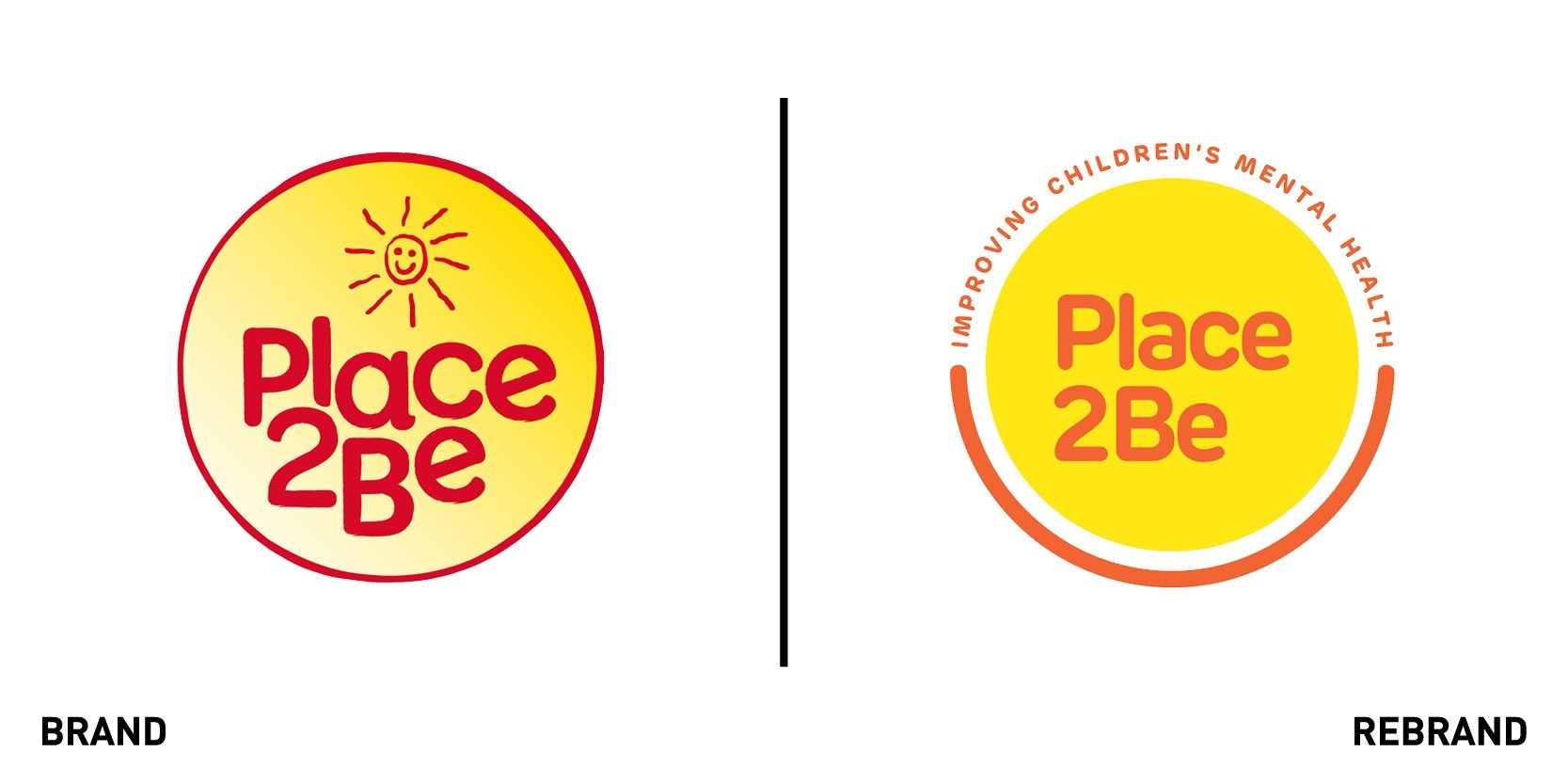
Place2Be
Place2Be, the UK’s leading provider of schools-based mental health services in the UK, sought the help of creative agency pslondon to create a new brand identity that would resonate with its target adult donor audience. Although Place2Be demonstrated great success at engaging children and young people, many people who had heard of the charity did not understand what its purpose was. To remedy that, pslondon kept the old circular logo and the bright tones of yellow and pink, but added the tagline ‘improving children’s mental health’ to rebuild the brand around the emotional resonance of childhood experiences. Sophie Buckland, senior creative at pslondon says, “A key part of updating the Place2Be brand was creating clarity around what they do, the development and incorporation of the strapline into the master logo achieves this whilst retaining an optimistic beacon of light for children who are struggling with their mental health.”
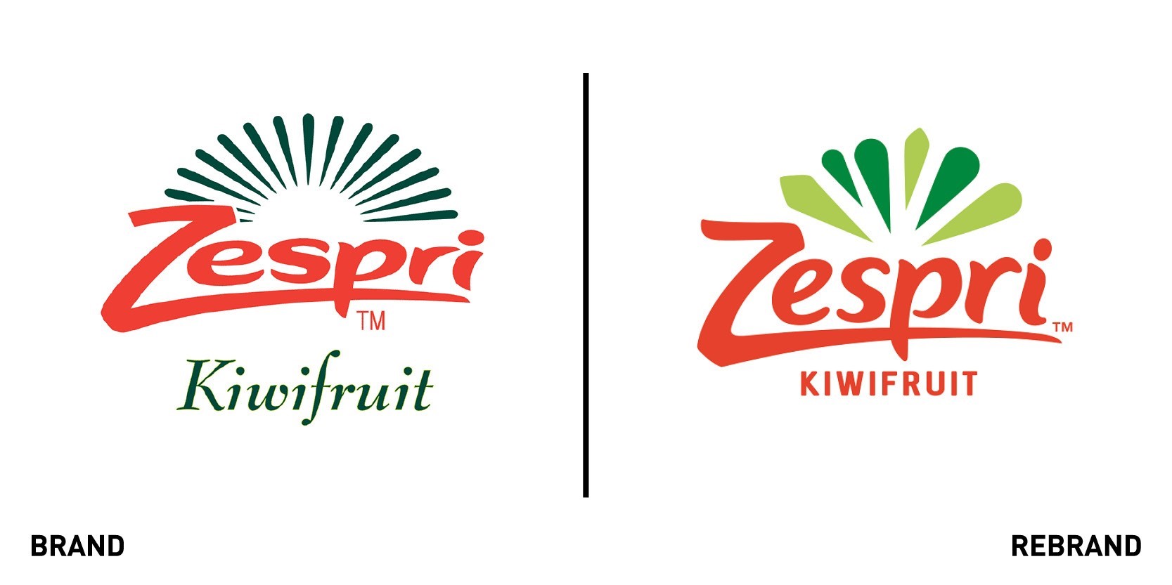
Zespri
For the first time in its 22-year history Zespri, the New Zealand-based marketer of kiwifruit, has undergone a total rebrand, including a new logo, tagline and visual identity that reflects the brand’s purpose and values of helping people, communities and the environment thrive through kiwifruit. This focus on health, fresh products and sustainability planet is reflected in their new tagline ‘make your healthy irresistible.’ which celebrates the fruit’s healthfulness and invites consumers to eat foods that are good for the environment. This is a really exciting time for Zespri and our industry on the back of the strong growth we’ve seen and the increasing global demand for nutritious products like our Zespri Kiwifruit. “We’re confident that our new brand will resonate not only with our loyal fans but pique the interest of new ones, helping differentiate Zespri in the fresh produce market so that we can continue to grow our share of the global fruit bowl. Zespri Kiwifruit are not only among the world’s most nutritious fruits, but they also taste amazing, so consumers can make the better choice of reaching for a snack that is both healthy and delicious,” says chief growth officer Jiunn Shih. The bursts of green on the new logo were inspired by the vibrant cross-section of the fruit and the new visual identity sought to capture the explosion of flavour consumers get when biting into the premium-quality kiwifruit.


