#TransformTuesday: 28 January
Here's this week's selection of rebrands from around the world, from British non-profits to American publishers. For more from #TransformTuesday, follow @Transformsays
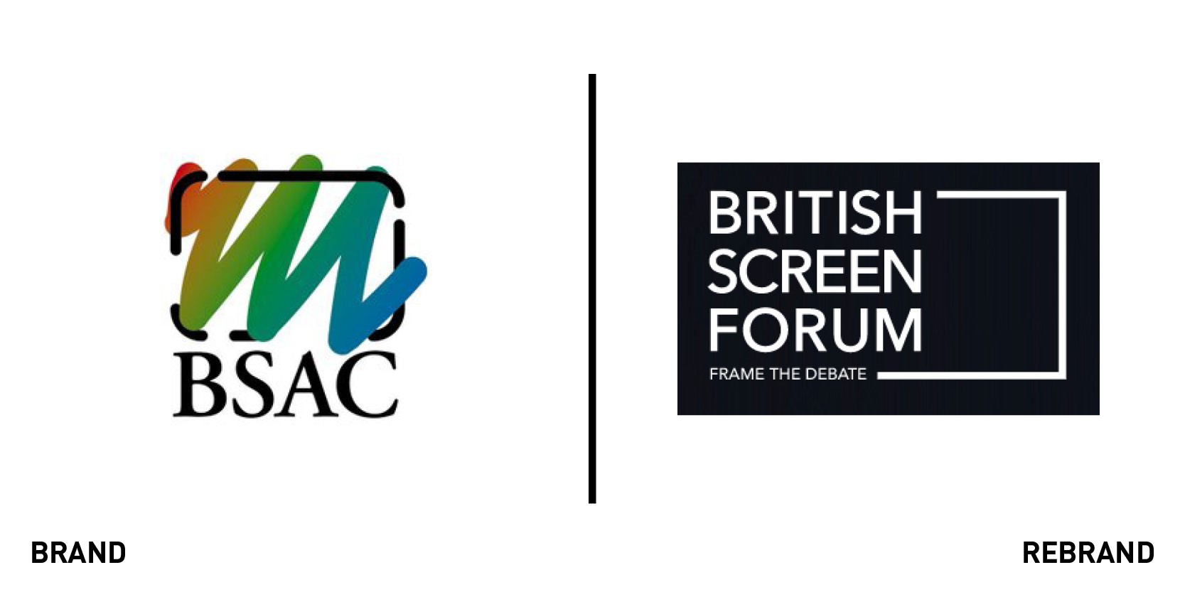
British Screen Forum
UK screen sectors membership organisation the British Screen Advisory Council has rebranded as British Screen Forum. It tasked Sherlock with creating a new brand identity to reflect its authority and impact. Sherlock used a sans serif font with a frame device as a nod to the screen industries that British Screen Forum represents. The new website uses extensive photography featuring British Screen Forum members and events, emphasising that it is the people and discussions that in large part define the organisation. Sherlock kept the colour palette simple and restricted to keep the visual noise to a minimum. Pete Johnson, chief executive of British Screen Forum, says, “Working with Sherlock was an absolute pleasure, they took time to fully understand our needs and delivered superb creative solutions.”
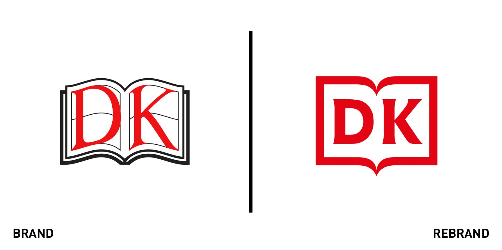
DK
International publisher DK (formerly known as Dorling Kindersley) has refreshed its branding, with a cleaner, more streamlined design. DK specialises in illustrated reference books for both adults and children on a wide range of subjects including travel, science and lifestyle. The company wanted to appeal to new audiences while retaining its familiar brand identity, and so it tasked Pentagram with creating a simplified version of the ‘open book’ logo. A new brand tagline – ‘For the curious’ – is designed to promote DK’s vision of inspiring curiosity and enabling discovery. As the logo is now a single colour, it can be applied in whatever colours and finishes best complement each book cover. Pentagram says, "Only a handful of publishing brands have a globally recognised visual identity, and it was important to retain DK’s iconic status, while bringing the old mark firmly into the digital age."
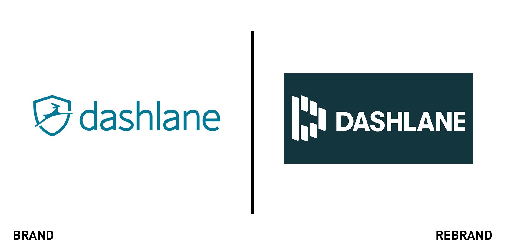
Dashlane
Password manager and digital wallet app Dashlane has refreshed its digital identity, aiming for a simplified look that nods towards its aim of creating a better user experience for its customers. Dashlane CMO Joy Howard says, “Our old brand identity didn’t quite reflect where we are going as a company. We wanted a clean, flexible system that reflects the clarity of our commitment to fix the UX of the internet. We help our customers reveal and conceal themselves and their data online; that idea turns into motion in our new identity system.” The company appointed Pentagram to deliver a new brand identity that it says feels simpler than ever and sets a solid foundation for what’s next. A single, basic shape forms the building blocks of Dashlane’s identity, reflecting the shape of smartphone screens and web forms. A pattern built from logo’s ‘H’ denotes barriers that Dashlane spirits past. Eddie Opara, partner at Pentagram, says, “We removed any extraneous filigree to present a sharp-edged visual identity system that points to Dashlane’s commitment to fix the UX of the internet.”
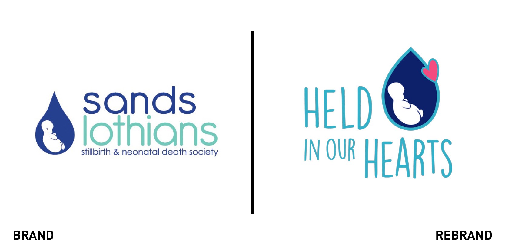
Held In Our Hearts
The Stillbirth and Neonatal Death Society, SANDS Lothians, has rebranded as Held In Our Hearts. The new name, website and logo are part of a relaunch that aims to highlight the core function of the charity which offers baby loss counselling and support to all bereaved parents. This support now includes babies lost at any stage of pregnancy and early childhood. Edinburgh agency Brand Oath created a new brand framework for the charity. At the strategic phase, and at the heart of the charity work, three key words were identified – empathy, connection and love – to reflect the different stages of the Held In Our Hearts journey. Nicola Welsh, chief executive of Held In Our Hearts, says, “We’re very excited about this next chapter in our identity. We are growing as a charity and, in turn, our support services have expanded to meet the increasing needs of bereaved families. We’ve been delighted to work with the team at Brand Oath and thank them hugely for all their help and support. We feel our rebrand reflects where we have come from but also looks to the future.”
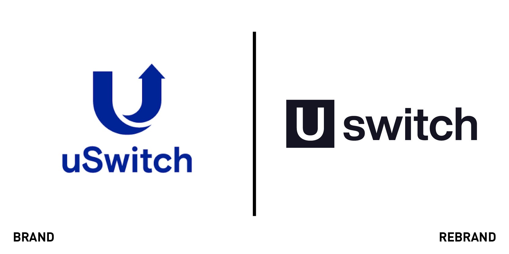
Uswitch
UK price comparison service and switching website Uswitch has undergone a rebrand. The service allows consumers to compare prices on energy, personal finance, broadband and mobile, and insurance. Instead of the conventional focus on price, products and process, the new Uswitch brand – which emphasises the ‘U’ – puts people at its heart and celebrates the benefits of switching. Built on the idea of ‘You, powered,’ Uswitch aims to show how, by choosing better products and services, people can get more of what matters to them – without hassle or extra costs. Uswitch enlisted venturethree to create the new brand platform, in collaboration with Uswitch’s own design team. Over the next few months, the brand will be rolled out across Uswitch’s entire platform, marketing communications and within its customer service centres.


