#TransformTuesday: 28 April

Here's this week's selection of rebrands from global customer support to music labels. For more from #TransformTuesday, follow @Transformsays on Twitter.

LiveChat
Since 2002, the company LiveChat has provided companies with a tool, eponymously named LiveChat, that enables website visitors to talk to that site’s customer support. Over the years LiveChat (the company) has been offering much more than just LiveChat (the product). ChatBot, HelpDesk and other brands had been launched. LiveChat was so much more. Unfortunately the corporate logo didn't reflect this. If anything, the company was firmly inside its own central brand.
While keeping many of the original components, such as the colours and the fonts, LiveChat’s chief creative officer, Maciej Serafinowicz and designer Jedrzej Rayski brought LiveChat firmly up to date. They took LiveChat outside of the speech bubble, adjusting the kerning to let the lettering breath. They changed the dimension of the bubble to allow for greater digital use. Finally, they ensured the whole product suite was fully aligned. According to LiveChat’s CMO Szymon Klimczak, LiveChat’s aim is to “transition from live chat software provider into a customer experience platform.” Here, seemingly, is a design and a strategy that back each other up.
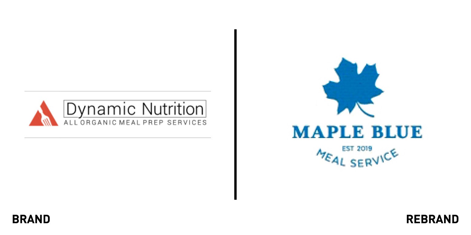
Maple Blue
The global meal preparation market is expected to double in the next two years, and San Diego-based meal preparation firm, Dynamic Nutrition, realised its existing visual identity wasn't best suited to capitalise on the growing demand in its sector. Fortunately, considering its infancy, there weren’t many brand touchpoints; with just a logo and website acting as the only pieces of collateral this company had before calling in Zstvns Design, a design firm specialising in helping startups. According to Zstvns’ Zach Stevens, “Giving this brand a personality that represented the founder and resonated with his audience was our primary goal. Turns out, the founder's story of working on a farm, watching things grow, and a nurturing attitude is exactly what a busy professional looking to spend more time with her family, less time shopping/cooking is seeking from a meal prep company.“
From that story came the identity, with Maple Blue ready to roll out shortly.
Michigan Association of Healthcare Quality
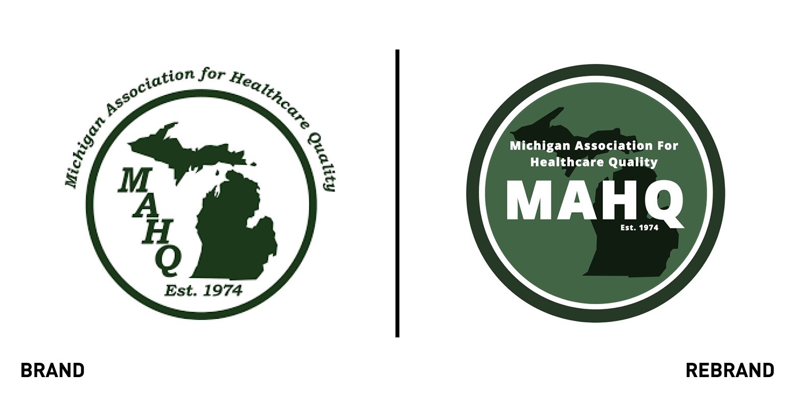
The Michigan Association of Healthcare Quality has been going for nearly 50 years but that shouldn’t be the primary factor to define an organisation. They seemed to make its age a dominant feature in their visual identity. It’s location came second, its slightly strange initialised name third. Lastly, physically outside its core, MAHQ’s function of improving quality of Michigan’s healthcare seemed like an afterthought. The rebrand done in-house by MAHQ’s directors Alyssa Spiteri and Jennifer Woodrum, brings the brand far forward. There is a sense that it has put stakeholders, its members and the wider community at the centre of the brand. It could have pushed further with its dynamism but there is no denying the vast improvement from the previous one.
OURAY Engineering and Manufacturing LLC
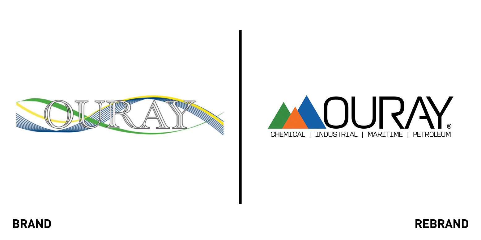
Ouray, Colorado, hosts the annual Ice Festival, one of the leading events for ice climbing. Aaron Montgomery has been competing here for nearly twenty years and, at 38, is still a strong contender in the USA World Cup ice climbing team. His love of the ice impacts everything - he named his company, OURAY Engineering and Manufacturing, after the ice festival which also inspired the company’s original visual identity. After eight years Montgomery decided it was time to change. The visual identity felt dated, and the company has widened its offering considerably. Eschewing a brand agency, who may possibly have suggested putting strategy more centre stage, Montgomery was inspired by the views of the three peaks of Red Mountain overlooking his beloved Ouray.
RECORDS
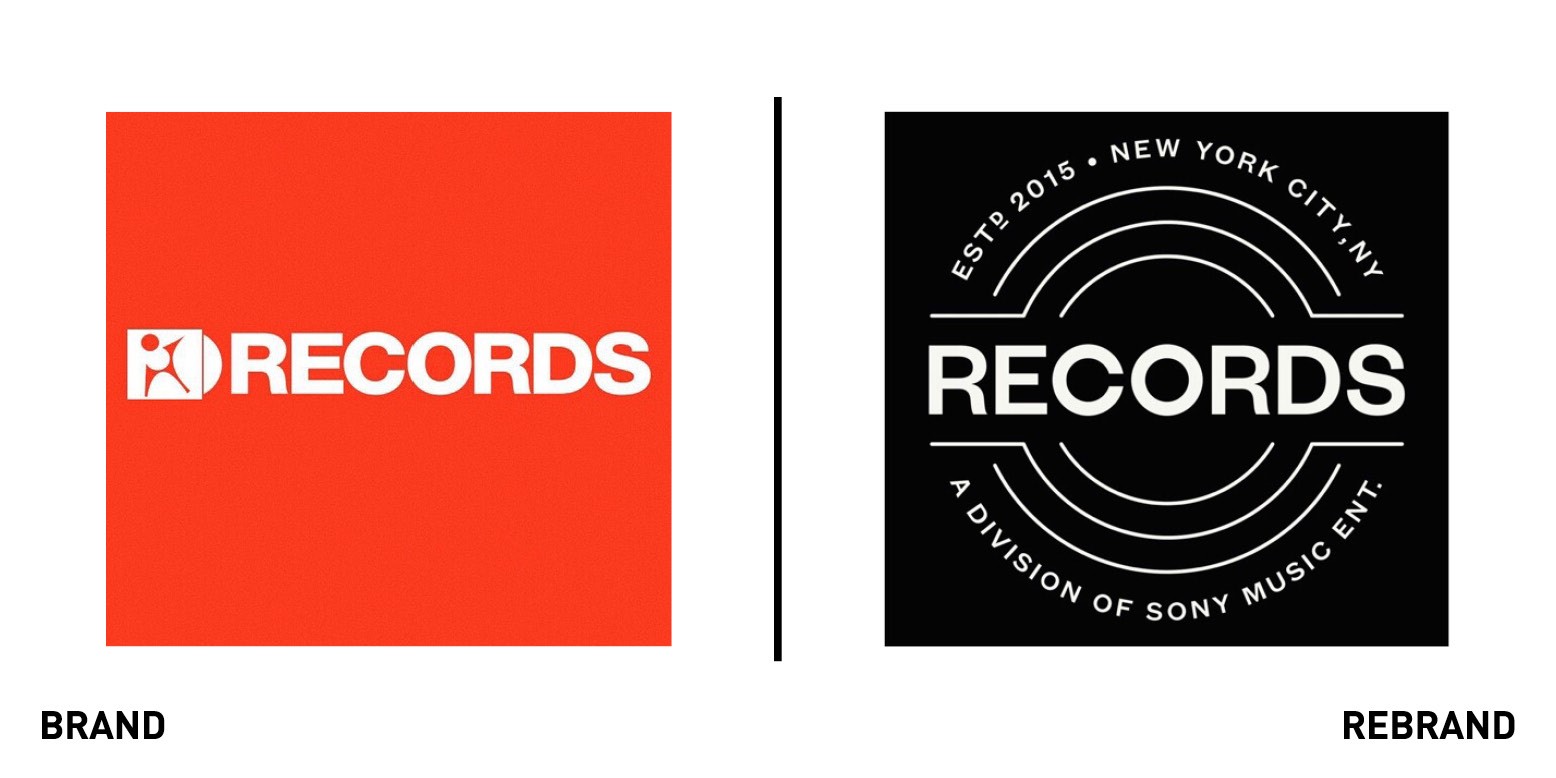
Co-founded in 2015 by music business legend Barry Weiss, RECORDS is a music label with a stack of a platinum artists on its roster, including Noah Cyrus, Matt Stell, and the super group LSD (formed by Labrinth, Sia and Diplo). Following a number of acquisitions, by early 2018 RECORDS had become a joint venture with Sony Music Entertainment, who moved Rachel Hardway across to become its director of digital strategy and creative.
Hardway’s early impressions of RECORDS was that no thought had been given to the visual identity behind the record label. As she comments “From the start, my number 1 agenda item was to apply a strategy and an identity to the label. I hired my trusted previous colleague Chris Cyran to work with me on assigning an identity to the brand.” While providing the reassurance of big name partner Sony, the new mark shares its independent heritage. The result is a strong, bold and confident identity.