#TransformTuesday: 24 March

Here's this week's selection of rebrands from around the world, from winemakers to luxury spas to drugstore chains. For more from #TransformTuesday, follow @Transformsays
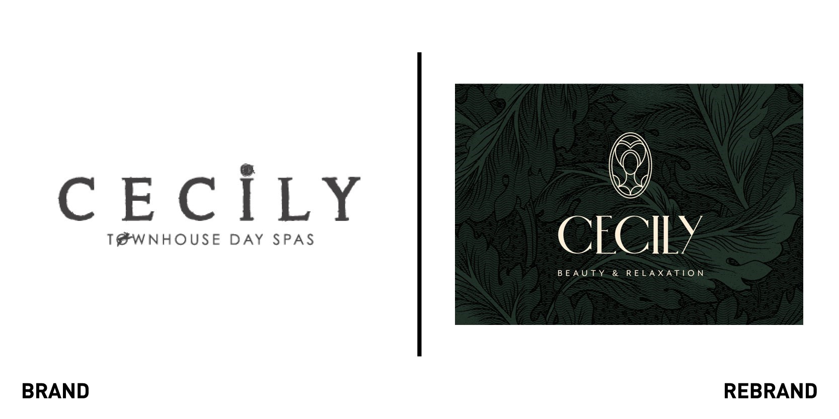
Cecily
London-based brand agency Mystery worked with high-end Berkhamsted-based day spa Cecily to create a new identity, graphics, a new logo and update its interior design. CEO of Cecily Haylee Benton wanted to convey a luxurious and traditional yet modern feel to the spa. To do so, Mystery created a new logo featuring the distinctive silhouette of Lady Cecily, a 15 century Berkhamsted noblewoman for whom the spa is named. Using her image allows the brand to pay tribute to the spa’s heritage while exuding elegance and high class. The graphic pattern, inspired by British textile designer William Morris, of big leaves on a dark background and the colour palette emanate a sense of calm and relaxation. “It was great working with the Mystery team on the refurbishment of Alchemy & I and Cecily, including Cecily’s rebrand. We had a very quick turnaround time, but they stepped up to the plate and brought enthusiasm and creative ideas that were exactly what we were looking for. We love the end result – a mix of modern meets Victorian style with a fun and contemporary edge and our clients absolutely love our new look,” says Benton.
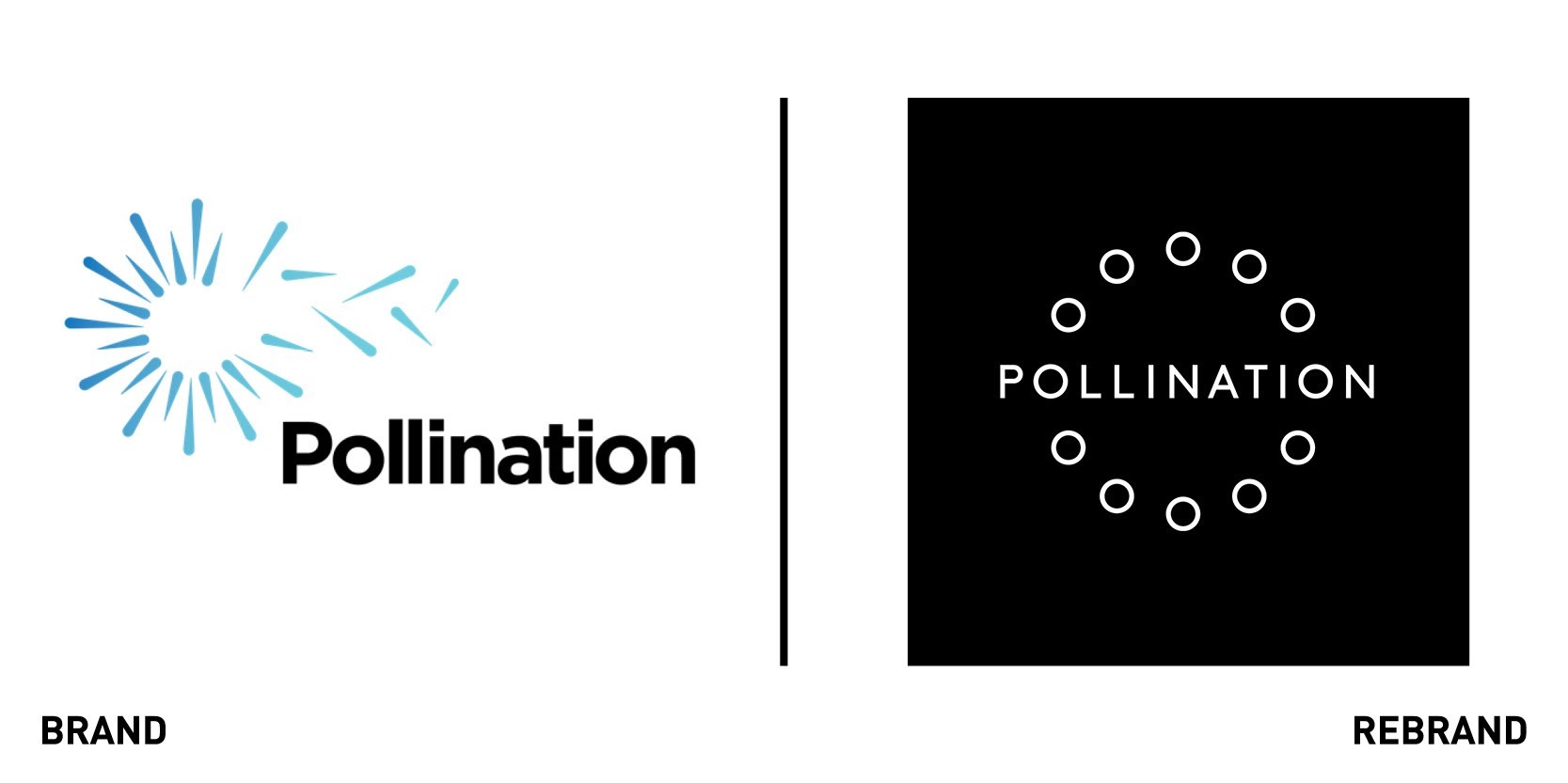
Pollination
Pollination, a specialist climate change investment and advisory firm, worked with design agency Frost*collective to create a new brand strategy, identity and website. The visual identity is based on the brand idea of ‘incisive imagination,’ whereby Pollination combines breakthrough thinking with on the ground action to achieve it s goal of a net zero, climate resilient future. Pollination’s finance, investment, technology, business and law expertise is collaborating to deliver a more sustainable future for clients. The photographic style and the new logo, in which small circles create a bigger circle around the company name, convey the importance of collaboration and unity to bring about change. The website is at the same time informative and easy to follow, with the circular symbols present in different forms and dimensions to remind the audience of the importance of cooperation. Co-founder of Pollination, Martijn Wilder says, “Climate change is the central issue of our generation. Frost* designed a brand that pushes us to where we need to be. They listened and challenged us, and the result is a dynamic brand that breaks conventions and ensures we stand apart now and in the future.”
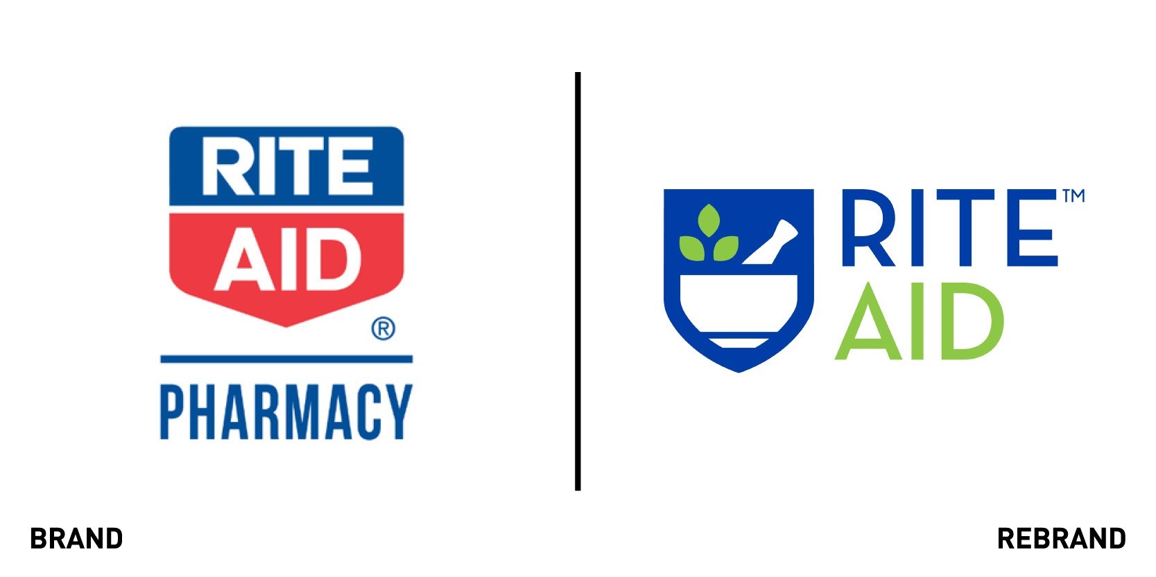
Rite Aid
Rite Aid Corporation, one of America’s biggest drugstore chains, has rebranded for the first time in more than four decades. The company launched a new logo as part of its strategy to introduce younger audiences to the brand. Aid is developing its in-store experience, increasing personalised digital engagement and refreshing merchandise to include a wide assortment of products with attributes that resonate with Millennial and Gen X consumers. The new logo, created by Sway Creative Labs, adopts a different colour palette, replacing the iconic red and blue with a light green and blue and eliminating ‘pharmacy.’ This conveys the idea that Rite Aid is more than just a pharmacy, rather it is a ”whole-being health destination that treats mind, body and spirit.” The iconic shield symbol is retained but instead of featuring the brand’s name, it has a graphic showing a bowl with a leaf and a bottle, symbolising a new holistic approach to health, which appeals to a younger generation. In fact, Rite Aid’s pharmacists will go beyond their traditional role into one where they are encouraged to take a holistic approach to health and well being. The in-store experience, dubbed ‘store of the future,’ will include a drive-thru to facilitate efficiency, a wellness room, and in-store digital capability to enhance engagement. The refreshed colour palette include pinks, purples, greens and oranges, which have been designed to make things easier to find in shops.
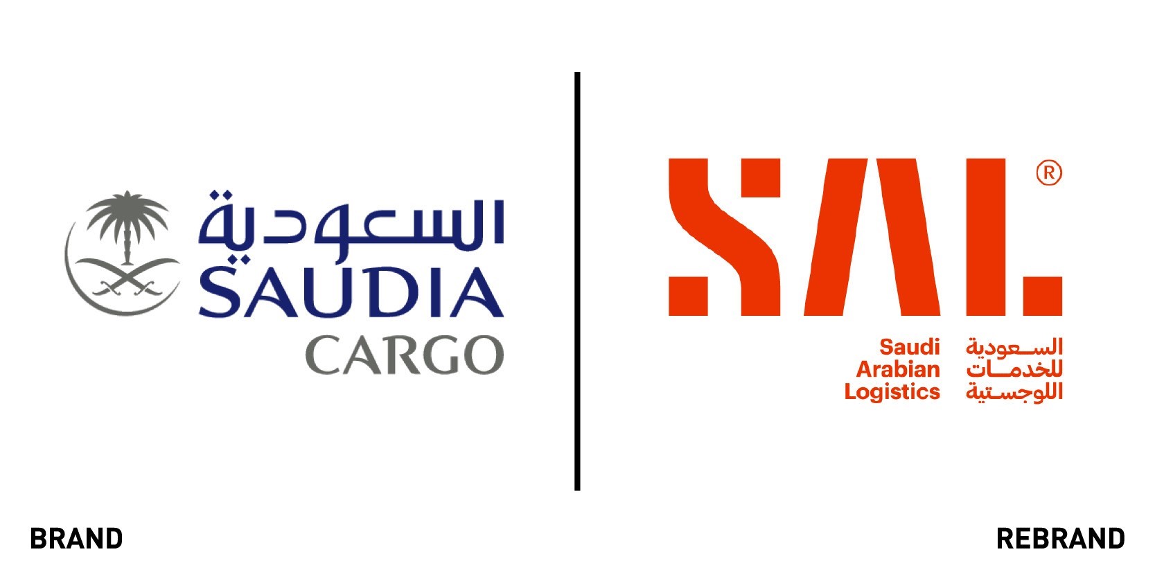
Saudi Arabian Logistics
Saudia Cargo, provider of ground handling services for international air cargo carriers, worked with brand agency Interbrand to design Saudi Arabian Logistics (SAL), the new independent handling division. As a spin-off from the Saudia Cargo brand, the new company had to focus on its expansion from ground handling to becoming a full logistics offer. To convey this growth, Interbrand started with the name. SAL brings the strategic intent to life, with the acronym also representing an international network dedicated to finding ways across oceans (sea), skies (air) and rails and highways (land). The strapline, SAL Delivering Impact, reveals the company’s ambition of becoming a driving force in national and regional transformation as does the logo written both in English and Arabic which appeal to a wider audience. The bright orange colour scheme is a trademark for SAL, clearly setting the company apart from Saudia Cargo and rendering it easily recognisable around the world, wherever it is, if on trucks, workers’ uniforms or brochures.
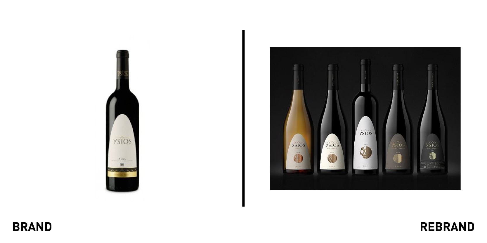
Ysios
A Pernod Richard Winemakers’ brand, Ysios, worked with design agency Coley Porter Bell to create a new packaging design, as part of its strategy to highlight its traditional method of viticulture and draw upon its craft heritage. The design is based on the connection between the Ysios brand and its surrounding terroir and the heritage of the Rioja Alavesa subregion. To capture Ysios’ micro cultivation philosophy of working with small scale vineyards and exploring every variable to enhance the singularity of each terroir, Coley Porter Bell designed visual icons on each bottle, which tell the unique story of each wine. The premium textures and finishes, such as micro-embossed foils and cotton paper labels, also highlight Ysios’ homemade feel and singular heritage. “Every aspect of the brand enhances the care that goes into it, so we created a design where there´s an honest rawness and handcrafted feel to the forms, materials, textures and finishes. Clean mineral tones, with earthy elemental textures and colours evokes the natural diversity of the region´s terroir, and tells a deeper story that you want to learn more about. Contrasting yet complementary, the design reflects the many different components that come together in a remarkable wine,” says Steve Irvine, creative director at Coley Porter Bell.


