#TransformTuesday: 2 June

Here is this week's selection of rebrands from around the world, from fried chicken to Covid-19 database to football community. For more from #TransformTuesday, follow @Transformsays on Twitter.
Popeyes
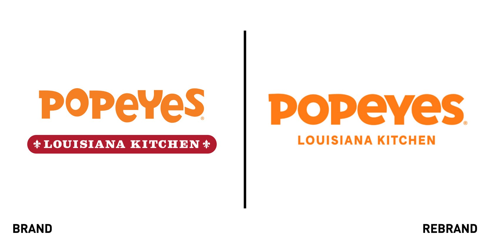
One of the world’s largest fried chicken quick-service restaurant chains, Popeyes, worked with international creative agency Jones Knowles Ritchie to launch a new visual identity and restaurant image that would translate its Louisiana roots in a more modern approach. The redesign began from the logo, a more mature version of the old one, with a contemporary typeface that reflects the culinary depth that goes into making Popeyes’ signature foods. The hand-drawn, orange brand pattern of the packaging, which includes chicken thighs, roosters, and trumpets, represents the vibrancy of Louisiana culture, and reinforces Popeyes brand heritage and equities.
The bold orange colour was inspired by the warm tones that dominate the menu, such as the crispy chicken and hot biscuits, while also celebrating the bold, Southern flavours and being a visual connection to the Popeyes people already know and love. The new visual identity will be rolled out on uniforms, merchandise, and all packaging, including to-go bags, cups and boxes.
The newly remodelled restaurants, the first of which opened in L.A. features warm woods and powdered coated metals in the furniture and counter design, which took inspiration from the iconic Saint Charles Market Car of New Orleans.
COVID-Data.info
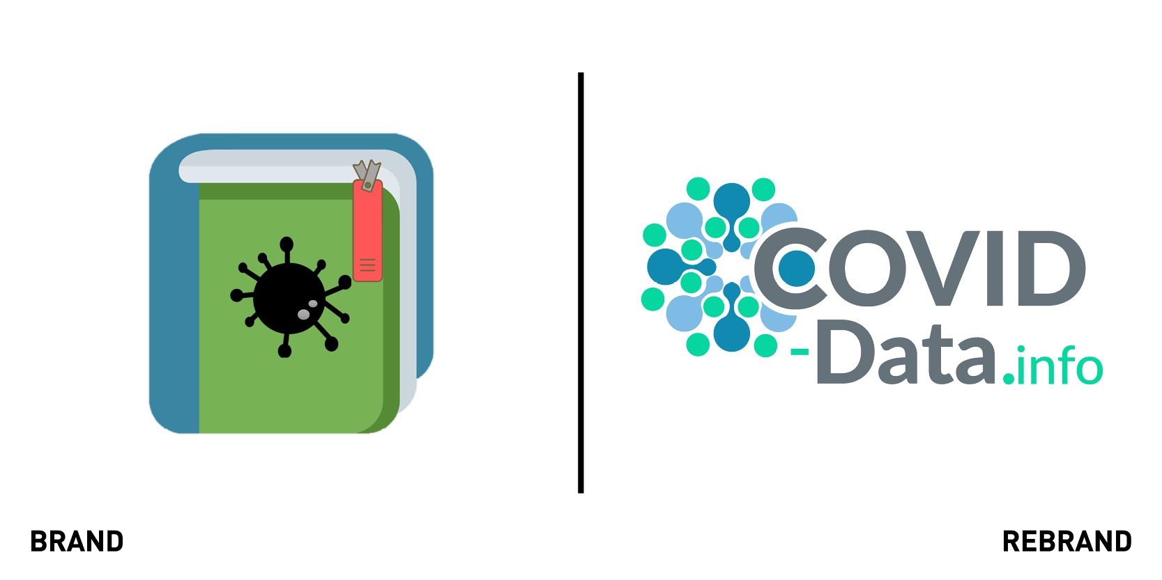
COVID-Data.info, a database which anonymously collects information on Covid-19 symptoms that users can voluntarily provide when they are sick, rebranded with a new visual identity and colour scheme to refresh its look and reflect the growth it is experiencing as a project. The new logo represents the forms of the virus and the process of contagion, while also being a metaphor of cooperation between every human being concerned about the current situation. The sense of unity evoked by the visual identity reflects what the project is all about: a collective effort to fend off a common enemy. The variation in the colour scheme represent the different profiles of the volunteers, more than 40 people from different backgrounds. It also stands for the people who have been infected and those who have not, with the empty circle in the centre having an aspirational interpretation of a space and time in which no more contagion occurs.
Northzone
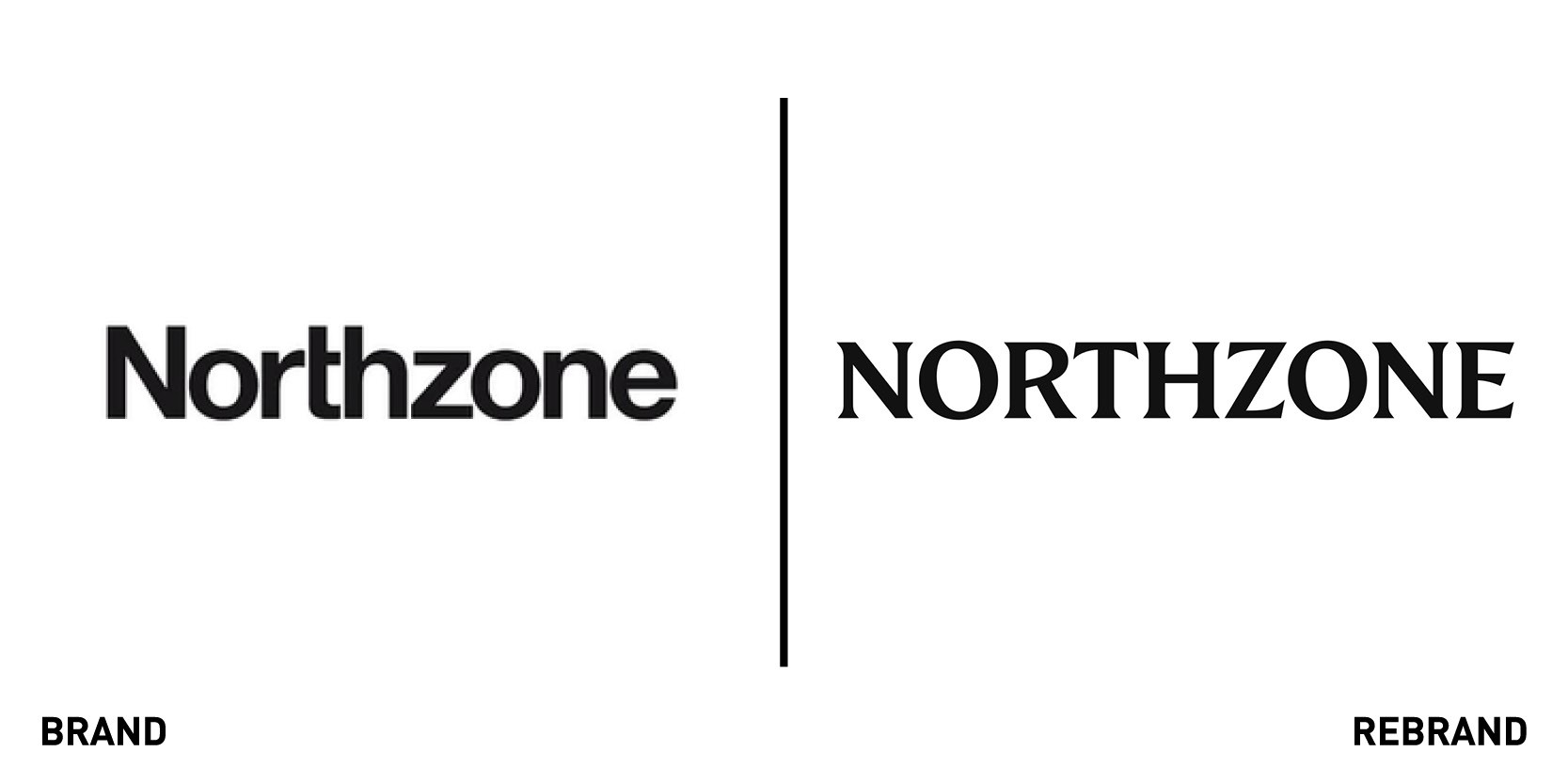
European and American venture capital fund Northzone worked with UK creative agency Ragged Edge to create a rebrand that would reposition it around its strength of character. The fund, which has invested in Spotify and Kahoot among others, wanted to elevate its profile to match its extensive track record. Although the old identity was purposefully neutral, the new positioning demanded something more directional.
The logotype was inspired by magazine mastheads, while the typographical approach positions the venture capital as a content brand with storytelling at its heart, and the black and white colour palette represents its transparency and its need to tell the story as it is. The photography and illustrations are designed to flex around individual stories, from the partners to the entrepreneurs Northzone stands by. Max Ottignon, co-founder of Ragged Edge, says, “The strength of the identity’s foundations, from the masthead to the bold tone of voice, allows Northzone to continue to adapt without losing any coherence. It felt important to make room for the personalities of the individuals – from the founders to the entrepreneurs they back.”
Montezuma Chocolate
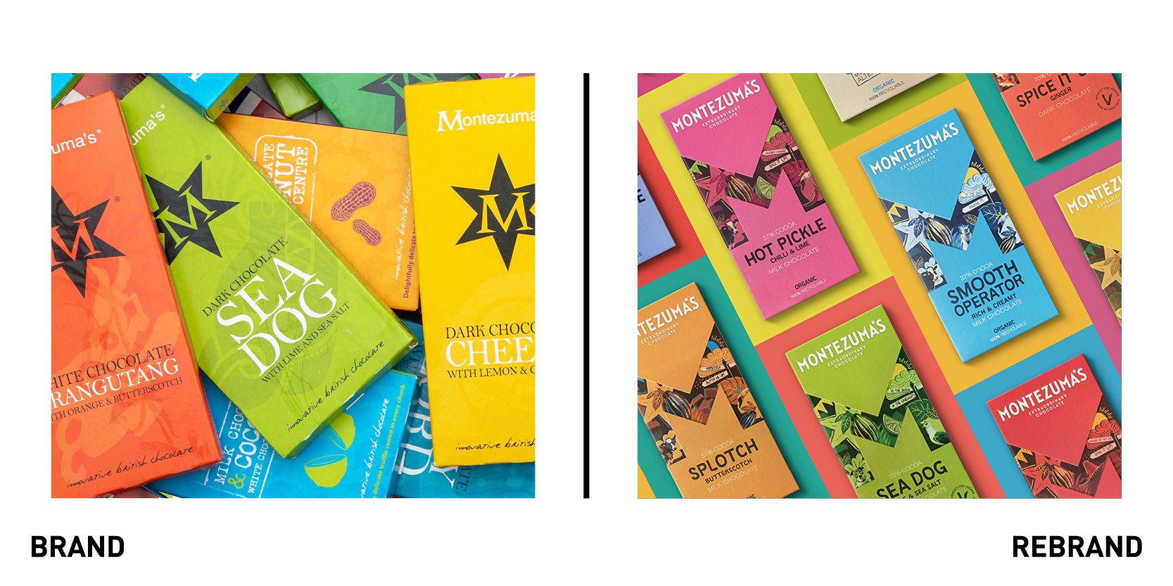
London-based creative design agency Butterfly Cannon worked with English handmade chocolate factory, Montezuma’s Chocolate to re-focus the brand’s purpose, and re-think its creative platform and visual identity on pack to attract a more urban ethical consumer. The purpose of the design agency became ‘inviting consumers to discover extraordinary chocolate flavours crafted with creativity and flair.’ It began by recreating the core visual identity: breaking the M of Montezuma out of the star it sat in, sharpening it to make it the instantly recognisable star of the show. Hand-drawn illustrations on it allude to the crafted way the ethically sourced chocolate is made, while the photographic elements keep things real, with each individual element telling a different part of the Montezuma’s story and celebrating its Latin American heritage.
The six-pointed star in place of the apostrophe in Montezuma’s is a visual link to the old brand identity that allows for a flexible approach to the brand assets while maintain a cohesive identity. Each individual flavour has its own ‘M’ icon, which in turn has unique illustrations and colourways that change to tell the story of the flavour and bring to life product names such as ‘Like No Udder’ and ‘Smooth Operator.’ These adopt a bespoke ‘Montezuma’s Sans’ typeface created to optimise legibility while also reflecting the hand drawn approach within the illustrations.
Probably the most revolutionary aspect of the rebrand is the ‘conscious design’ process whereby eco-friendly packaging was used across the entire range, making it the first British brand in the premium segment to do so. Globally based suppliers were swapped for ones within Europe, cartons were created with no foiling, the bars moved from a triplex plastic-based flow wrap material to being wrapped in 100% paper-based material. Montezuma’s newly packaged range is 100% recyclable, compostable or biodegradable.
AquaLibra
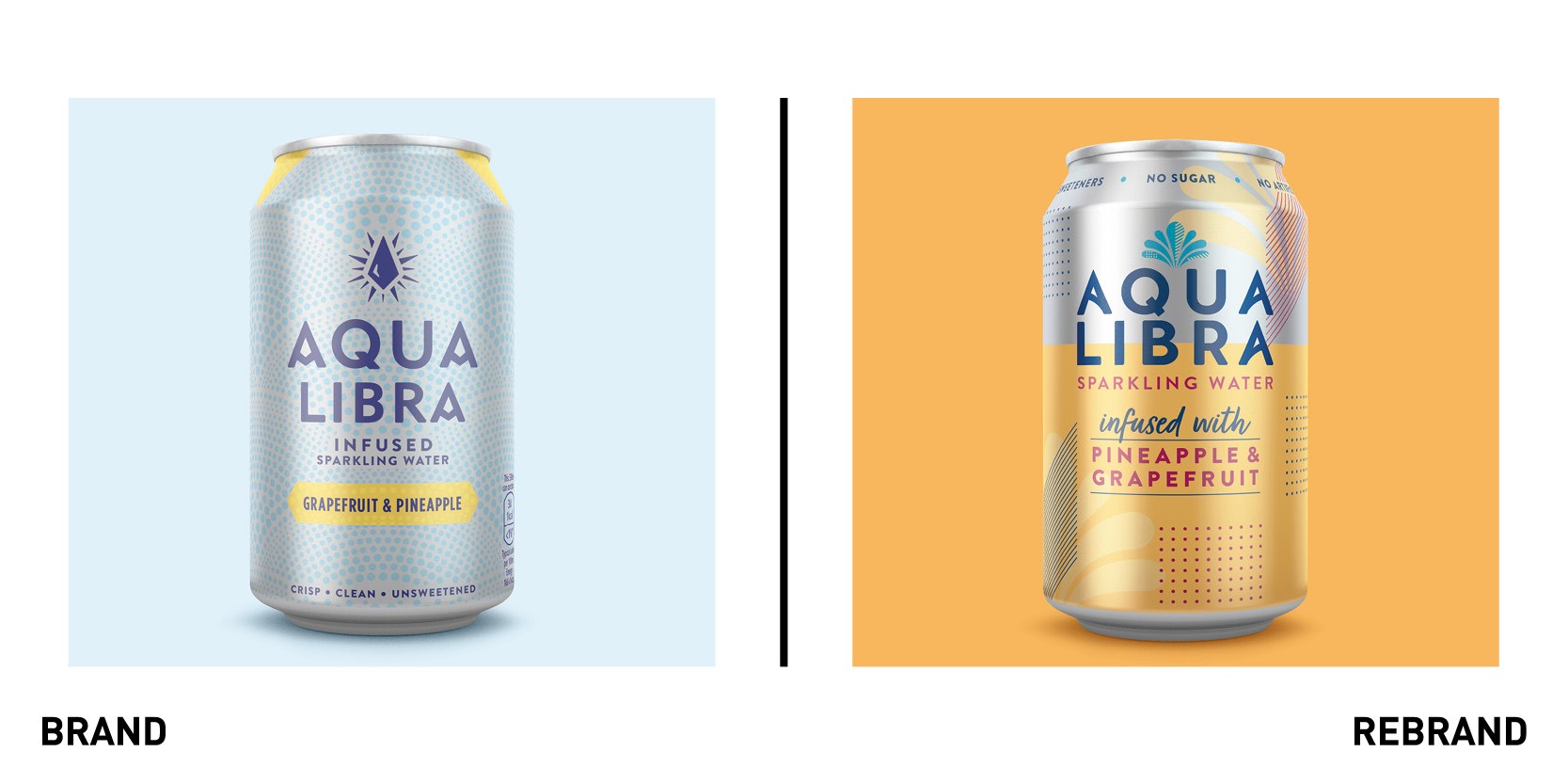
International soft drinks company Britvic worked with global creative agency BrandOpus to create a new identity and packaging design for Aqua Libra to increase market share by extending the brand’s appeal to the mainstream carbonated soft drink market. Following it’s peak in the 1980s as a non-alcohol alternative, the brand was re-launched in 2018 to compete in the infused sparkling water category and, although there has been positive growth in the last decade, there is still plenty of potential to take advantage of. “Our objective was to make our brand more distinctive and recognisable whilst ensuring that consumers could identify it as a drink that would give them all of the enjoyment of a can of fizz without the compromise,” says senior brand manager at Aqua Libra, Francois-Marie Menoret.
The new brand identity centres around the fountain, a piece of existing iconography that has been re-imaged to represent the brand’s ‘freedom to enjoy’ attitude and makes the brand stand out amongst competitors. The new brand also includes free-flowing unstructured patterns for a more expressive feel. “We wanted to find a way to deliver on natural without compromising on taste and enjoyment cues – the pastel colour palette and fresh design cues have helped us find the right balance,” says Ellen Munro, creative director at BrandOpus.
The Real Olive Company
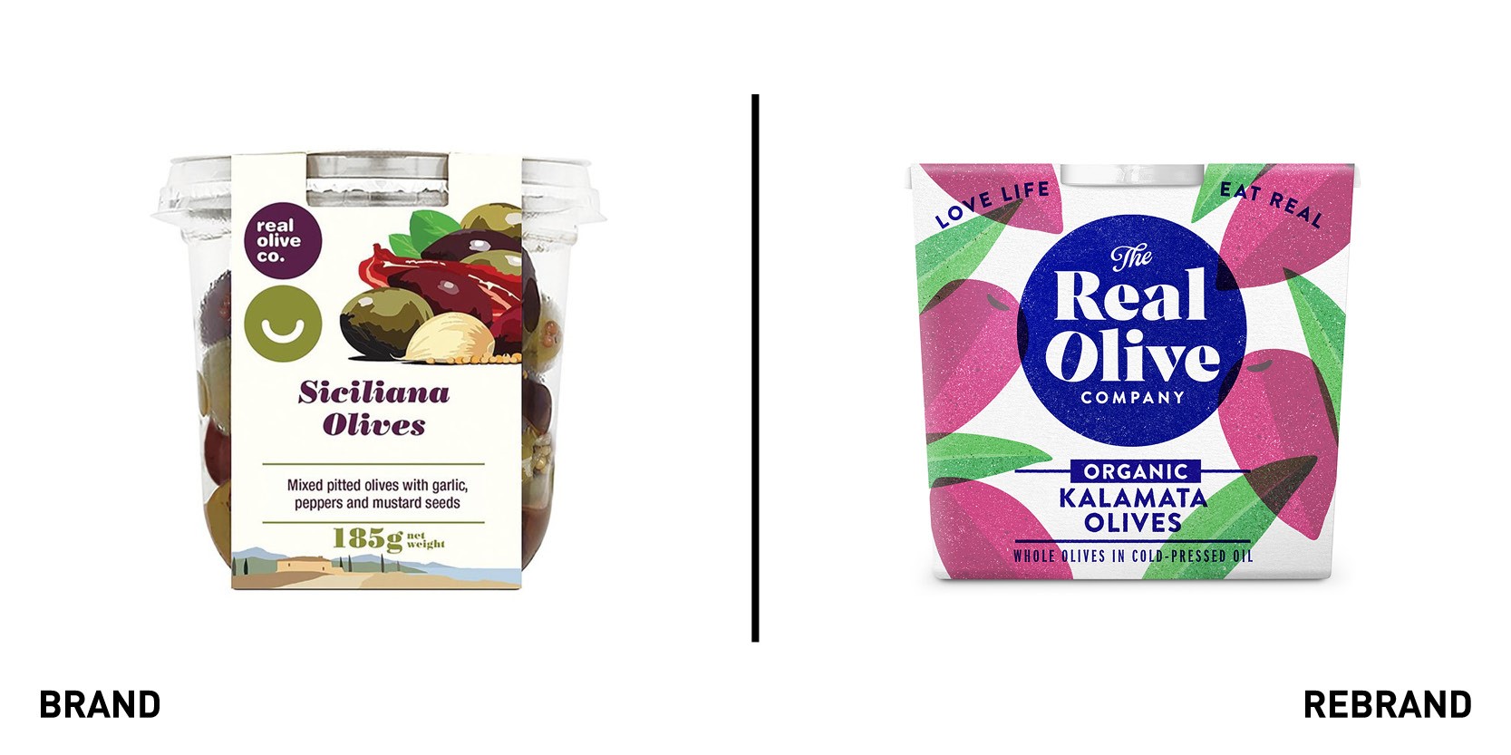
British Real Olive Company worked with food and branding expert company The Space Creative to create a new visual identity that would open the door to wider distribution and increased sales. The Space helped sharpen Real Olive’s focus to attract a more discerning foodie audience seeking ‘good’ brands- expert producers with sustainable business practices. “The olive fixture is typically an own label affair and we spotted an opportunity for The Real Olive Company to stand out in a sea of plastic pots by drawing inspiration from the vibrant colours of the sun soaked Mediterranean," says creative director of The Space Creative David Thomson.
The rebrand positions Real Olive as a premium producer of the highest quality olives and antipasti with roots at the heart of the olive grove. The blue Ink stamped brand mark and crafted typography overlaid on hand drawn risoprint illustrations, as well as the navy blue colour scheme, all hint at the olives' Mediterranean provenance.
90min
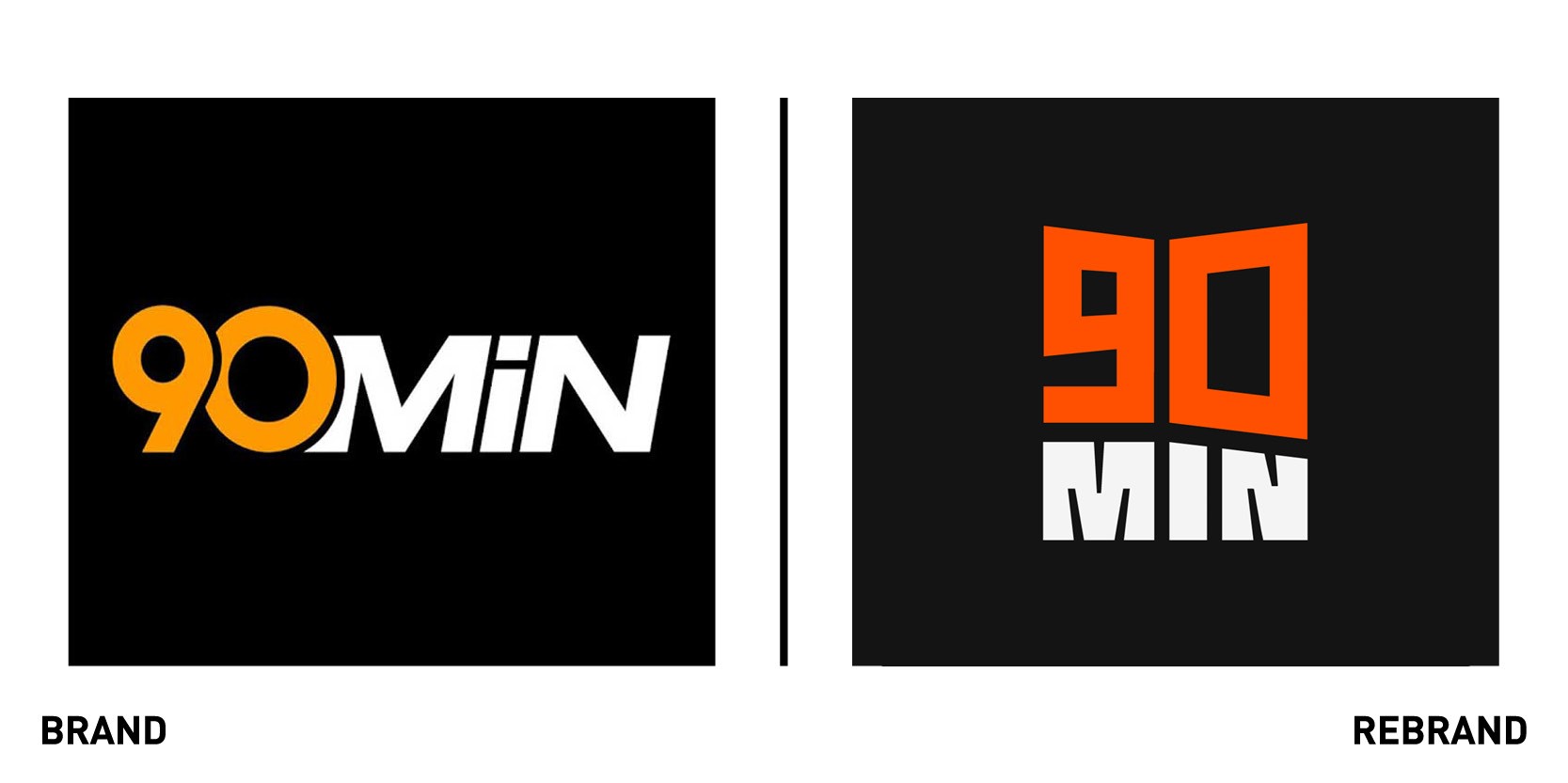
Minute Media’s 90min, the biggest fan-centric football brand internationally, announced a brand refresh including a new logo, new site design and the launch of a new section, ‘The Switch’ which will cover what happens in football outside of the 90 minutes of each game. The new design was created in-house and was voted on by Minute Media employees. The rebrand is designed to represent 90min’s commitment to being the voice of the fan. The new logo is symbolic of a megaphone that amplifies the voice- whether of a fan in a stadium or where the voice of one fan is amplified to reach millions of other fans.
"90min's mission is to represent the voice of the football fan, and as a result, we began our logo research by examining football fans themselves, not just the sport of football, including how to represent their passion without resorting to mainstream football iconography. Our company also aims to reach the next generation of fans, therefore, it was important to create a cleaner, more modern logo design--one with personality, that would translate the passion and ethos of who we are: bold, irreverent and passionate," says Daphne Cairns, 90min designer
Both the typography (inspired by retro football kits) and colours used in the new visual identity are bolder and dynamic, representing the increasing growth.


