#TransformTuesday: 18 February
Here's this week's selection of rebrands from around the world, from Greek airlines to Australian coffee cups. For more from #TransformTuesday, follow @Transformsays
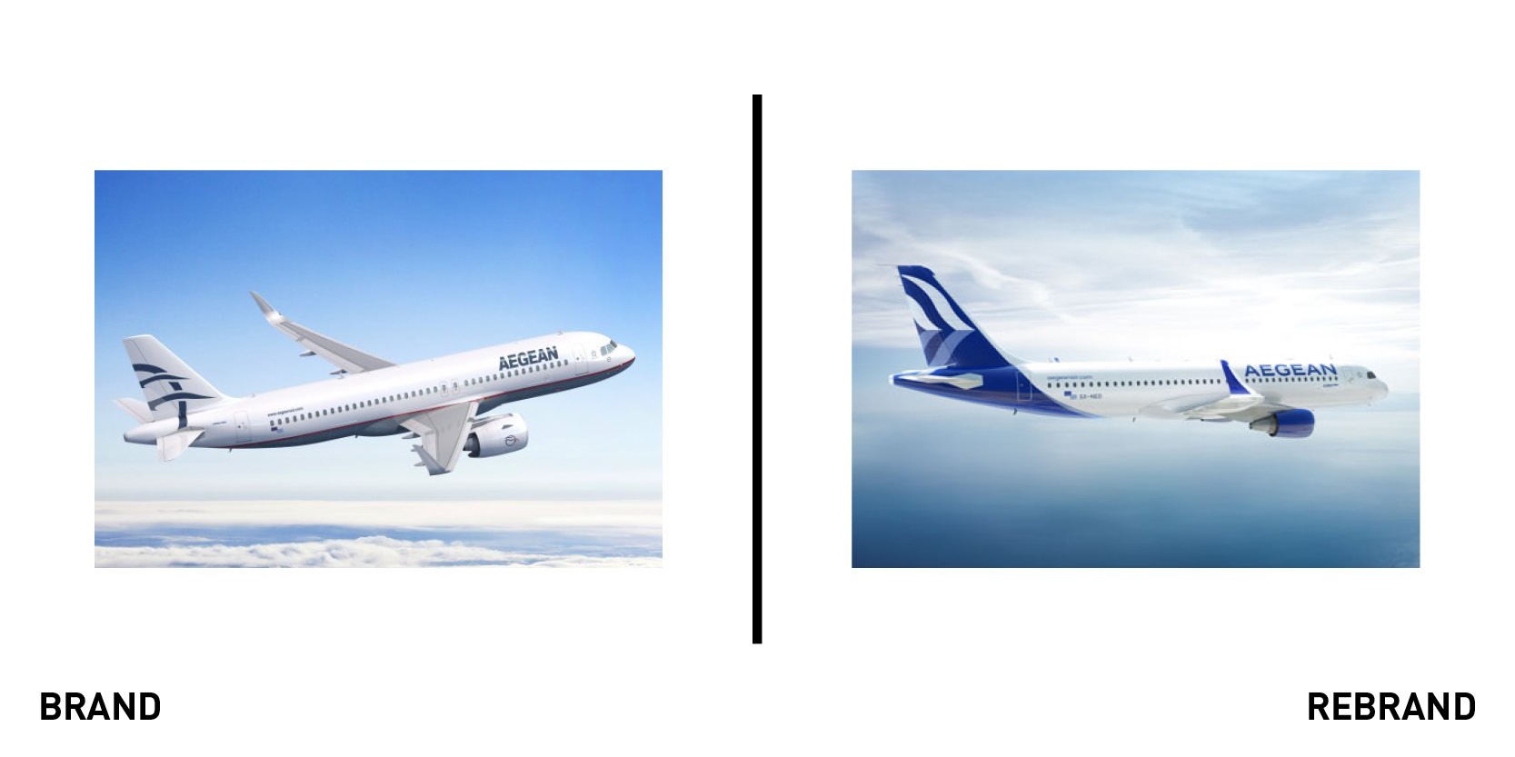
Aegean
Greek airline Aegean has unveiled a new design to coincide with the arrival of a new fleet of Airbus aircraft, starting with an A320neo. The new branding will be used across Aegean’s livery and cabin interiors as well as all communications. Specialist design agency PriestmanGoode carried out the redesign for the Greek flag carrier, which spans logo design, livery, graphic items and digital products as well as cabin interiors including soft items, amenity kits and meal services. PriestmanGoode said the design represents the whites and blues of the Greek skies and Aegean Sea. The new logo comprises a modern take on the old design featuring two gulls, plus a redrawn Aegean wordmark. At the core of the design is a nod to classical Greek architecture, with sharp angles and rounded details. The new identity was unveiled at an official ceremony in front of Aegean employees, attended by Greek prime minister Kyriakos Mitsotakis and Aegean chairman Eftychios Vassilakis.
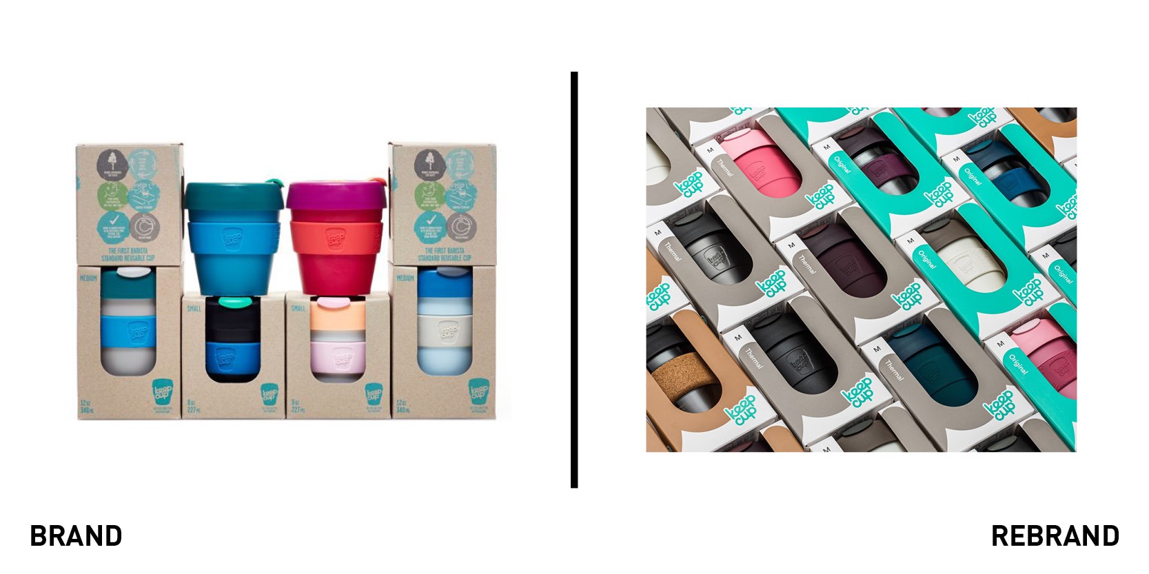
KeepCup
Australian reusable coffee cup brand KeepCup was started 10 years ago in Melbourne by café owners Jamie and Abigail Forsyth. Since then, KeepCup has grown to become a worldwide business, with the cups used in more than 65 countries. To maintain its status in an increasingly crowded market, it appointed Frost*collective to redesign its retail packaging. Building on the brand’s values, Frost* acknowledged its commitment to sustainability with a wraparound design that clearly conveys key messaging and heroes the new brand story and call to action. KeepCup managing director Abigail Forsyth says, “We engaged Frost* for its robust approach to design, packaging and the sustainability ethos at the heart of our business. The new packaging delivers on the brief by boldly reclaiming our brand name from the category and distilling 10 years into a punchy brand story that covers our love of design and enjoyment of great drinks, with a call to action for an inclusive and responsible approach to the climate emergency. Don’t waste today.” Ant Donovan, group creative director at Frost*collective, adds, “Competition has grown exponentially in the reuse cup space, so we needed a new bold packaging design to regain KeepCup’s iconic status and help drive more sustainable lifestyles and behaviours.”
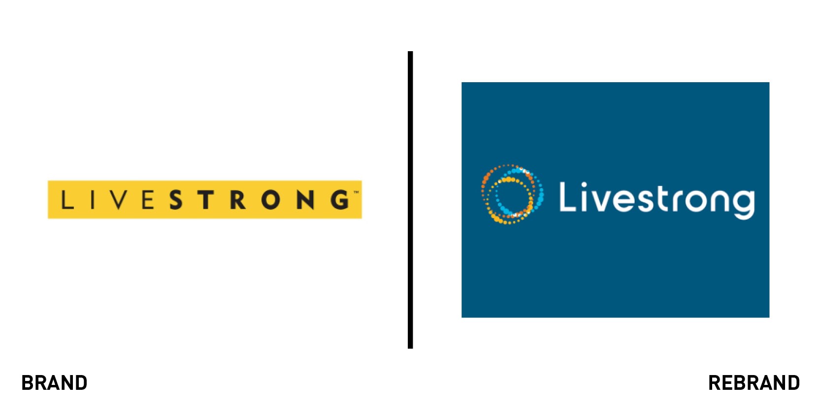
Livestrong Foundation
The Livestrong Foundation is a US charity that seeks to improve the lives of people affected by cancer. Founded by seven-time Tour de France winner and cancer survivor Lance Armstrong, the organisation had to refocus following revelations that Armstrong used performance-enhancing drugs. At a recent ‘relaunch’ event in Austin, Texas, Livestrong announced changes in the way it operates, with the focus moving away from one-on-one support services to supporting entrepreneurs developing products to improve treatment and patient care. Along with the relaunch came an artistic redesign. The old yellow and black logo has been replaced by a blue background with three rings – orange, blue and yellow – as Livestrong moves forward as an organisation and shifts away from its old image.
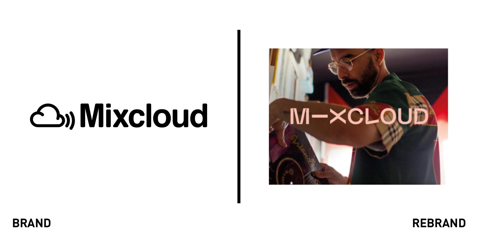
Mixcloud
Mixcloud is an audio streaming platform that supports creators to craft a deeper listening experience and build their own fan communities. It is home to a catalogue of 50m DJ mixes, radio shows and podcasts, available to be listened to free of charge across all devices. To mark its 10th anniversary, Mixcloud has launched a new brand identity, created in collaboration with design agency Studio Output, that would propel it forwards through its next decade. The new identity is built upon three core character traits: brave, empathetic and connector. Johanna Drewe, creative director at Studio Output, says, “At the heart of the brand is ‘the connector.’ Its form reflects the fluidity of cultures and countercultures, whilst its purpose is to unite. It amplifies communities online and offline, constantly restless and moving through imagery, connecting genres and topics and experiences.” The fluid movement runs through the typography, with a customisable font and vibrant colour scheme. Nico Perez, co-founder of Mixcloud, adds, “With this major step change for us as a company, it’s perfect timing for us to move on from our cloud logo. We’re excited to introduce our community to an entirely new brand that better represents the passion and vibrancy they bring to the platform every day.”
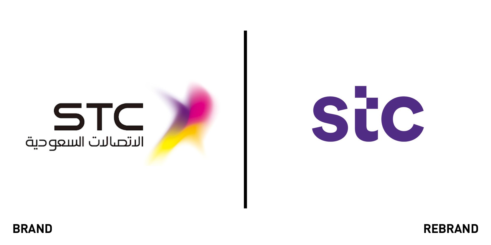
STC
Saudi Telecom Company (STC) provides cable, landline, mobile, internet services and computer networks for residential and business customers. It wanted to define a new identity that emphasised its connection with people, in line with the evolution in its corporate culture that highlights drive, devotion and dynamism. It enlisted Interbrand to create a new visual identity and message. Using the tagline ‘Everything’s going forward!’ the rebrand encompasses a simple design system that uses three main colours, with a ‘slider’ working as the essence of the new identity. The slider has three purposes: to link, to transform and to reveal. The new logo uses lower case letters to convey a younger, more digital expression, and the descriptor that previously formed part of the logo has been eliminated so it transcends the meaning of its initials. STC will use the rebrand to support its expansion from a local telco to a regional digital powerhouse, with a new name, visual and verbal expression.


