#TransformTuesday: 12 May

Here's this week's selection of rebrands from around the world, from product development firms to legal advisers to social care organisations. For more from #TransformTuesday, follow @Transformsays on Twitter.
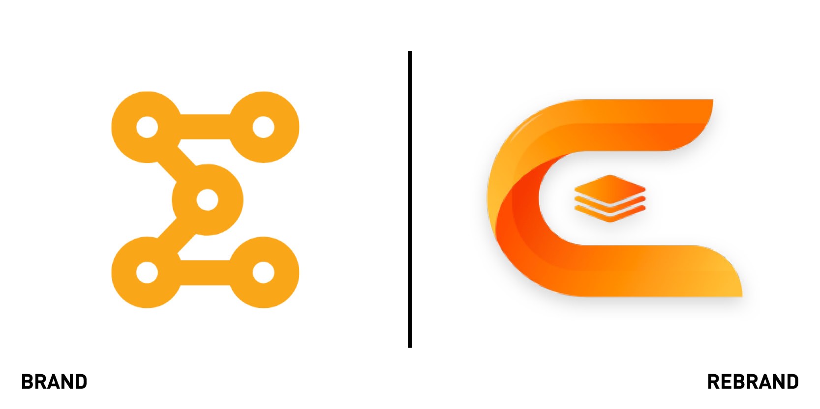
Emproto Technologies
Product development firm Emproto Technologies, based in the Karnataka state of India, has launched a modernistic new logo to symbolise the firm grip it has advanced on product development on behalf of its clients. While the old logo represented the initial objective of the company of helping start-ups connect the dots from idea to product through technology, the new one reflects a matured business model and a stable client base that has helped the company increase its reach. The new logo, a curve encompassing a stack which makes the letter E, symbolizes the firm grip Emproto has on all the tech stack for its clients.
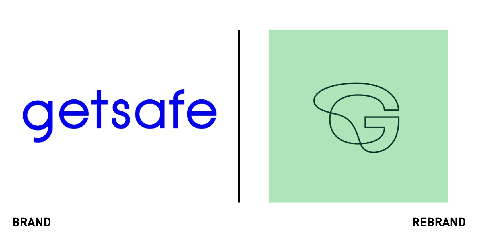
Getsafe
German digital insurance company Getsafe renewed its brand image to position itself as a digital insurance provider for a new generation of insurance customers throughout Europe. The rebrand, which includes a new logo, new design and a new voice, reflects Getsafe’s core objective, to “empower people to live life to the fullest by covering them and their universe, no matter who or where they are.” Through the new identity, Getsafe wants to combat the bad reputation that insurance companies often have of being perceived as the necessary evil, encouraging people, especially millennials, that insurance offers a safety net. "Our new brand stands out, catches the eye and perhaps even polarises. This is something completely new for the insurance world, which usually acts conservatively or plays on fear," says Christian Wiens, CEO and founder of Getsafe.
The motto of embracing all the risks in life and knowing that Getsafe has your back is clearly reflected in their new brand elements: the logo includes an ‘accident’ with a dented letter G; the font is irregular; the imagery changes perspective, showing the events from the perspective of the claim, and the colour palette represents a ‘before and after’ of the accident, with each colour being available in a positive, light variant and an enriched contrasting colour.
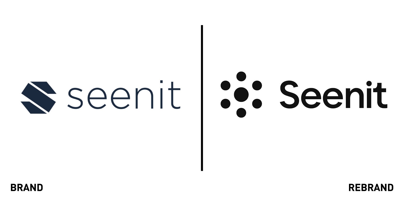
Seenit
London-based video crowdsourcing platform Seenit launched a new brand identity which further reflect its mission to help create a world where everyone’s story can be told and voice heard. To do so, Seenit opted for a cleaner and simpler logo design, which was reduced to its essential elements and designed to work on both print and digital applications. Though much of the rebrand was done in-house, Seenit turned to marketing agency Symphony Talent to help with initial research and building the messaging, and later brought in Floating Elements for the logo design. To be true to their objective and strapline ‘Bring storytelling to life,’ Seenit used their own video crowdsourcing platform to build a stock library of photos from their community when trying to develop their new visual identity. “In the past we relied heavily on stock from all the well-known sites. It looked nice, it was cheap (in some cases free) and it served a purpose. But it didn’t reflect our brand. We are all about people-powered content, and we wanted to have a people-powered brand. So we got our community to send in their photos and over a year we built a stock library of around 2,000 photos,” says Ed Stennett, marketing manager at Seenit. The new identity also includes the launch of a new website and new BETA platform, Seenit Stellar.
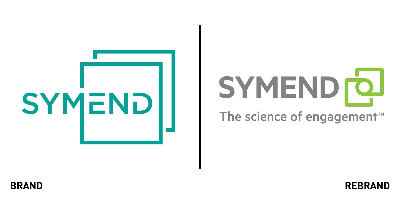
Symend
Canadian science-driven digital engagement platform Symend revealed a new brand identity in conjunction with making a funding announcement in order to make a powerful statement about the company in the different markets and geographies they operate in. Symend worked with New York branding firm Athorn Clark & Partners to design a new brand that would articulate their powerful value proposition to clients and prospects alike. The strapline ‘science of engagement’ and the bright green, intertwined square symbol on the new logo reflect what Symend aims to do: transform the debt recovery industry by combining behavioural science with advanced analytics and technology to treat individuals with empathy. The visual identity also includes poster ads featuring black and white headshots of different people accompanied by catch phrases by further emphasize the human aspect of debt recovery. “The color was brightened to present a vibrant energy inherent in the company's culture. The font needed to project strength and stability, while feeling accessible. And the graphic was intentionally designed to evoke the intersection of the advanced analytics and behavioral science solution,” says John Athorn, principal and director of creative development of Athorn Clark & Partners.
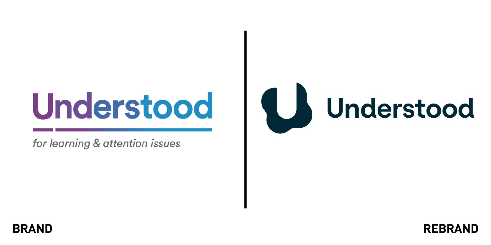
Understood
American social impact organisation Understood Understood launched a rebrand to underscore its expanded mission, Shaping the World for Difference, which focuses on four areas that support individuals throughout their lives: families, educators, young adults and the workplace. The rebrand includes an animated identity, a new website design, ADA-compliant colour palette, inclusive photography, illustration and animations, a new sonic identity, and a dyslexia-friendly custom typeface, UnderstoodSans. By meeting high standards of accessibility across colour and motion design, the new brand lives up to its core mission of advocating for undeserved people with learning and thinking disabilities. “The needs of the diverse communities we serve, from grandparents to principals, from young adults to employers, informed all aspects of our new brand ecosystem. The redesigned brand will help ensure that our resources engage as many people as possible and help them thrive in school, at work, and throughout life,” says Nathan Friedman, chief marketing officer of Understood. The organization worked with brand consultancy Wolff Olins and type foundry Displaay to create the new custom typeface, while the sonic identity was created by New York-based sonic marketing agency Listen.


