#TransformTuesday: 11 February
Here's this week's selection of rebrands from around the world, from healthcare to horse racing. For more from #TransformTuesday, follow @Transformsays
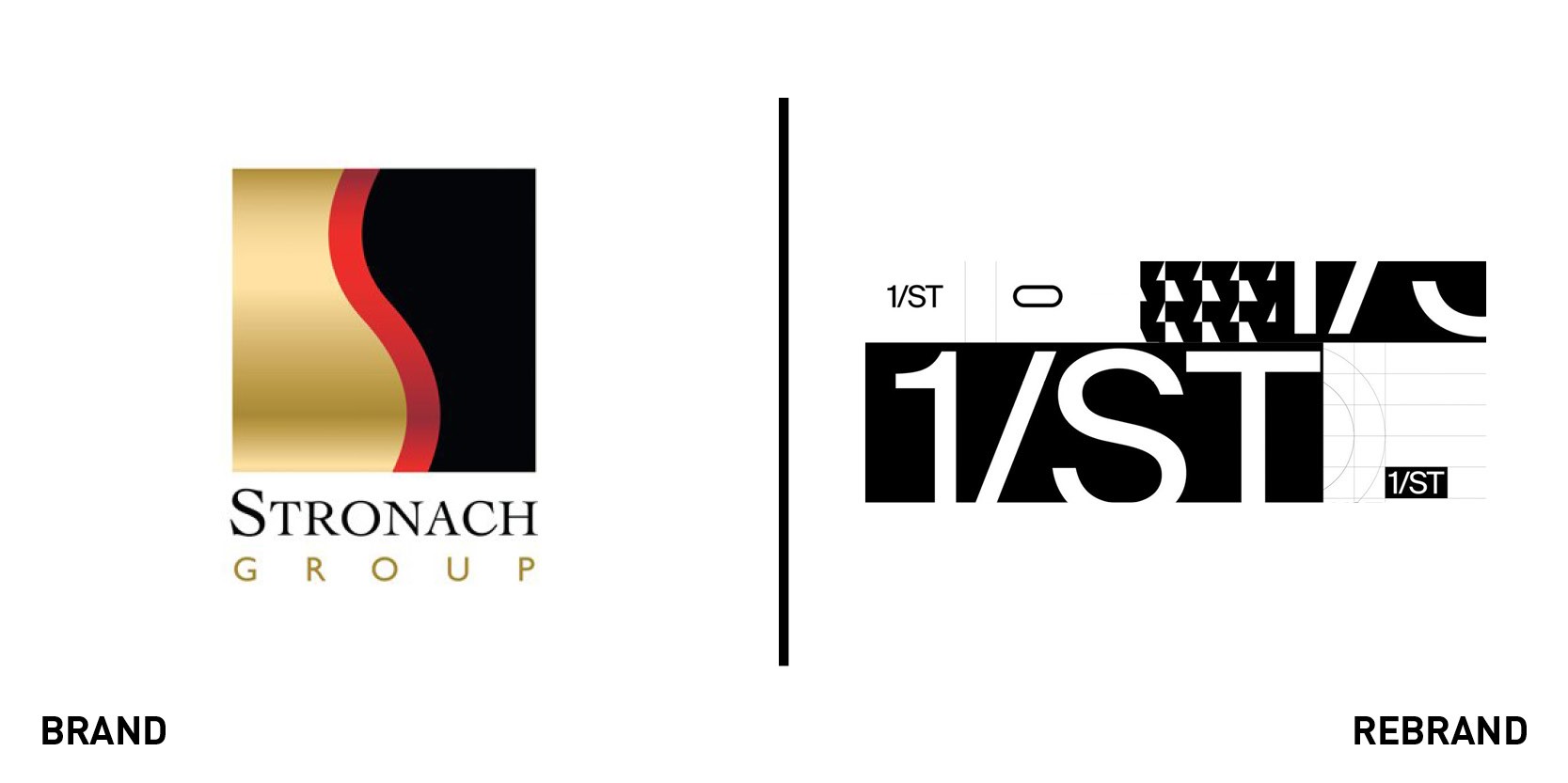
1/ST
The Stronach Group, an American horse racing and betting brand, partnered with American design agency Character to introduce a dynamic, digital-first identity, 1/ST (pronounced ‘first’). By focusing on the website and the digital aspect of the rebrand, the new brand lends some modernity to a historical name like that of Stronach. The group has been at the centre of horse racing for centuries, and with its new digitally savvy brand it can continue to do so in the world of today, attracting a new generation of fans. In fact, every aspect of 1/ST works well on the web, from the big logo which takes centre stage on the website, resting on an animated background, to the bright visuals that catapult the viewer in the dynamic world of horse racing. The name 1/ST embraces the competitiveness of the sport but also demands that the horse, as the main character, comes first.
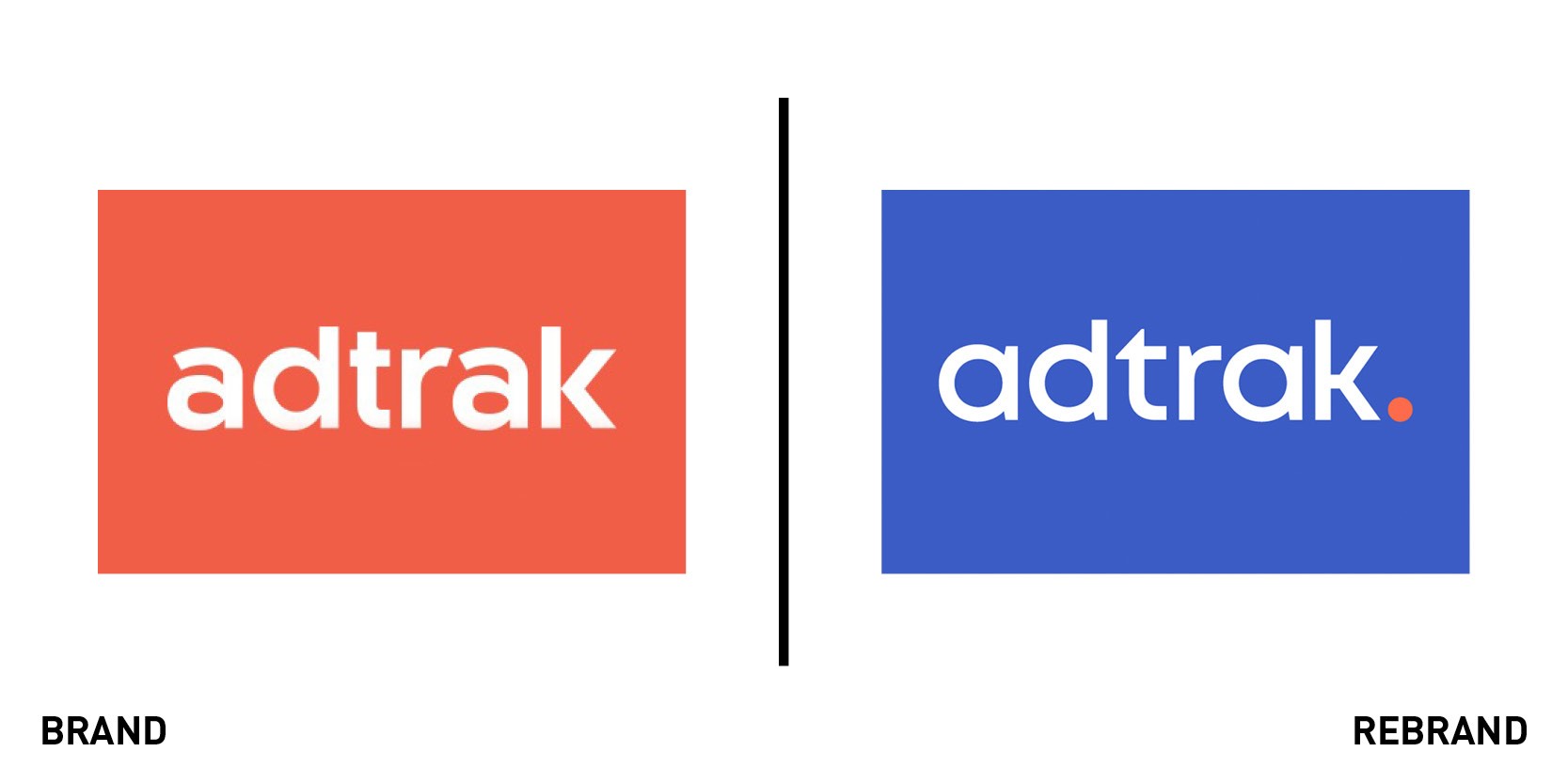
Adtrak
Nottingham-based digital marketing agency Adtrak unveiled a new brand that aims to be uncomplicated and digitally friendly. The new identity is part of an extensive change programme that aims to improve the agency’s client experience and facilitate growth. This is reflected in the simplicity of the new brand, which only uses a four-colour palette, mostly centred on shades of blue. Marketing and communications manager Ami Hassall describes Adtrak’s new brand as “both simple for our designers to use and simple for our costumers to understand. When designing anything in the Adtrak brand, we ask ourselves if what we’re doing adds value. If it doesn’t then why do it?” The internal graphic design team, which led the rebranding project, focused on improving the logo’s design so it would resonate well on the website, adding colour variations to it that change depending on the application or background used. To increase its digital presence the agency introduced different shapes each representing the word ‘Adtrak’ which can be used in a pattern or in isolation and now outline the website.
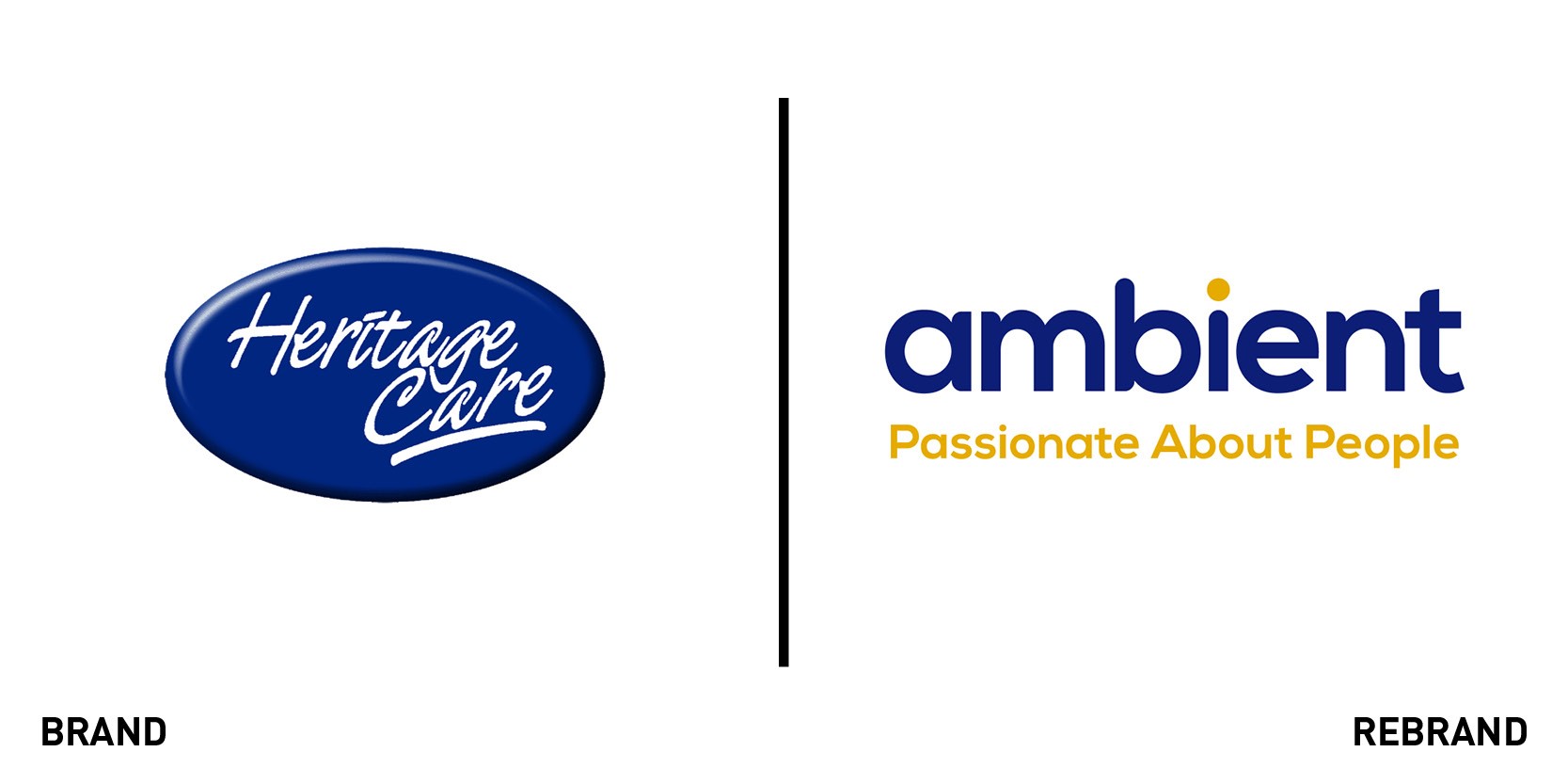
Ambient
One of the top 20 generic non-profit health and social care providers in the UK, the Heritage Care charity, has incorporated alongside Community Options under one new brand, Ambient. The internal marketing team, which worked on the rebrand, has created a single, concise identity, which will come together from April 2020. One name, one logo and one website help the brand communicate what they are about and who they can support to their audience in a more effective and direct manner. Although it is widespread, operating in over 140 locations and providing over thirty thousand hours of care to people on a weekly basis, the charity has made Ambient it’s umbrella brand. Making the dot on the I in ‘Ambient’ the same shade of orange as the tagline redirects the viewer to what is important for Ambient, the people. “Our new tagline, ‘Passionate about People,’ reinforces that it is the people that are the focus, rather than the portfolio,” says director of marketing and communications, Davina Sellick.
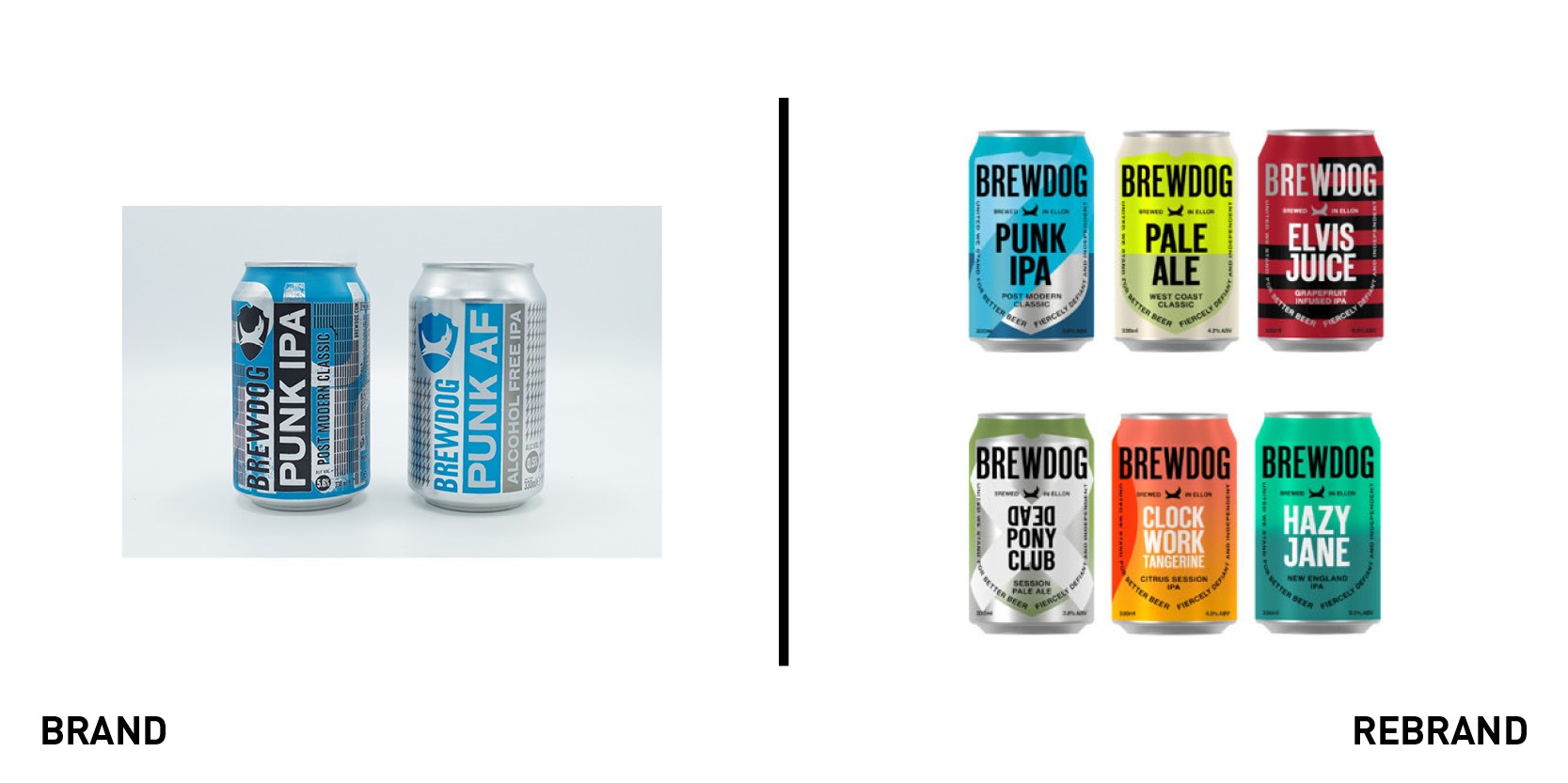
Brewdog
Iconic punk brewery Brewdog has unveiled a new brand identity to support its mission in becoming more sustainable. Partnering with London-based design studio Made Thought, Brewdog’s in-house team sought to create not only a new visual identity, but also make Brewdog more environmentally friendly. Ben Parker, co-founder and co-creative director of Made Thought, wanted to give greater depth to the rebrand so it wasn’t just a “new surface decoration.” That is why 'BrewDog tomorrow,' a six-point charter that summarises the key points the company will take to commit to a greener future, was also launched as part of the new brand identity. It pledges to take actions to tackle climate change, such as reuse old cans and reduce waste by turning imperfect beer into vodka. The new brand is visible on its most popular can and bottle beers, including the Punk IPA, and on posters covering Brewdog bars. Although the colours remain largely the same, the Brewdog wordmark is horizontal rather than vertical and the dog logo appears at the centre of a shield-like form created by their historical motto ‘united we stand for better beer; fiercely defiant and independent.’ This gives the beer brand a cleaner and more linear look.
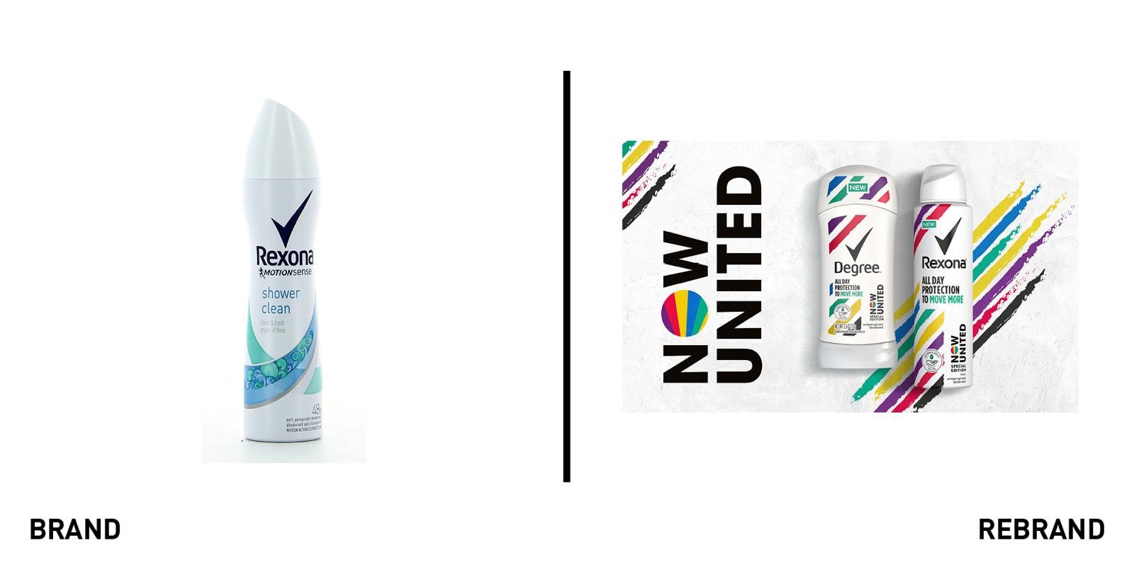
Rexona Now United
With the help of design agency PB Creative, global FMCG brand owner Unilever has created a new anti-perspirant deodorant range for teens, Rexona. The new range, shown above, right, will stand alongside the existing Rexona branding, left. To stay true to its consumers, Unilever teamed up with American Idol creator, Simon Fueller’s global pop group, Now United (NU). The partnership with this group, made up of singers and dancers, has helped Unilever target the young audience and deliver a product which resonates with their needs, smelling fresh without worrying about sweat or damaging the skin (the deodorant has a dermatological stamp of approval). The visual identity can be summed up in its tagline ‘all day protection to move more’ (with 'move more' written in colour), which encourages teens to be more active while with Rexona Now United. Lloyd Moffat, creative director PB Creative says, “Rexona is the leading efficacy anti-perspirant brand. Our challenge was to deliver the brand’s authority in this area without creating designs that appeared too clinical to the Generation Z target audience. As a result, we’ve created a cosmopolitan and engaging set of unisex designs for a diverse global teen community.”


