Motion inspires new visual identity for New York dance company
New York-based design studio Gretel revealed the new brand design behind the Stefanie Nelson Dancegroup (SND), ahead of the group’s 20th anniversary.
New York-based design studio Gretel revealed the new brand design behind the Stefanie Nelson Dancegroup (SND), ahead of the group’s 20th anniversary.
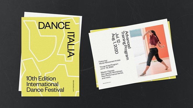
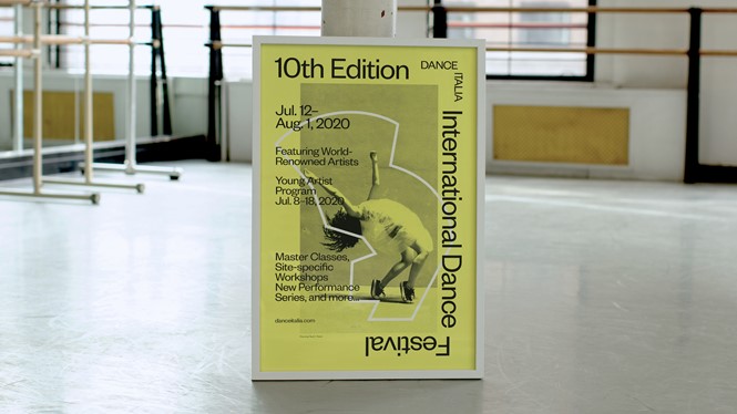
SND used the rebrand as a means to increase its presence in the NYC arts world and emphasise its connection to the dance programme’s successful sub brand, Dance Italia.
“We paired with Gretel to investigate core values of our company and have those reflected artistically to the highest design standards in our publicity materials. The resulting work is a wonderful visual reflection of our past and a strategic springboard for our future,” Stefanie Nelson, founder of SND, says.
Gretel’s mission statement says that they focus their design on antagonistic themes. That is reflected in SND’s design, especially the idea of order/chaos that the dancers transmit through the photos used in the new visual identity. In one picture, a woman is jumping in the air on one leg, yet there is stillness in the picture, which transmits a sense of order.
“We were drawn to the tension between elegance and awkwardness in Stefanie’s work: Quiet meditations and explosive movements. Symmetry and asymmetry. Hard and soft forms. Even in still photography you could sense all of this,” Greg Hahn, founder of Gretel, says.
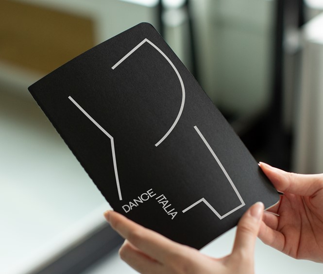
At the foundation of the brand’s design are a series of abstract graphic forms, printed on a black printed on a black background and seemingly shapeless at first glance, that echo dancers’ movements through the use of straight and rounded lines. Gretel created them by using the group’s collection of archival performance photography.
“The goal for this project was to mimic movement and dance through the design in a way that is personal and specific to SND,” says Elaan Bourn, Gretel’s design lead on the SND project. “By creating a graphic library of forms that represent and abstract the edgy, contemporary and energetic nature of Stefanie’s pieces, we were able to visualise the spirit of the rebrand.”


