Jimmy's Iced Coffee founder on packaging, rebranding and sustainability
Brother and sister duo Jim and Suzie Cregan built a brand based on enthusiasm, social media and caffeine. But the 10 year-old visual identity had never been wholly reexamined. It survived through adaptation as the company has expanded and introduced new products and product ranges.
But it was no longer distinctive. “When we first launched we thought, ‘This brand is timeless; it’s going to last forever,’” says Jim Cregan. “And it got to year and nine and we’re looking at it and questioning things. A lot has changed and a lot of other things have caught up with what our brand used to look like.” The cinema-marquee typography and Hollywood-inspired lighting might have been distinctive in food and beverage in 2011, but it was becoming a visual cliché; one that the brand wanted to move away from.
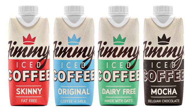
Cregan turned to the Jimmy’s Iced Coffee in-house creative team, which worked on the rebrand on and off for about a year. The new design simplifies things. Relying on a two colour system and the signature ‘Jimmy’s’ script, the new packs are clean, with limited communications. The back of the pack is where the sourcing and product info – traditionally residing on the pack sides – has been located. This leaves a broad canvas for the new visual identity to wrap around each of the packs.
Cregan says the new approach offers a stronger on-shelf presence with a more “grown-up” look. “We’ve gotten into a space within the packaging world where, if there’s space, let’s fill it. And we’ve kind of gone ‘Let’s not do that.’”
"When we first created our design, we knew it had to be timeless. It couldn't be a flash in the pan job that would suddenly look old. I feel like we nailed this. Fast forward nearly a decade and it feels like the brand could do with a new pair of kicks and a new hairdo. It needed a freshen up. You don't have to compare yourself to Nike or Apple, you've just gotta do what you feel is right for the brand. We feel the time is right, so we're gonna do it and it's gonna rock," says Cregan
The new brand has been introduced across the product range and uses a new naming system for the products, taking a step away from the traditional coffee nomenclature system. The simple ‘coffee + milk’ style aligns with the Jimmy’s brand attitude of challenging the industry norms. Another industry norm being addressed is sustainability. Already 100% recyclable, Cregan says the company aims to go plastic free by the end of this year – a challenge for a brand with plastic caps present on every product it sells. But, with the introduction of aluminium cans and other materials, the company will strive to meet its sustainability objective.
Cregan says this is a challenge the upstart can take to bigger players, “It shows the big companies, ‘You guys have the manufacturing power to be able to do these changes.’ Coke recently said, ‘We’re not going to be jumping out of plastic anytime soon.’ If we can do it and we’re tiny and we’ve got not resource, come on guys. This stuff is important.”
Two elements of the brand that will remain unchanged are the products themselves and the tone of voice. Known for a cheeky, characterful tone of voice, the company’s consistency across its brand messaging and social media will be untouched by the new visual identity. Similarly, the product recipes themselves will be unchanged.
The rebrand hit the shelves on 13 January.