Brand profile: Eurocamp
The package holiday travel market features tough competition, but with a rise in holidaymakers choosing the package option, providers in this space have had to reexamine their brand positioning. Jeremy Owen discusses Eurocamp’s new approach to brand, storytelling and the package holiday
Campsite holidays are one of those pursuits that are loved by the initiated, but to the outsider they many inspire thoughts of damp canvas, ready-made packet meals and shower blocks of questionable hygiene. But Eurocamp, from its base in England’s northwest, is committed to changing these perceptions and enticing customers who may not normally choose a self-catering or package holiday into changing their opinions of camping holidays as a low-budget option.
Founded in 1973, Eurocamp began by selling tent holidays on a single campsite in Brittany. Through a number of acquisitions and mergers across the 1980s and 1990s it grew exponentially. Now it offers holidays across 180 sites in 10 European countries, making it significantly bigger than direct competitors Tui, Jet2, James Villas and also, notably, Center Parcs, the company that has arguably gone furthest in evolving the camping holiday into a luxury option.
Accordingly, Eurocamp has invested £50m into its accommodation options over the last five years, now offering more diversity across accommodation, gastronomy and location. The business and the industry has changed immeasurably, but Eurocamp has remained true to the values that it has always upheld: freedom, spending time outdoors, and enjoying time together as a family, and brand driver, to encourage people to truly engage as opposed to just selling an image of a lifestyle. And, true to its roots, tent holidays still make up a small proportion of sales.
The decision to rebrand was a long time coming. The last strategic review was in 2013. The old identity had evolved over the years into something of a Frankenstein affair. Around the logo a diverse colour palette, script fonts and distressed edges on images combined to create a confusing vernacular, with Eurocamp’s own brand book no longer reflecting the reality of the communications being produced. Moreover, since the establishment of the previous branding, usage of digital media had risen exponentially. The Eurocamp website had become crucial to business, in particular on mobile, which accounts for around 60% of traffic, and for this the existing identity was proving simply unfit for task.
After the peak campaign period in early 2018, Eurocamp realised it needed to build a more solid position or it wouldn’t have anything in place for its 2019 activity, thus not being able to take advantage of the boom in package holiday sales. But, doing so would help it reframe the narrative around the package camping holiday for wider audiences.
Enter Manchester-based creative agency Squad which came on board in April 2018. Positioning is often seen as a strategic task but, for Squad, it as a creative problem. The agency’s approach is to find an idea that is both the passion inside a given business and the desire outside of it and then encapsulate that idea in a word, phrase or sentence. For Eurocamp the word was ‘possibilities.’
Squad then started to get under the skin of Eurocamp itself, getting to know its people, and its culture and trends. The team travelled extensively around Eurocamp sites in Spain and Italy, even using their own children on a trip to France, the expert young researchers attending every available kids’ club before a thorough interrogation over dinner. The Squad team also immersed itself in the customer research that Eurocamp had available, conducted focus groups, spent time in call centres listening to live bookings and interviewed staff from across all areas of the business, from couriers to the managing director.
With a comprehensive experience of the brand now in place the team was able to develop a new creative concept, one that they intended to inform every element of the audiences experience with the brand. There was free reign for Squad to redevelop every area of the visual language, although there was the stipulation that the old logo must be retained. Another restraint was the need to address a lot of practical issues across print and digital executions. To keep everything on track, Squad consulted regularly with Eurocamp’s internal creative team to ensure what was eventually created was practical, with a new brand bible as a key deliverable to guarantee a consistent image across all communications.
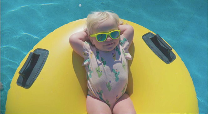
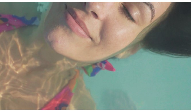
Most prominently, the new identity is led by photography. Imagery was, of course, present in the old brand but it took second or third stage behind logo placement, headlines, call to action splashes and graphic decoration. In the new brand ,the imagery is brought to the fore. Squad wanted the stills to communicate the joy, and sometimes even the imperfections, of holiday snaps and so the shoot was performed in a ‘run and gun’ style, across multiple locations in Europe.
The project identified the need to use more video to convey the experience and connect emotionally with customers. Going beyond television advertising, a series of films were devised that could be leveraged across the website and social media. Squad wanted the filming to be more than just a standard TV spot and so the idea of the longer form mini-docs quickly took shape. There was much discussion about travel vloggers which shaped not only how Squad captured the footage, but also how it tackled the stills, with director Simon Mulvaney. With the concept of ‘possibilities’ already settled, scripts flowed freely, the team approaching them from a number of tonal angles to quickly ascertain what wasn’t right. This freed time needed to portray the right brand personality and explore the wealth of possible possibilities available with Eurocamp.
The campaign consisted of two 30-second television commercials and five online films. Each film follows a different family as they embark on their Eurocamp holidays, the narratives deliberately different to convey the contrast between experiences that the different Eurocamp parcs offer. The final footage exhibits a professional edge that is in accordance with conveying Eurocamp’s wish to be seen as a quality provider. Simple things like the crop and the grading are distinctive and install a fresh energy into the visuals, a styling cue successfully used by sports and lifestyle brands. Indeed, the final suite of imagery depict a set of scenarios around the possible actions (and inactions) that would be experienced on a Eurocamp holiday. The colour grading also serves a practical purpose in unifying the look of a vast amount of material shot in so many different locations which keeps the premium feel.
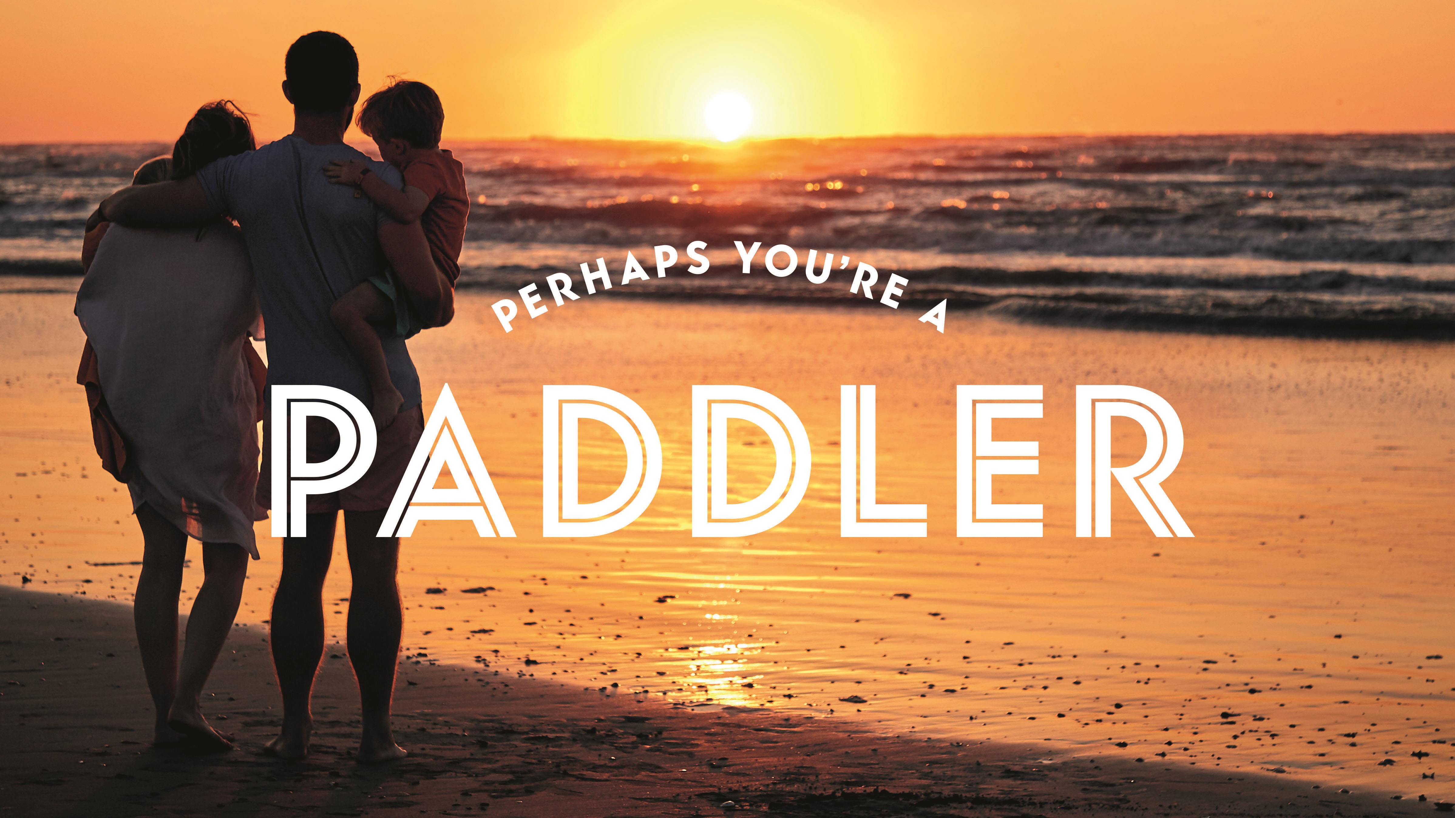
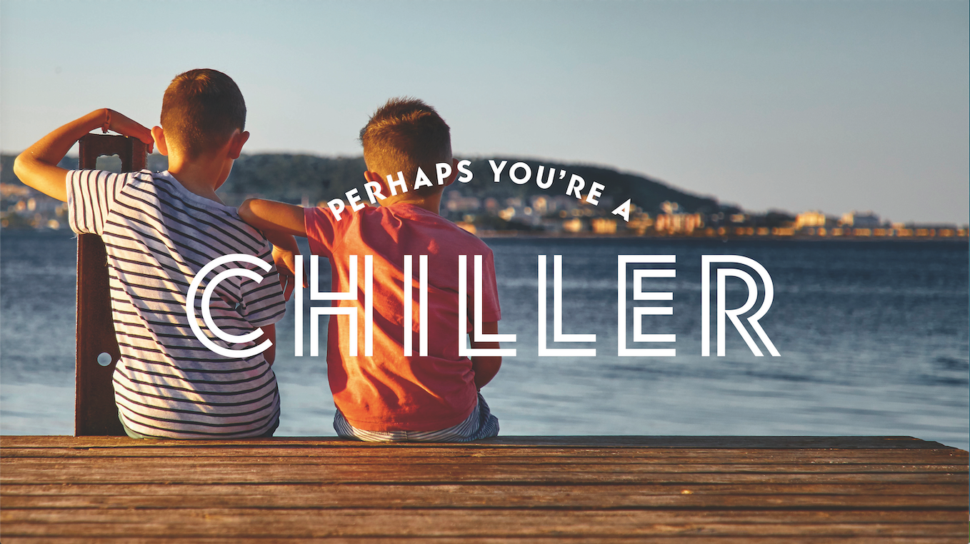
Present now which was largely absent before is negative space. The creative features careful composition within the imagery to allow for negative space free from communicative details. This allows a distinctive typographic headline lockup to be overlaid, if necessary. The font choice is singular, a clean, highly readable but still decorative split-line sans-serif. It is elastic enough that it has been successfully applied across a wide range of final applications. It has a personality that is a radical departure from the handwritten scripts of the old brand. It is also very ‘now’ in that it possesses some of the retro overtones currently popular in contemporary design.
The copywriting that the typography supports is idiosyncratic and upfront in its approach, functioning like the best recruitment posters in that it directly questions the audience as to what type of holiday they enjoy through ownable idioms such as ‘chiller’ or ‘never sit stiller;’ monikers that essentially divide the holidaymaking public into tribes, or more correctly, families. This is a memorable piece of writing in itself, but it goes beyond that to play a functional role. The segmentation is carried through into the information architecture of the website as the different categories are used as a filter that directs the user quickly to a set of destination proposals that whet their appetite further by communicating more specific details supported by holiday location photography.
The brand refresh has been timely as, according to the UK’s Travel Association (ABTA), the trend in customers switching to package holidays that they predicted last year will continue to rise in 2020. This trend reflects a change in customer buying habits that reflect the growing quality of package holidays but is also indicative of the general European economic situation. Customers are searching for cost-effective options that will allow them to take trips abroad and take part in their desired activities and, naturally, some of these buyers will be those that may otherwise have not chosen a campsite-based holiday.
But what of the close competitors mentioned earlier? A quick survey of Eurocamp’s nearest rivals uncovers some common themes. Tui invites customers to reunite with their feelings; James Villas promises ‘your holidays your way;’ Center Parcs offers an opportunity to spend quality time with family; Jet2 says people can trust its brand. There are common threads which suggest creativity based on a market research-led approach founded on shared, not distinctive, insights.
Across the landscape, advertising imagery is somewhat similar, featuring happy holidaymakers doing things filmed with a high grain/soft-focus filter. Eurocamp’s approach, complete with the ‘sliders’ or ‘chillers’ gambit feels the most real and is different enough to stand out. The new brand looks like it has been created by someone who has been on a Eurocamp holiday. Chris Hilton, Eurocamp’s head of marketing says this “is designed to make people to reconsider the brand. We believe there is a huge opportunity to showcase how Eurocamp has evolved and how it can offer a holiday that’s the perfect fit for lots of different families through the breadth and flexibility of our offering.”
In contrast, competitors appear more intangible as they have pursued a more emotive route, the benefits of which are harder to prove, their tones of voice are also more saccharine, which has the effect of making the creative feel like it has been created whereas Eurocamp has empowered its audience to use their holiday time to live up to their core personal values. It’s a benefit oriented approach that speaks to the actual facilities on offer in the packages, rather than to a romantic ideal of the ‘perfect holiday.’
Hilton says, “We really believe in our product and know that when people understand it, our holidays have broad appeal. The requirement for our brand activity is getting people to engage, we are not trying to facilitate a lifestyle.”