BMW’s rebranded logo radiates 'openness and clarity'
Historic automobile manufacturer BMW has redesigned its logo for the first time in more than two decades. The new logo will represent the transparent mobility of the future.
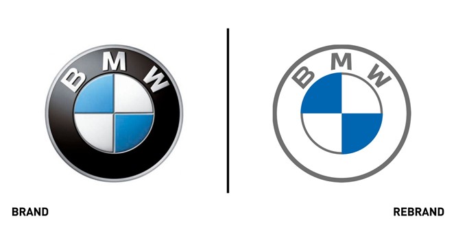
Although retaining the classic white and blue, which represent the state colours of BMW’s home in Bavaria, the new logo has eliminated the iconic black border replacing it for a more transparent one. This gives the symbol a larger proportionate area and emphasises BMW’S ‘Bavaria graphic’ so as to radiate more “openness and clarity,” according to BMW’s senior vice president of customer and brand, Jens Thiemer.
BMW is just one of many companies that has replaced its 3D logo with a flatter more modern design for use across digital touchpoints.
“With this new transparent variant, we want to invite our customers more than ever to become part of the BMW world. In addition, our new brand design is geared to the challenges and opportunities of digitisation for brands. With visual restraint and graphic We are equipping ourselves flexibly for the wide variety of contact points in communication at which BMW will show its presence online and offline in the future,” says Thiemer.
Howard Belk, co-CEO and chief creative at brand and design company Siegel+Gale, offered an expert critique of the new brand. He says that by eliminating the black border, the simple blue and white graphic will essentially become the car’s new logo in the future. “It won’t only be BMW aficionados that make the immediate association between that very simple graphic element and BMW. From there it is easy to imagine future branded experiences and products where the letters BMW don’t even appear,” Blek says.
Since its registration in 1917, the multinational car company has redesigned its logos six times. This is the only logo iteration that does not feature the signature black ring device.


